Series 7 – SUBJECT TO AVAILABILITY
Lapis Lazuli
(No. 702)

Ⓥ VEGAN
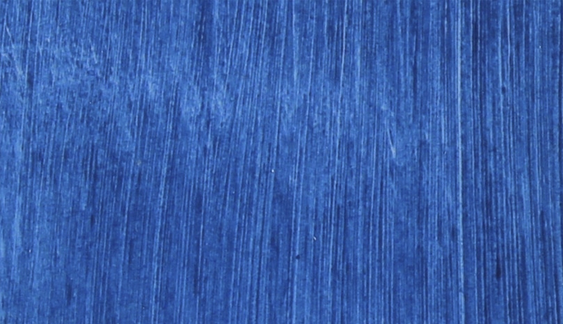
Inorganic, natural earth—This is the purest and oldest form of the Lapis Lazuli pigment, a genuine earth from Afghanistan. Lapis was the inspiration for the modern synthetic ultramarine blue, whose colour is a deeper, less dirty blue than Lapis; the handling qualities are identical.
This is the blue that the Old Masters used for centuries. This pigment is expensive and rare. Lapis Lazuli and Azurite are a family of natural earth pigments and were the source of the famous blues of the Middle Ages.
There are plenty of books that deal with this subject superbly, but I feel it’s appropriate that I say a few things about it…
Continue Reading
The first and most noticeable thing about Lapis, when one compares it to the modern synthetic equivalent ultramarine blue, is the reduced tinting and covering power and slightly dirtier colour, though neither of these traits should detract from the natural beauty. If you are looking for a blue of great sharpness with huge, explosive possibilities, and tinting ability that can poke your eye out even when mixed with another colour, try Phthalocyanine Blue instead. Lapis is a different creature.
My own inclination is to create the painting for the colour rather than the colour for the painting. When combined with Terre Verte and other earth colours, Lapis is at home. Spread it out as a wash across a landscape at the horizon line, and it’s done. Or add it as a toner to cool shadows in portraits. The choices, of course, are yours, and as I always say, it’s the artist who does the hard part!
When I first assessed the feel and nature of this pigment, it was instantly clear it would have to be milled/dispersed gently and carefully. Hand grinding was interesting but didn’t quite yield its deepest nature as the crisper colour isn’t quite achieved in this way, so I elected to use a stone roller mill. The relationship between stone and oil seemed more harmonious; to my mind, using a steel roller machine would have been sacrilegious. The paint’s texture is slightly granular, almost fluffy in its body, and when stroked between fingers you feel the slight, sandy particles, which are up to 20 microns in size but still minute. The synthetic Ultramarine Blue feels more like a gel, as if there are no particles—because the particles are less than a micron in size. I do see that the making of Lapis was a great challenge, and I feel almost nervous yet possessive about making it available.
In the summer of 2007, I met David Hockney and Lucien Freud at the Royal Academy in London. At the time, David was having a private showing of his giant tree painting, and I thought it would be fun to present each artist with a tube of Lapis. Considering the nature of both artists’ works, I had expected more of a reaction from Lucien. But I’m delighted to say that it was David’s interest and subsequent order for my Lapis that convinced me to add it to our range. As with all oil colours, to achieve the best in terms of lightfastness, I suggest you cure Lapis oil paint in a good light, as this alleviates linseed’s tendency to go murky.
| Colour Index | PB29 |
| Drying | Average |
| Transparency | Semi-Transparent |
| Lightfastness | Not Tested |
| Oil Content | Average |
| Tint Power | Low |
| Toxicity | Non-Toxic |
| ASTM D-4236 | ✔ |
Series 7 – Subject to availabilty
Lapis Lazuli (No. 702)

Ⓥ VEGAN
Inorganic, natural earth—This is the purest and oldest form of the Lapis Lazuli pigment, a genuine earth from Afghanistan. Lapis was the inspiration for the modern synthetic ultramarine blue, whose colour is a deeper, less dirty blue than Lapis; the handling qualities are identical.
This is the blue that the Old Masters used for centuries. This pigment is expensive and rare. Lapis Lazuli and Azurite are a family of natural earth pigments and were the source of the famous blues of the Middle Ages.
There are plenty of books that deal with this subject superbly, but I feel it’s appropriate that I say a few things about it…
Continue Reading
The first and most noticeable thing about Lapis, when one compares it to the modern synthetic equivalent ultramarine blue, is the reduced tinting and covering power and slightly dirtier colour, though neither of these traits should detract from the natural beauty. If you are looking for a blue of great sharpness with huge, explosive possibilities, and tinting ability that can poke your eye out even when mixed with another colour, try Phthalocyanine Blue instead. Lapis is a different creature.
My own inclination is to create the painting for the colour rather than the colour for the painting. When combined with Terre Verte and other earth colours, Lapis is at home. Spread it out as a wash across a landscape at the horizon line, and it’s done. Or add it as a toner to cool shadows in portraits. The choices, of course, are yours, and as I always say, it’s the artist who does the hard part!
When I first assessed the feel and nature of this pigment, it was instantly clear it would have to be milled/dispersed gently and carefully. Hand grinding was interesting but didn’t quite yield its deepest nature as the crisper colour isn’t quite achieved in this way, so I elected to use a stone roller mill. The relationship between stone and oil seemed more harmonious; to my mind, using a steel roller machine would have been sacrilegious. The paint’s texture is slightly granular, almost fluffy in its body, and when stroked between fingers you feel the slight, sandy particles, which are up to 20 microns in size but still minute. The synthetic Ultramarine Blue feels more like a gel, as if there are no particles—because the particles are less than a micron in size. I do see that the making of Lapis was a great challenge, and I feel almost nervous yet possessive about making it available.
In the summer of 2007, I met David Hockney and Lucien Freud at the Royal Academy in London. At the time, David was having a private showing of his giant tree painting, and I thought it would be fun to present each artist with a tube of Lapis. Considering the nature of both artists’ works, I had expected more of a reaction from Lucien. But I’m delighted to say that it was David’s interest and subsequent order for my Lapis that convinced me to add it to our range. As with all oil colours, to achieve the best in terms of lightfastness, I suggest you cure Lapis oil paint in a good light, as this alleviates linseed’s tendency to go murky.
| Colour Index | PB29 |
| Drying | Average |
| Transparency | Semi-Transparent |
| Lightfastness | Not Tested |
| Oil Content | Average |
| Tint Power | Low |
| Toxicity | Non-Toxic |
| ASTM D-4236 | ✔ |
