1. Light and Pigment Compared
  • Painting technique is a dauntingly large and rather vague subject to discuss. We could provisionally define ‘technique’ as the skills involved in accomplishing a specific artistic intent. But this leaves the notion of ‘artistic intent’ unexamined (it obviously takes infinitely various forms among artists) and tends to suggest that such an intent is rather imposed on the medium of paint. There is no one prescriptive model of ‘good technique’. One can, however, distinguish a narrower, more practical sense of the term as the knowledge consisting of certain axioms of advice on how to avoid using paint in ways that will produce impermanent or visually ineffective, results. Some of these axioms are given in the section of this site: Dos and Don’ts of Technique.

    When artistic instruction was centered on the workshop, questions of aesthetics and soundness of physical procedures were inseparable. But towards the end of the 17th century, workshop training began to be supplanted by that of the Academies, whose curricula were generally confined to drawing in dry media. As Delacroix observed, painting pictures and handling colour was seen by a few academic theorists as involving much intelligence; this was reserved for graphic preparation. This ‘de-skilling’ of the business of applying paint caused damage to artistic formations and was the object of frequent criticism.

     As other texts in this website reiterate, oil paint is a suspension in one of several kinds of drying oil, either of a coloured dry pigment or of a coloured liquid or ‘lake’ with an inert powder added to give it body. But in both instances, we are dealing with coloured substances, which seem to possess a particular colour because each absorbs to a varying extent some parts of that spectrum of coloured light we perceive, in total, as ‘colourless’ white light whilst reflecting, to a varying extent, other parts. Newton famously demonstrated that daylight was not one but virtually the whole range of all ‘pure’ colours visible to us by breaking it down with a glass prism. Subsequent physicists have concluded that the range of these ‘spectrum’ colours (red-orange-yellow-green-blue-violet) is, subatomically, a range of frequencies with which the packets of energy we call photons hit the human retina. The red end is the lowest frequency visible to the human eye; the violet end is the highest. For other species that have sensitivity to the infrared and ultra-violet extremes of light invisible to us, the spectrum is of course, quite different in extent.

     The spectrum is not, of course, several distinct frequencies but a continuous spread of them. But suppose we select a typical or median point from each of the three general ‘zones’ of these frequencies, one from the red-orange zone, one from the yellow-green, and one from the blue-violet. In that case, we can construct a triad of coloured lights from which, if intermixed, most of the remainder of the spectrum can be reproduced, and if the triad is thoroughly intermixed (known as additive mixing), the result is white light. This triad of coloured lights (and within limits, their frequencies are not strictly fixed) is generally known as the triad of primary additive colours. When each primary is mixed with one other primary, a triad of secondary additive colours results.

     The behavior of coloured light is fundamental to colour theory. Still, the colours of the light resulting from the mixing of adjacent primaries of coloured lights suffice to demonstrate to anyone who has used a palette that the behavior of coloured substances like paint is usually quite different. This is because the colour we perceive a given paint to ‘possess’ results from the interaction of light that is generally full-spectrum, with a surface that absorbs some parts of that spectrum and, to a greater or lesser extent, reflects others. In fact, the portion of the spectrum reflected by most coloured substances is far broader than we might in common sense, judge them to have as their actual colour. We are psychologically predisposed to conceptualise and distinguish colours in accordance with ‘colour constancy’, which leads us to assume that the part of the light spectrum which a given substance reflects most of all is its ‘proper colour’. If we did not have such a tendency, we would find the day-to-day recognition of objects much more difficult. But there are many instances where the full spectrum of standard daylight is not present, for example, in a room which has intensely coloured window glass or walls. In these instances, that part of the spectrum of light usually reflected by a given substance might be only weakly present in the light falling into and reflected by the room, and our perception of the colour of that substance changes accordingly. This is the cause of that well-known irritation to clothes-buyers and artists alike: metamerism—the change in the colour of objects determined by change in the colour of the light falling on them. For instance, an intensely red light will be so weak in the yellow-blue spectral zone that a ‘green’ object that reflects that zone most of all will appear dark grey or even black.

     The complexity of the reflectance of light by paint surfaces explains why the range of their colours far exceeds those in the light spectrum alone. Brown and red earth colours are substances which only weakly reflect certain wavelengths of the red-orange portion of the spectrum whilst absorbing almost completely the yellow-to-violet remainder. This complexity also explains the richness of paint colour in manipulation. The pattern of reflectance of light across the spectrum by each colour is highly idiosyncratic and can be plotted in graph form.

     For example, the reflectance profile of a given red pigment peaks at a certain point in the red zone of the spectrum but only tapers away gently on that portion of the graph covering the adjacent orange zone, whilst the profile of another red peaks at virtually the same axial point but tapers sharply away through the orange zone and then tapers only gently through the green-blue-violet zones. In dry or opaque form, these two might appear indistinguishable. But when these pigments are made into paint and brushed out, their differences are immediately apparent: thinner and more transparent zones will disclose the ancillary ‘taper’ or ‘undertone’ of colour. These differences are also disclosed when each red is mixed with another colour: generally, the orange undertone will be far more conspicuous in the resultant mix than the blue.

    Here it could be postulated that the red zone of the light spectrum is at the opposite frequency extreme from the violet, and therefore we cannot talk of the “violet side” of red. In terms of the physics of light, this is true. Still, the greater complexity of light reflectance by substances, not to mention the immense complexity of our perceptual processes, licenses us to organise the spectral colours and the non-spectral in various ways. If we take the linear light spectrum and combine the red extreme to the violet extreme, we can form a circular spectrum of apparently seamless colour transition.

     The above illustration was made by Eugene Chevreul, one of the principal 19th-century colour theorists. From the mid-17th century onwards, in the writings of Boyle, Newton, Felibien, and Young, attempts were made to reconcile the discoveries of the physicists concerning light with far older artistic traditions regarding the fundamental or ‘capital’ colours: red, yellow, and (sometimes) blue. It had long been suggested that these three colours were (in theory at least) the pre-mixed basis for all other derived colours. But their behavior, when intermixed, seemed at odds with that of light. What we now understand about reflectance and absorbency of light by surfaces explains this.

     The traditional artist’s primaries were an unwitting attempt to make a good selection from the spectrum in a manner anticipating those of physicists. But the broad reflectance of the physical primaries means that each absorbs only about one-third of the spectrum: blue reflects a fair amount of green and absorbs only red; red also reflects blue whilst absorbing green; and yellow reflects green whilst absorbing blue. In an approximate way, these artistic primaries’ reflectances overlapped sufficiently to ‘cover’ the spectrum. The demands of printing from colour photographs forced the precise and standardised specification of these colours as the familiar modern ‘ideal’ printers’ primaries. Pleasingly, the modern standard printers’ primaries are precisely the same as the secondary colours derived from additively mixing each pair of what are generally accepted as the standard light primaries. And if the printers’ primaries are similarly mixed in pairs, the resulting triad of ‘subtractively’ mixed secondary colours is precisely the same as the light primaries. Thus, our systems of predicting light and physical colour behaviour interlock.


    Obviously, the primary light colours, considered as selections from the linear spectrum, are shifted far more to one side of that spectrum than their physical colour counterparts. In fact the light spectrum visible to us is so greatly biased to the green-blue-violet side that no predetermined primary light triad can reproduce these frequencies entirely; every selection of lights that covers the other parts adequately will fail to cover these. But despite this range of light being fully visible to us, our sensitivity to colour, as disclosed by our conscious power to discriminate colour difference, is biased to the orange-yellow-green side. The usefulness of any physical colour primary triad, whether of printing ink or paint, lies in its forming a basis for mixing colours that we can judge to be different, and consequently it will be shifted to that side of the light spectrum to which we are most cognitively, as opposed to most physically, responsive.

    It is in mixing colours that the difference between the behaviour of light and paint becomes most salient, as a comparison between their respective secondary colours demonstrates. Whereas red-orange and green light together produce a yellow more intense in brightness than each of these lights alone, and green light and violet produce a similarly stronger blue, all mixes employing the physical, paint primaries are less intense than their constituents, and because the physical primaries are themselves shifted towards the zone of the spectrum to which we are optimally responsive, the secondaries follow suit.


    To put it broadly, the successive additive mixing of the light primaries results in more intense light; the subtractive mixing of successive physical primaries results in something that absorbs most spectral light—a dull, dark grey verging to black. The reason for this difference in result is that when we mix lights, two or more joining streams of photons obviously result in more photons, but the frequencies at which they are travelling are evened out by this collision such that their resultant frequency is at a median point relative to each on the spectrum of light frequencies. But when we mix paints, ‘peak’ reflectance zone of each paint is no longer as strongly reflective as that zone comprised of the combined overlapping ‘taper’ of subsidiary reflected spectral light both possess. Thus yellow paint and blue paint each reflects a considerable but weaker spectral ‘fringe’ of green, and when they are mixed, it is this fringe that becomes the ‘peak’ reflectance of the blend. Paradoxically, the spectral impurity of paint allows it to be mixed in predictable ways.

    When artistic instruction was centred on the workshop, questions of aesthetics and soundness of physical procedures were inseparable. But towards the end of the 17th century workshop training began to be supplanted by that of the Academies, whose curricula were generally confined to drawing in dry media. As Delacroix observed, the business of actually painting pictures and of handling colour was not seen by many academic theorists as involving much intelligence; this was reserved for the graphic preparation. This “de-skilling” of the business of applying paint caused damage to artistic formations, and was the object of frequent criticism.

    As other texts in this website reiterate, oil paint is a suspension in one of several kinds of drying oil either of a coloured dry pigment, or of a coloured liquid or “lake” with an inert powder added to give this body. But in both instances we are dealing with coloured substances, which seem to possess a particular colour because each absorbs to a varying extent some parts of that spectrum of coloured light we perceive, in total, as “colourless” white light, whilst reflecting, to a varying extent, other parts. Newton famously demonstrated that daylight was not one but virtually the whole range of all “pure” colours visible to us, by breaking it down with a glass prism. Subsequent physicists have concluded that the range of these “spectrum” colours (red-orange-yellow-green-blue-violet) is, subatomically, a range of frequencies with which the packets of energy we call photons hit the human retina. The red end is the lowest frequency visible to the human eye; the violet end is the highest. For other species which have sensitivity to the infra-red and ultra-violet extremes of light invisible to us, the spectrum is of course quite different in extent.

    The Linear Spectrum (Chevreul, 1864)

    The Linear Spectrum (Chevreul, 1864)

    The spectrum is not, of course, several distinct frequencies, but a continuous spread of them. But if we select a typical or median point from each from the three general “zones” of these frequencies, one from the red- orange zone, one from the yellow- green, one from the blue- violet, we can construct a triad of coloured lights from which, if intermixed, most of the remainder of the spectrum can be reproduced, and if the triad is completely intermixed (known as additive mixing), the result is white light. This triad of coloured lights (and within limits their frequencies are not exactly fixed), is generally known as the triad of primary additive colours. When each primary is mixed with one other primary a triad of secondary additive colours results.

    The Triad of Primary Light Colours mixed additively to produce the Secondary Light Triad.

    The Triad of Primary Light Colours mixed additively to produce the Secondary Light Triad.

    The behaviour of coloured light is fundamental to colour theory, but the colours of the light resulting from the mixing of adjacent primaries of coloured lights suffices to demonstrate, to anyone who has used a palette, that the behaviour of coloured substances like paint is usually quite different. This is because the colour we perceive a given paint to “possess”, results from the interaction of light which is generally full- spectrum, with a surface which absorb some parts of that spectrum, and, to a greater or lesser extent, reflects others. In fact the portion of the spectrum reflected by most coloured substances is far wider than we might in commonsense judge them to have as their actual colour. We are psychologically predisposed to conceptualise and distinguish colours in accordance with “colour constancy”, which leads us to assume that the part of the light spectrum which a given substance reflects most of all is its “proper colour”. If we did not have such a tendency we would find the day-to-day recognition of objects much more difficult. But there are many instances where the full spectrum of standard daylight is not present, for example, in a room which has strongly coloured window glass or walls. In these instances that part of the spectrum of light normally reflected by a given substance might be only weakly present in the light falling into and reflected by the room, and our perception of the colour of that substance changes accordingly. This is the cause of that well known irritation to clothes-buyers and artists alike: metamerism—the change in the colour of objects determined by change in the colour of the light falling on them. For instance, a strongly red light will be so weak in the yellow-blue spectral zone that a “green” object which reflects that zone most of all will appear dark grey or even black.

    The complexity of the reflectance of light by paint surfaces explains why the range of their colours far exceeds those in the light spectrum alone. Brown and red earth colours are substances which only weakly reflect certain wavelengths of the red-orange portion of the spectrum whilst absorbing almost completely the yellow-to-violet remainder. This complexity also explains the richness of paint colour in manipulation. The pattern of reflectance of light across the spectrum by each colour is highly idiosynchratic, and can be plotted in graph form.

    Sample graphs plotting Colour Reflectance for two different red pigments.

    Sample graphs plotting Colour Reflectance for two different red pigments.

    For example, the reflectance profile of a given red pigment peaks at a certain point in the red zone of the spectrum but only tapers away gently on that portion of the graph covering the adjacent orange zone, whilst the profile of another red peaks at virtually the same axial point, but tapers sharply away through the orange zone, and then tapers only gently through the green-blue-violet zones. In dry or opaque form these two might appear indistinguishable. But when these pigments are made into paint and brushed out, their differences are immediately apparent: thinner and more transparent zones will disclose the ancillary “taper” or “undertone” of colour. These differences are also disclosed when each red is mixed with another colour: generally the orange undertone will be far more conspicuous in the resultant mix than the blue.

    Here it could be objected that the red zone of the light spectrum is at the opposite frequency extreme from the violet, and therefore we cannot talk of the “violet side” of red. In terms of the physics of light this is true, but the greater complexity of light reflectance by substances, not to speak of the immense complexity of our perceptual processes, licenses us to organize the spectral colours as well as the non-spectral in a variety of different ways. If we take the linear light spectrum and simply conjoin the red extreme to the violet extreme, we can form a circular spectrum of apparently seamless colour transition.

    The Light Spectrum represented as a circle.(Chevreul, 1864)

    The Light Spectrum represented as a circle.(Chevreul, 1864)

    The above illustration was made by Eugene Chevreul, one of the principal 19th century colour theorists. From the mid 17th century onwards, in the writings of Boyle, Newton, Felibien and Young, attempts were made to reconcile the discoveries of the physicists concerning light with far older artistic traditions regarding the fundamental or “capital” colours: red, yellow and (sometimes) blue. It had long been suggested that these three colours were (in theory at least) the pre-mixed basis for all other derived colours. But their behaviour, when intermixed, seemed at odds with that of light. What we now understand about reflectance and absorbency of light by surfaces explains this. The traditional artist’s primaries were in fact an unwitting attempt to make a sufficient selection from the spectrum, in a manner anticipating those of physicists. But the wide reflectance of the physical primaries means that each absorbs only about one third of the spectrum: blue reflects a fair amount of green and absorbs only red, red also reflects blue whilst absorbing green, and yellow reflects green whilst absorbing blue. In an approximate way these artistic primaries’ reflectances overlapped sufficiently to “cover” the spectrum. The demands of printing from colour photographs forced the precise and standardized specification of these colours as the familiar modern “ideal” printers’ primaries. The modern standard printers’ primaries pleasingly happen to be exactly the same as the secondary colours derived from additively mixing each pair of what are generally accepted as the standard light primaries. And if the printers’ primaries are similarly mixed in pairs the resulting triad of “subtractively” mixed secondary colours is exactly the same as the light primaries. Thus our systems of predicting light and physical colour behaviour interlock.

    The Triad of Primary Lights and the Triad of Printers’ Primary Colours compared.

    The Triad of Primary Lights and the Triad of Printers’ Primary Colours compared.

    Obviously the primary light colours, considered as selections from the linear spectrum, are shifted far more to one side of that spectrum than their physical colour counterparts. In fact the light spectrum visible to us is so greatly biased to the green-blue-violet side that no predetermined primary light triad can reproduce these frequencies entirely; every selection of lights which covers the other parts adequately will fail to cover these. But despite this range of light being fully visible to us, our sensitivity to colour, as disclosed by our conscious power to discriminate colour difference, is biased to the orange-yellow-green side. The usefulness of any physical colour primary triad, whether of printing ink or paint, lies in its forming a basis for mixing colours which we can judge to be different, and consequently it will be shifted to that side of the light spectrum to which we are most cognitively, as opposed to most physically, responsive.

    It is in mixing colours that the difference between the behaviour of light and paint becomes most salient, as a comparison between their respective secondary colours demonstrates. Whereas red-orange and green light together produce a yellow more intense in brightness than each of these lights alone, and green light and violet produce a similarly stronger blue, all mixes employing the physical, paint primaries are less intense than their constituents, and because the physical primaries are themselves shifted towards the zone of the spectrum to which we are optimally responsive, the secondaries follow suit.

    To put it broadly, the successive additive mixing of the light primaries results in more intense light; the subtractive mixing of successive physical primaries results in something which absorbs most spectral light- a dull dark grey, verging to black. The reason for this difference in result is that when we mix lights two or more joining streams of photons obviously result in more photons, but the frequencies at which they are travelling are evened out by this collision such that their resultant frequency is at a median point relative to each on the spectrum of light frequencies, but when we mix paints “peak” reflectance zone of each paint is no longer as strongly reflective as that zone comprised of the combined overlapping “taper” of subsidiary reflected spectral light which both possess. Thus yellow paint and blue paint each reflects a considerable but weaker spectral “fringe” of green, and when they are mixed it is this fringe which becomes the “peak” reflectance of the blend. The spectral impurity of paint, paradoxically, allows it to be mixed in predictable ways.

2. Models of Interpretation
  • At this point the physics of light becomes less important than simply positing some useful models of colour organization. The colour wheel introduced above must be familiar to most readers, but if it is given three “spokes” or diameters then we have three axes of the complementaries, linking each primary colour with the secondary that results from the other two. The physiological basis for these complementary colours lies in the spectral range that each reflects, as mentioned previously. When we look at a surface strongly coloured by a primary the receptors in our retinae react to the full range of the spectral colour reflected, but these receptors are rapidly exhausted, leaving active only those receptors which respond to the other part of the spectrum. Thus we see an “afterimage” of the complementary colour.

    The Colour Wheel showing complementary pairs of colours across each diameter.

    The Colour Wheel showing complementary pairs of colours across each diameter.

    As the Impressionists in 19th century France both attempted to respond more directly to the raw data of their eyes and also to accommodate the increasing sophistication of colour theory, they placed increasing reliance on complementary colour transitions. It is almost too well known to state that they recorded yellow sunlight producing violet shadows, green foliage making tree trunks look red, and blue skies dotted with orangey clouds. But if, thanks in part to the writings of Chevreul and Ogden Rood , impressionists and neo-impressionists had become more conscious of complementarity, it does not follow that previous artists were not informally aware of this principle in their handling of colour. It had long been appreciated that delicately determined greys could be made by directly mixing colours which in fact were complementaries. Painters such as Veronese, Rubens and Delacroix had in different ways introduced green semitones into passages of pink flesh. Claude or Cuyp landscapes commonly show amber light throwing blue shadows across clouds. But clearly the tonal structure of these artists’ works functioned robustly and independently of their constituent colours. This brings us to more complex models of colour construal, and also some definition of terms.

    As stated before, the range of artist’s colours extends far beyond the spectral ones. Most conspicuously, it includes white, reflecting the whole spectrum, and black, absorbing all of it. It also includes browns, dull greens, maroons, blackish blues and so on. How can these be related to the colour wheel and its three pairs of complementaries? The solution lies in a variety of models which take instead the circle of continuously gradated colour, (of which the colour wheel is a sixfold reduction), as a two dimensional plane, so to speak, but add a third dimension running above and below it. Above it runs the scales of hues: the scale of colours that result from successive additions of white to every minutely different colour on the circle, until white is reached. Below it runs the scale of tints or shades: the scale that results from increasing additions of black to each colour on the circle, until black is reached. If we interpret the pure white and pure black extremities as respectively, the north and south poles of a sphere, of which the colour circle is the equator line, then we have the convenient colour-sphere first proposed by the German artist Runge in 1810. The equator line can be further regarded as the rim of the colour circle where colours are at their most intense or most saturated, and we can determine our position on the circle according to the chroma of these colours. Bit if we follow each radius from each chromatic position to the centre of the sphere then we can construct a scale of diminishing saturation, that is, the scale from each maximally intense colour, through successive additions of grey which is of the same tonal weight or value, until absolute grey is reached at the centre. It is along this scale of diminishing saturation of a given colour that we can assess the quality of an individual paint as we obtain it: the greater the proportion of filler, the less saturated the colour of the paint, the “greyer” it appears to us.

    The Colour sphere as proposed by Runge.

    The Colour sphere as proposed by Runge.

    This model usefully incorporates locations for the artist’s colours mentioned above; it is clear that browns and some reds are interpretable as particular tints of fully saturated oranges and reds. The need to provide classificatory systems to specify colours in industrial dyeing, printing and pigment manufacture has in the last century produced the complex models of coded colours devised by Pope, Ostwald, or most in use nowadays, Munsell. But these systems are most useful in industry, and the assistance that models like Runge’s provides, is in leading the artist to formulate a mental geometry of colour in the same way as we presuppose a physical geometry in our perception of form. They are merely aids to understanding, and do not represent structures “out there”.

    What such systems do lead us to appreciate is how, particularly in European painting from the 15th to the 19th centuries discussion of colour is inseparable from that of tonal weight or value. They also show how such a use of different tonalities is “implicitly complementary”. For example, a rich brown, as a tint of orange, will set off a hue of blue. The exploitation of the mutually intensifying effects of juxtaposed complementary colours, is simply one strategy in the tonal construction of a painting. The works of Velasquez, Poussin and much of Rubens indicate that colorific variety is essentially ordered by what French theorists dubbed “the values.”

3. Methods of Application and Mixing

It must be obvious that studio practice in colour use long pre-dates scientific theories which attempt to explain it. Only one artistic movement, the neo-impressionism of Seurat and Signac, attempted to order the former according to the latter. For preceding ages the approach was that of pragmatically tested methods for making use of the available physical materials. And though authors such as Vasari and de Mayerne were at hand to take down remarks by Michelangelo and Rubens, their writings and those of Cennino or Leonardo essentially record personal interpretations of a frequently unrecorded corpus of practical knowledge.

Any account of paint handling and mixing starts from fairly commonplace observations. This one is no different.

Oil paint can be applied in, broadly, three distinct strengths:

  1. in a thick, often textured layer; as impasto.
  2. in a largely opaque thinner layer.
  3. in a thin largely transparent layer, as a wash or as a glaze.

The first two can be accomplished by use of a brush or a knife; the third generally requires a soft brush, or even a cloth.

Different colours in oil paint can be combined in three distinct ways:

  1. by mixing them directly in their wet state on a palette or on the surface to be painted.
  2. by placing one on top of another in layers.
  3. by placing one next to another in close juxtaposition.

Clearly each application method (a), (b), and (c) can be used in each and every combination method (i), (ii) and (iii). Impasto can be mixed, layered or juxtaposed; washes or glazes likewise. An historical example could be given of a painter in whose work each combination of methods can be found. Perhaps this classification sounds bone-headed, but it helps to show how various technical attainment can be.

Oil paint evolved from tempera because the latter permitted artists only to weave and hatch over different layers of paint and to a great extent, did not allow the easy fusion of colours directly or the attainment of rich dark passages. But artists inherited methods of application proper to tempera, and so early oil paintings were often begun in tempera alone and then continued with increasing additions of oil to the topmost layers of working. Thus combining colours in successive layers (as in (ii) above) was a natural development of traditional practice. This mode of combination can be examined in the matters of underpainting, coloured priming, and glazing.

Layering Paint: Underpainting

As said previously, drawing and painting are ultimately inseparable activities, and underpainting is often confusingly termed underdrawing .But this at least elucidates its function. In the 15th century both northern and southern European artists, having prepared their panels, would usually draw on these with dry media, and then reinforce this design, often modelling it out with cross-hatching, using thinned grey or reddish-brown ink or paint. Such preliminary work guided subsequent development, and enriched the semi-transparent thinned colour placed on top: a warm brown underpainting, for instance, would prevent a dark red from appearing too purplish.

Glazing: The Northern Tradition

Experts must forgive this somewhat bald classification which is only adopted to be concise. Flemish 15th century artists quickly exploited the way in which oil paint could create rich colour effects by means of successive layers of thin transparent paint of similar or even identical chroma (see above section). Generally a passage of undermodelling would be painted representing the motif in lighter hues of the intended end-state colour, with the modelling similarly put in with restrained tints. On this would be painted several layers of a similar and translucent colour, usually without any addition of white, but often thinned by the addition of oil blended with pine resin. The result would be an intensification and deepening of the given colour.
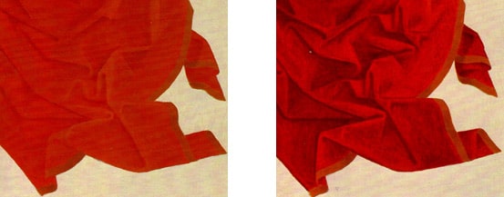
Demonstration panels, mimicking the Early Netherlandish artists’ techniques of drapery modelling in oil.

Demonstration panels, mimicking the Early Netherlandish artists’ techniques of drapery modelling in oil.

(Left) shows a bright undermodelling in vermilion modulated slightly with lead white and red lake. (Right) shows translucent glazes of red lake applied in successive layers to create the shadows. The glaze is thickest in the darker shadows; the very darkest are reinforced with the addition of a little ultramarine to give a purplish cast.

Glazing: The Venetian Tradition

In the hands of 16th century Venetian and some central Italian artists glazing methods were adapted to attain more adventurous effects. These tended to use the mixing principles stipulated in the previous section., and usually presupposed an overall coloured priming, on which highlights of the motif could be laid in with thick opaque lead white. But areas of the priming, often brown or green, would be left as reserve between these. Glaze layers would be applied over both to create stronger lighting effects than the similar- colour method would permit. For example, a brown primer could be underpainted with thick white highlights representing drapery folds, and then the whole passage might be glazed over with blue or green. The result would be that the white would shine through these glaze layers as blue or green lights, whilst the brown primer would convert a blue layer, as a colour to which it is a complimentary tint, to a rich bluish grey, and would convert a green layer to a deep greenish gold. Baroque artists developed the method of white underpainting of highlights, particularly in rendering flesh. If a nude was underpainted in white on a reddish primer, parts of which would be left as reserve, successive layers of thin pink and orange would appear bright and warm on the white highlights, but would look deeper and cooler when placed directly on the primer. This was later dubbed “making optical greys”. It can be often found in works of Rubens.

Wet and Wet Mixing

This is a common term for method (i)above, and is clearly the one familiar to most painters today. It must seem self- evident to us that mixing distinct colours (e.g blue and yellow) produces others, but to the medieval artist this appears to have been unknown. Since glazing alone could not create a painting, however, 15th century painters must have quickly realized how easily the new oil paint permitted direct mixing. The role of such mixing was enlarged by changes in artistic sensibility: as early 18th century painters inclined towards brighter, cooler and more even lighting in their works, their handling became far less reliant on glazing and more dependent on opaque layers instead. I have never found any trace of “optical” greys in Tiepolo, for instance, who frequently appears to work passages in one bravura period. David, in his mature works, would develop a painting from freely brushed stippled veils of colour or frotties,on which he would precisely model with opaque paint. This method was best adapted to the exact draftsmanship he pursued.

The Romantic reaction to Neo-Classicism led to a rejection of David’s careful handling, but a painter such as Delacroix , though he admired Rubens, did not revive Baroque methods, and instead pioneered the combining of colours by juxtaposition (see below). As the 19th century progressed artists such as the German Nazarenes and the English Pre-Raphaelites attempted to revive glazing in their own eccentric procedures, but generally Realist and Impressionist movements urged artists to adopt wet-and wet alla prima methods in which drawing and painting would be accomplished together using the newly-available tube colour and also the newly formulated pigments.

Juxtapositional Mixing

Any painting, of whatever period, will attain an effect by setting differently coloured areas side-by-side .But a specific colour within a painting can be determined without physical mixing, simply by juxtaposing small areas or taches of those constituent colours which otherwise would be used to mix it subtractively on the palette. Delacroix would paint rapid strokes of purple and green into flesh pink to modulate its appearance from a distance. The Impressionists partially developed this technique, but it was not until the 1880’s that a younger group of artists, led by Seurat, responded to contemporary colour theorists and attempted to place Impressionism on a more consistent footing. Accordingly, they confined their palettes to include only the fully saturated colour-circle colours and white. Thus a green lawn could be rendered with small points of yellow and of blue, a blue sky could be made to shimmer with points of orange, and a brown shadow could be recreated with dots of red, green and a little yellow. In many respects their technique anticipated modern 3-colour printing, although they found that the primaries alone were not, as paints, strong enough to synthesize optically all the colours they needed.