Michael Harding Watercolours: The Artist’s Palette Redefined
DISCOVER
MICHAEL HARDING
WATERCOLOURS
Step into the vibrant world of Michael Harding Watercolours, a range crafted for artists who crave exceptional quality and intensity in their work. After decades of perfecting oil paints, Michael Harding has expanded into watercolours, offering 136 meticulously ground pigments that dazzle with their vibrance and longevity. Each colour is rich in history and craftsmanship, providing unparalleled depth and clarity.
Whether you’re exploring delicate washes or bold strokes, these watercolours promise to elevate your artistry. Dive into a palette where each hue tells a story, making your art not just a creation but a masterpiece.
Explore more and uncover the full spectrum of possibilities with Michael Harding Watercolours.
Step into the vibrant world of Michael Harding Watercolours, a range crafted for artists who crave exceptional quality and intensity in their work. After decades of perfecting oil paints, Michael Harding has expanded into watercolours, offering 136 meticulously ground pigments that dazzle with their vibrance and longevity. Each colour is rich in history and craftsmanship, providing unparalleled depth and clarity.
Whether you’re exploring delicate washes or bold strokes, these watercolours promise to elevate your artistry. Dive into a palette where each hue tells a story, making your art not just a creation but a masterpiece.
Explore more and uncover the full spectrum of possibilities with Michael Harding Watercolours
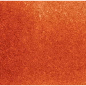
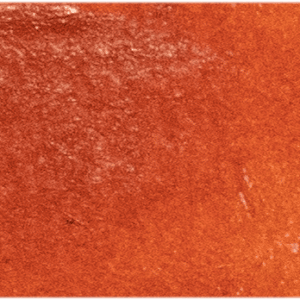
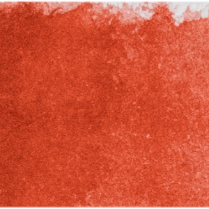
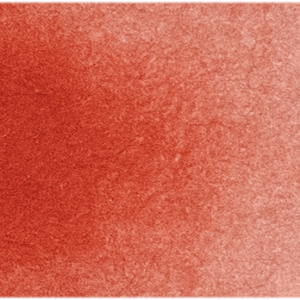
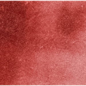
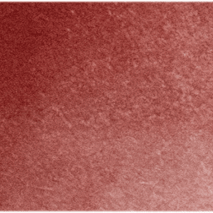
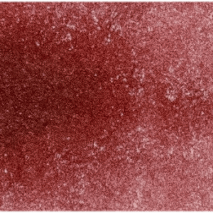
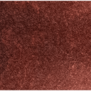
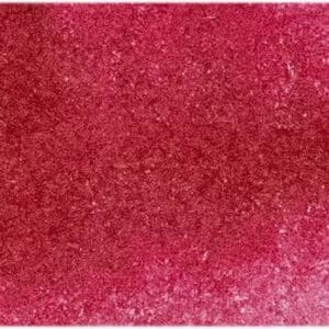
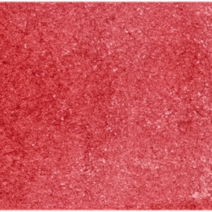
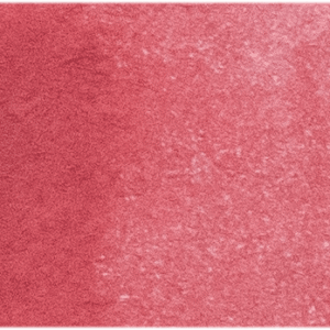
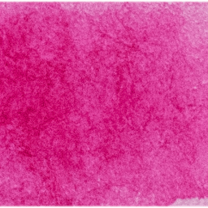
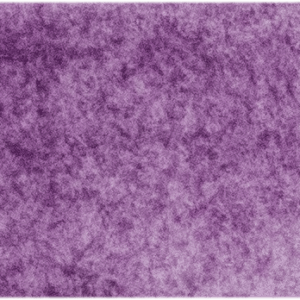
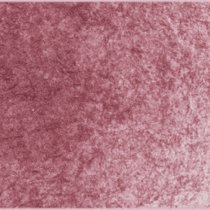
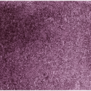
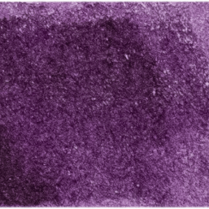
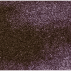
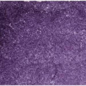
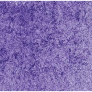
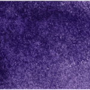
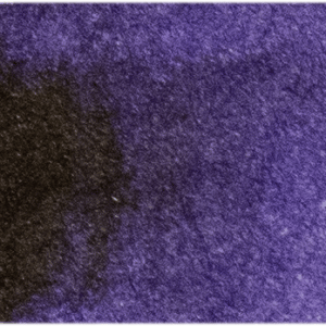
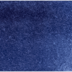
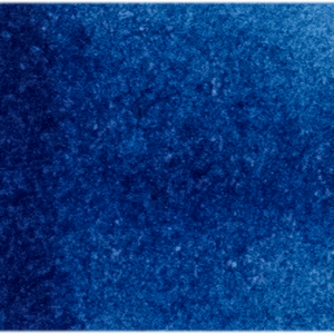
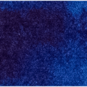
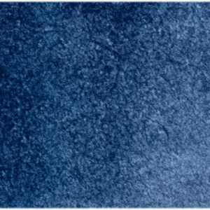
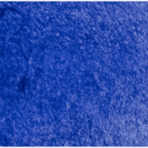
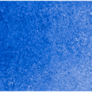
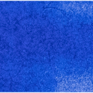
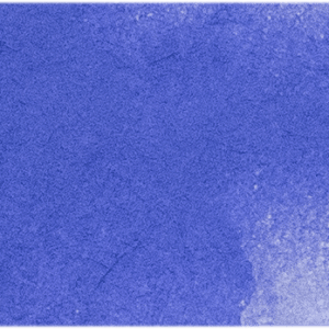
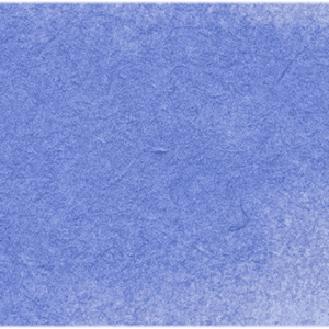
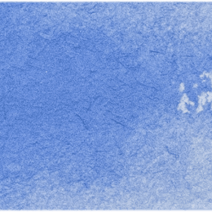
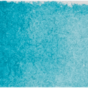
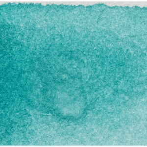
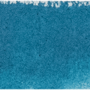
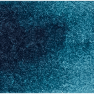
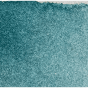
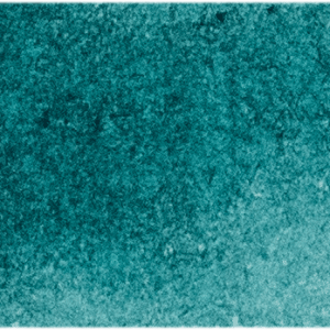
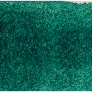
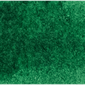
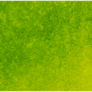
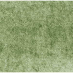
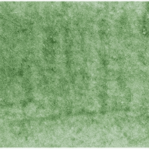
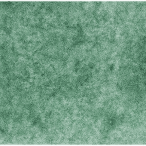
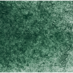
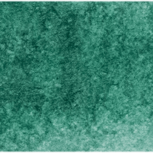
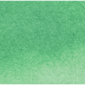
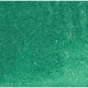
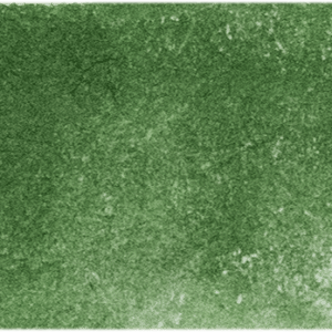
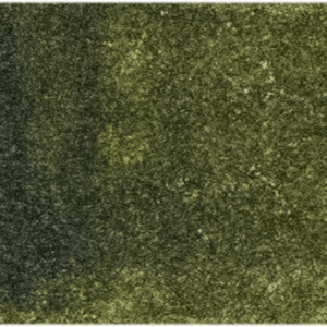
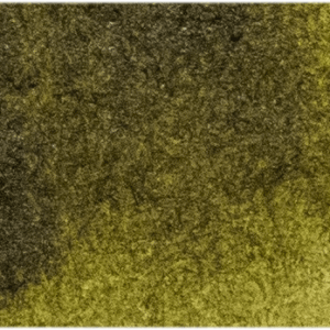
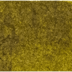
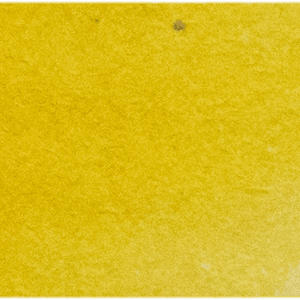
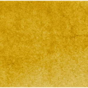
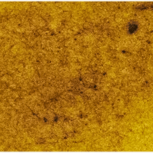
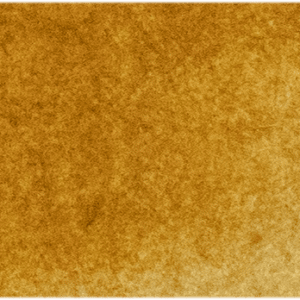
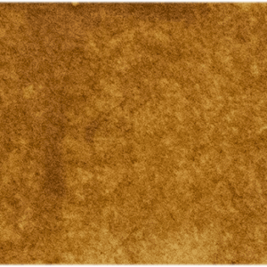
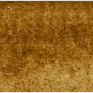
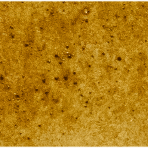
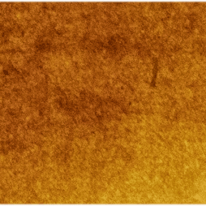
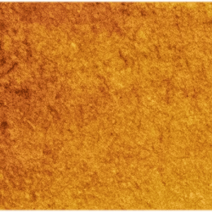
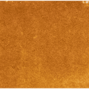
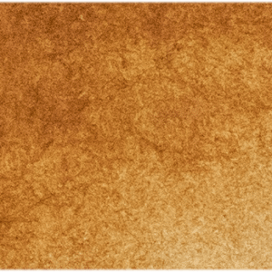
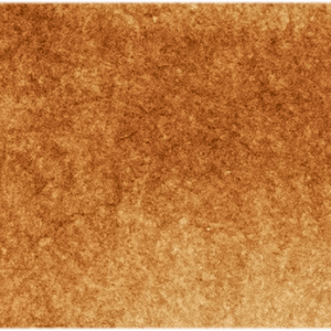
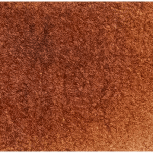
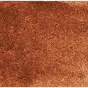
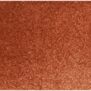
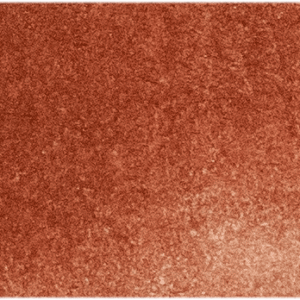
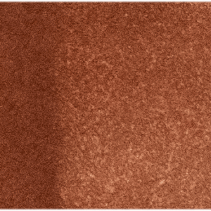
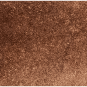
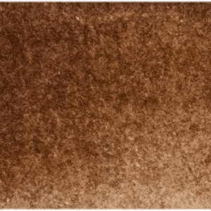
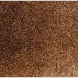
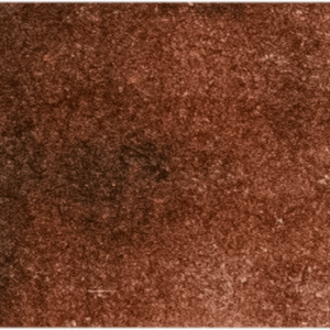
Click the paint swatch to discover each colour’s Pigment and other important details about the colour.
Please consider these images as a guide only.
3 reviews for MH Watercolour Reviews
3 reviews for MH Watercolour Reviews
-
I received the wonderland set as a gift and I must say these watercolors are the best I have ever used. I have tried many of the top name brand products and Michael Harding is nothing like all those others. The colors are so vibrant and do not fade as much as other brands. I fond this helps a lot when gauging your values. Now I don’t want to use any other brand. They are truly in a class by themselves. Wow!
-
I LOVE LOVE LOVE my MH water colours, love their truth of pigment, the colours, their granulation, the depth of colour AND they way they dont go rock hard like the Daniel Smiths I used to love, and use.
MH watercolours, because of the honey, stay very usable for weeks and weeks.
You can see my works on Instagram Louisewalkeranddoogledog , rich fabulous colours and the works kind of detailed so the colours on the palette staying usable is great benefit, as one work can take a month.
Main Colours used….love the Moonlight,Opera Rose, Alazarin Crimson, Bright green lake, Moss green, green Gold, perylene Green, Belladonna, Deep Purple (Dioxazine.) Green Gold and the blues are sensational, cobalt and ultramarine…. the list goes on and on… worth every every penny…..look at the works on Instagram, they speak for themselves…











Julie –
I received the wonderland set as a gift and I must say these watercolors are the best I have ever used. I have tried many of the top name brand products and Michael Harding is nothing like all those others. The colors are so vibrant and do not fade as much as other brands. I fond this helps a lot when gauging your values. Now I don’t want to use any other brand. They are truly in a class by themselves. Wow!
louise walker –
I LOVE LOVE LOVE my MH water colours, love their truth of pigment, the colours, their granulation, the depth of colour AND they way they dont go rock hard like the Daniel Smiths I used to love, and use.
MH watercolours, because of the honey, stay very usable for weeks and weeks.
You can see my works on Instagram Louisewalkeranddoogledog , rich fabulous colours and the works kind of detailed so the colours on the palette staying usable is great benefit, as one work can take a month.
Main Colours used….love the Moonlight,Opera Rose, Alazarin Crimson, Bright green lake, Moss green, green Gold, perylene Green, Belladonna, Deep Purple (Dioxazine.) Green Gold and the blues are sensational, cobalt and ultramarine…. the list goes on and on… worth every every penny…..look at the works on Instagram, they speak for themselves…
Aelfred –
Dear Michael Harding and company,
My name is Aelfred and I was fortunate enough to receive one of the Michael Harding awards at the Royal Society of British artists annual exhibition this year. Whilst a little time has now past since the show, I have only just started using the materials I received. The results of the many different materials included in the prize has been a revelation. Although I have been using MH colours for a few years now, this has been my first opportunity to combine these paints with the other products you offer and I will certainly not stop using these from now on. They look set to enrich and improve my practice and develop my understanding of what oil paints can achieve. I therefore wanted to thank you the company for its generosity in supporting the RBA and its prizes. I am grateful for the support you offer to aspiring artists and painters generally and struggle to imagine what it would be like to try and work without the materials develop and produced by your company.