

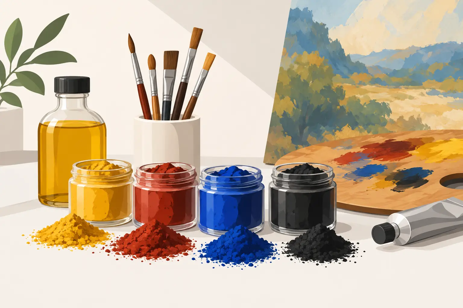
A tube of oil colour is not simply a named hue in a convenient form. Its behaviour begins with the oil pigments within it: the mineral or organic particles that give the paint its colour, opacity, tinting strength, texture and, in many cases, its particular character on the brush. For painters who want more predictable mixtures and more deliberate surfaces, pigment knowledge is not an academic extra. It is part of learning what the paint can do.
The same broad colour family can contain very different pigments. Two reds may appear close in a colour chart yet differ profoundly in undertone, transparency, drying rate and the greys they make with green. A pale blue may be delicate in a wash of paint but overpowering in a mixture. Once these distinctions are understood, palette decisions become less about collecting colours and more about selecting useful materials.
What oil pigments contribute to a paint
Oil paint is made from pigment dispersed in a drying oil, most often linseed oil. The pigment is the coloured solid; the oil binds those particles into a workable paint film. The quality of a paint depends on both, but pigment is where its visual identity begins.
Pigments vary in particle size, shape and refractive index. These physical properties influence whether light passes through the paint layer, scatters from it or is absorbed by it. That is why some colours cover strongly while others are naturally transparent, even when both are applied at a similar consistency.
Opacity is useful when you need clean, decisive corrections, pale passages or assertive marks over a darker underpainting. Transparent colours are especially valuable for glazing, optical depth and mixtures that retain a sense of light. Neither is inherently superior. The useful question is whether the pigment’s natural behaviour serves the painting method in front of you.
Tinting strength matters just as much. A high-strength pigment can alter a mixture with the smallest addition. Phthalocyanine Blue, for example, can quickly dominate white and earth colours, while a low-tinting yellow or earth may allow more gradual adjustment. This is one reason why mixing by volume alone can be misleading. A small touch of one pigment may have more effect than a much larger addition of another.
Single-pigment colours and clear mixing
A single-pigment colour contains one colourant, identified by its Colour Index name and pigment code. These colours are often valuable as the foundation of a mixing palette because their bias and behaviour are easier to read. If a mixture turns unexpectedly dull, you have fewer variables to trace.
This does not mean multi-pigment colours are to be avoided. A carefully formulated mixture can offer a beautiful, useful colour that is difficult or inefficient to create from separate tubes. It may be ideal for a particular landscape palette, portrait practice or rapid working method. The trade-off is that every additional pigment brings another influence into a mixture.
For painters building a first serious palette, a modest group of well-understood single-pigment colours is usually more instructive than an extensive selection of pre-mixed hues. Begin with colours that provide warm and cool tendencies across the primaries, then add earth colours and speciality pigments according to the subjects you paint. A portrait painter, a plein-air painter and an abstract painter may all make sound but different choices.
When assessing a tube, read beyond the colour name. The pigment code reveals what is actually in the paint, while transparency, lightfastness and series information help explain its intended character and value. A colour name can carry historical associations, but pigment information is the more dependable guide to how that particular paint may behave.
Hue is only the beginning
The familiar distinction between warm and cool is useful, provided it is treated as a practical observation rather than a fixed law. A yellow leaning towards green will behave differently in foliage mixtures from one leaning towards orange. A red with a blue undertone can make clearer violets than a warmer red, yet may produce less convincing sunlit oranges.
It is worth making small mixture strings rather than relying on labels. Mix each red with each blue, then each yellow with each blue. Add white to a portion of each mixture and observe how the colour opens out. Some apparently rich mixtures become chalky in tints; others remain luminous. These tests show the real working character of oil pigments more clearly than a colour wheel alone.
Earth, mineral and modern organic pigments
Traditional earth pigments, such as Yellow Ochre, Raw Umber, Burnt Sienna and Venetian Red, remain central to many palettes because they offer natural restraint, useful body and harmonious neutralising power. Their lower chroma is not a limitation. It often makes them exceptionally effective for building form, establishing tonal structure and tempering more intense modern colours.
Mineral pigments include many of the historic and inorganic colours valued for their distinct handling and permanence. Ultramarine, cobalt colours and iron oxides each have their own visual rhythm in mixtures. Some produce textured, granulating-looking brushwork in a lean application; others feel smooth and dense. Their cost can reflect the pigment itself, its processing and the quantity required to achieve proper colour strength.
Modern organic pigments introduced colours of remarkable intensity and clarity. Quinacridones, phthalocyanines and certain modern yellows offer clean chroma that earlier palettes could not always provide. They are invaluable, but they need measured use. Their strength can make neutral mixtures appear artificial if added without care, particularly beside the quieter earth colours.
The strongest palette usually combines these families thoughtfully. A painter may use an earth red to establish flesh shadows, a transparent modern red for a glaze, and a powerful blue-green only in minute amounts for landscape accents. Material knowledge enlarges choice rather than prescribing a single historical or contemporary approach.
Paint handling, oil and pigment load
Pigment does not act alone. The oil used as a binder and the proportion of pigment to oil affect consistency, gloss, drying and the body of the mark. A paint with a high pigment load generally gives the painter greater colour presence and economy: less paint may be needed to achieve a decisive note. Yet high pigment load should not be understood merely as intensity. It also allows the individual nature of the pigment to remain legible.
Some pigments naturally require more oil to form a workable paint, while others can be milled into a firmer, more buttery consistency. This is why different colours in a professional range need not feel identical from the tube. Uniformity may be convenient, but it can also obscure genuine material differences.
Mediums can adjust flow, transparency, gloss or drying time, but they should support the paint rather than compensate for an unsuitable colour choice. If a transparent passage is required, begin with a naturally transparent pigment where possible. If covering power is required, choose a colour that provides it rather than loading a transparent colour with white and hoping for the same result.
Be equally attentive to fat-over-lean practice when working in layers. Early layers should generally contain less oil and dry more quickly than later ones. Pigment choice affects this consideration because some colours dry more rapidly than others. Whites, earths and blues do not all progress at the same pace, so allow the actual paint film, room conditions and thickness of application to guide your judgement.
A practical way to test your colours
A personal pigment chart is one of the most useful studio references you can make. Paint each colour in a full-strength stroke beside a graduated tint made with white. Record the pigment code, transparency, drying observations and whether the paint feels soft, stiff, glossy or matt when dry. Over time, this becomes more valuable than a generic chart because it records your own materials and methods.
Test mixtures with a purpose. Make neutrals from complementary pairs, not only bright secondary colours. Try a blue with an earth orange, a red with a green, and a yellow with violet. Observe whether the resulting grey is warm, cool, clean or muddy, then note which component is responsible. This will make colour correction on the painting far less hesitant.
If you are replacing a familiar colour, compare the pigment composition before expecting an exact match. Two paints with similar names may not be equivalents, and two differently named paints may share a pigment but differ in binder balance or consistency. Tools such as a colour comparison chart can help narrow the field, but a painted test remains the final authority.
Choosing with permanence and practice in mind
Lightfastness should inform every enduring work, especially where a colour will be exposed in pale tints or glazes. A pigment that appears stable in a mass tone may behave differently when spread thinly across a light ground. Choose colours with sound permanence ratings and use fugitive materials only with full awareness of their limits.
Health and studio practice also deserve direct attention. Pigment names can indicate potential hazards, but always refer to the product label and safety information for the specific paint. Good habits are straightforward: avoid eating or drinking while painting, prevent sanding dust from becoming airborne, clean hands carefully and keep materials out of reach of children and animals. Painters seeking vegan or non-toxic options can make informed selections without treating ethical considerations as separate from material quality.
The most useful colour is not always the brightest or rarest one. It is the pigment whose behaviour you understand well enough to use with intention. Give each new tube a place on your chart, a few measured mixtures and time on an actual painting. Its character will soon become part of your visual language.