
A painter’s pursuit,
in watercolour.
The story of Michael Harding’s watercolours - how a painter who became a paint maker turned, at last, to the medium of water. Real swatches, films from the studio, the artists’ voices, and a study of the whole range by Marlaine Michie, gathered here as a single living catalogue.
Michael Harding was a painter before he was a paint maker. Dissatisfied with the colours he could buy, he began grinding pigments and milling his own oils in search of something honest - a richer, more luminous colour, made the way a painter would want it made.
After decades building the oil range that carried his name around the world - milled by hand in South Wales, to archival standards, free of unnecessary additives - he turned the same uncompromising eye to watercolour. The result is a line that behaves, in the words of one artist, “like ink in its intensity.”
“I delight in surprising artists with the power of colour!”
- Michael Harding
The watercolour line now spans 136 colours - single pigment where possible, finely milled and highly loaded, with no fillers and no unwanted extras. Just pigment, binder, and the careful hand of a maker who still considers himself, first, a painter.
They reward a little patience. The concentration can take getting used to; a little goes a long way. Mixed on a ceramic palette, pre-wetted to the ratio you need, they open out into rich, deep colour and clean, chroma-shifted neutrals - without turning to mud.
The pigments behind the colour.
Every watercolour begins as a pigment with a story - where it comes from, how it is made, and how the Old Masters used it. Follow a colour to its history in the Pigment Encyclopaedia.
Every colour, laid down.
The complete range as real paint-out swatches, milled and brushed onto laminate - grouped by family. Tap any swatch to open its full pigment data and chemistry.
Whites
3Yellows and Oranges
19Reds and Violets
33Blues and Greens
5Showing 60 of 136
Watch the colours move.
Michael and his artists show how the watercolours behave, mix and granulate - then the Stivi Wonders channel swatches them family by family.
Introducing the Michael Harding Watercolour Range
The range of over 130 colours - 96 of them single-pigment - milled with the same uncompromising philosophy as the oils. Michael introduces the line he spent two decades developing.
One colour family at a time.
Swatched and compared family by family, these films from the Stivi Wonders channel show how each group of Michael Harding watercolours behaves on the page.
From perylene maroons to the historic madders - the warm, staining heart of the palette.
Michael Harding Perylene Watercolours
The perylene reds and maroons - semi-transparent, lightfast, and beloved of botanical and landscape painters.
via @StiviWondersPR206 Watercolours
A close look at the PR206 red pigment, swatched and compared across makers including Michael Harding.
via @StiviWondersStraight from the Michael Harding Paints channel.
Michael Harding's Ten Favourite Watercolours
Michael picks ten colours from the range he could not paint without - and shows how each behaves on the page.
In Conversation: Michael Harding on His New Watercolours
A conversation with Jackson’s Art about why Michael turned to watercolour after forty years of oil, and what took so long.
Antique 18th Century Master Set
A closer look at the Antique 18th Century Master watercolour set - historical pigments ground for the modern palette.
How Granulating Watercolours Work
A hands-on demo of the granulating set, and how to coax beautiful, textured granulation from the pigments.
The surest measure of a paint is the hand that lifts it. Across studios and continents - from plein air in Bermuda to journals in Cape Town - artists have made the watercolours their own. A few of their voices:
“Michael Harding's watercolours are beautiful paints with powerful colours, and a little can go a long way. The pigment concentration and smooth consistency make them easy to reconstitute into rich, deep colours. Creating high-contrast paintings is important to me, and these paints are always ready to go when I am.”
“After swatching them I was surprised at how silky and thick the paint is, though it dances with the water in perfect harmony for light washes. The colour range is amazing, and the paints are so vibrant you do not need many layers at all. It's like painting with silk. The quality is better than any American or European brand I have used.”
“I am delighted with the brilliancy of the pigments and the range of colours available in Michael's new watercolour line. The colours mix cleanly whether mixed on my paper or on my palette. The colours are intense and highly pigmented and I can mix just the shades I need to give my paintings luminosity and depth.”
A whole range, tested by one artist.
Marlaine Michie tested the entire range - on Fabriano Artistico and Arches, cold pressed and hot pressed - and created the colour swatch comparisons that accompany the watercolour profiles. Here is her work, in her words and on her paper.


“I love using MH paints because they are a unique and quality brand. With the single stroke of a brush, the magic of colour unfolds on the page. And so much colour! I find it such a joy to use these watercolours because they were made for the artist by an artist. With the high pigmentation load, I can choose to paint vibrant colours or have the freedom to tone things down. Every painting has become an adventure. I discovered these paints through the Italian Art Shop in Cape Town, when I was asked if I would test a few colours. When Michael Harding asked me to test the whole range, I agreed without hesitation, and so the unexpected journey began! I am passionate about paint and colour, so I really enjoyed discovering this brand and mixing the colours, and watching how they behave on paper. It never gets old for me! During the testing process, I found myself reaching for MH paints in my personal painting, too. I then soon realised they were becoming 'my brand'. I use them for illustrations in my journals, as well as for painting anything from birds and flowers to landscapes. This brand has a range of colours to suit every watercolour artist out there!”
The swatch comparisons
Marlaine laid related colours down side by side to show how they behave on paper - the comparisons featured at the foot of each Watercolour Profile.


@MHWatercolours
Swatches, paint-outs and studio moments - live from our Instagram. Follow along and tag your own work.

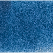
Cerulean Blue - straight from the tube

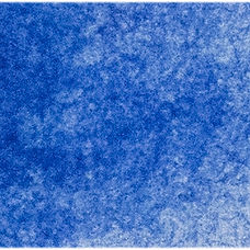
Genuine Lapis Lazuli (Afghan)

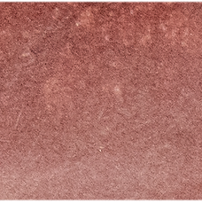
Rose Madder - a classic lake


Sap Green, freshly milled

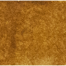
Raw Sienna Light
Cerulean Blue
Made for the artist, by an artist.
Colour Disclaimer: Colours shown on screen or in print may vary from the actual product. For the most accurate representation of colour, texture and finish, we recommend viewing a physical sample or swatch in person before making your final selection.