

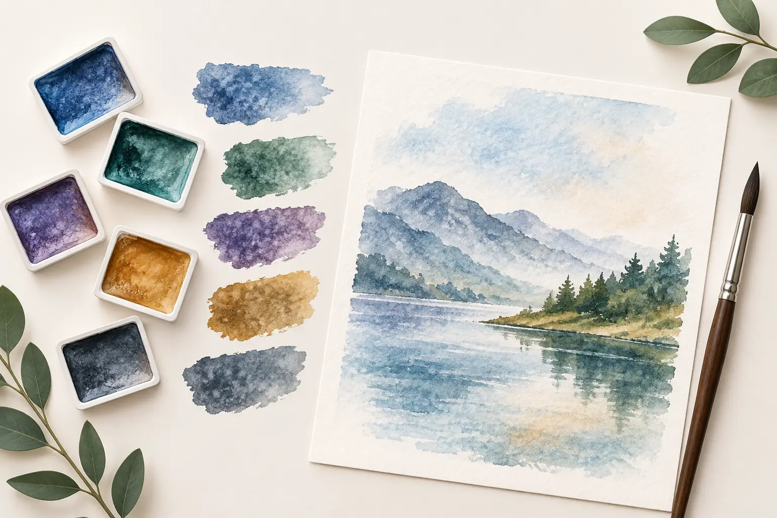
A wash of Ultramarine can settle into the hollows of cold pressed paper while leaving clearer colour on its high points. That movement is not an accident to be corrected: it is the particular value of essential watercolour granulating colours. Used with intention, they introduce structure, atmosphere and a material presence that smooth-staining paints cannot readily imitate.
Granulation is often described as a texture, but it is more useful to think of it as pigment behaviour. Larger or less evenly dispersed pigment particles are carried by the water, then gather as the wash dries. The paper, the amount of water, the angle of the sheet and the colours alongside it all influence the final result. A granulating colour is therefore not a decorative effect added after painting. It is an active part of the painting process.
What makes a watercolour colour granulate?
Granulation begins with the pigment. Mineral and earth pigments commonly have particle characteristics that settle visibly in a wash, while many modern organic pigments tend to stain the paper in a more even film. This is a tendency rather than an absolute rule. Formulation, pigment concentration and the surface being painted all matter, which is why pigment information is more useful than a colour name alone.
On rough or cold pressed paper, pigment has a varied surface on which to collect. The granulation is usually more conspicuous, particularly in broad, generously wet washes. Hot pressed paper offers less tooth, so the same colour may appear quieter and more even. Neither result is inherently better. A botanical painter seeking a clean, controlled passage may choose the smoother surface; a landscape painter may welcome the broken deposits that suggest stone, cloud or weathered walls.
Water also changes the effect. A lean, quickly brushed wash may show little separation. A wetter wash, allowed to settle without repeated brushing, gives pigment time to travel and congregate. This is one reason granulating watercolour rewards a measured approach. Continue working the wash as it dries and the delicate deposits can become muddy or disturbed.
Essential watercolour granulating colours for a working palette
There is no single compulsory set. The most useful selection depends on subject, preferred paper and whether your palette is built for clear mixtures, expressive washes or both. Still, a small group of well-chosen granulators can bring considerable range without making a palette unwieldy.
Ultramarine Blue
Ultramarine Blue, generally PB29, is one of the most valuable starting points. It is a transparent, granulating blue with enough warmth to make convincing skies, distant hills and shadow mixtures. Paired with an earth such as Burnt Sienna, it can yield a wide sequence of neutral greys, from soft lavender to near-black, with visible variation across the wash.
Its warmth is also its limitation. If your work relies on bright, high-chroma turquoise passages or cool spring greens, Ultramarine will not replace a cleaner, cooler blue. It earns its place because it is expressive in dilution, dependable in mixtures and capable of making a modest palette feel less mechanical.
Cobalt Blue
Cobalt Blue, commonly PB28, offers a different kind of blue granulation. It is often cooler and lighter in character than Ultramarine, with an open, airy quality that is especially effective in pale skies and atmospheric distance. Its texture can remain visible even in light washes, where a heavily staining blue may look too uniform.
Cobalt is not usually the most economical choice for dark mixtures, and it has less depth than Ultramarine. Consider it a specialist blue for luminosity and separation rather than a replacement for every blue on the palette.
Cerulean Blue
Cerulean Blue is valued for its opaque to semi-opaque, distinctly granulating character. Depending on the pigment version, it may be based on PB35 or PB36, and those pigment differences are worth checking when comparing colours. It is a natural choice for cool skies, blue-grey distance and broken coastal light.
Because Cerulean can be relatively opaque, it is less suited to every glazing task. Yet that modest opacity can be precisely what makes it useful: it softens mixtures and produces a dry, particulate quality that reads beautifully against the transparency of surrounding washes.
Earth colours
Earth pigments are the quiet foundation of many granulating palettes. Raw Sienna, Burnt Sienna, Raw Umber and Burnt Umber can offer a breadth of natural variation in masonry, bark, sand and skin shadows. Their practical strength lies in how readily they temper more intense colours without making every neutral lifeless.
Burnt Sienna and Ultramarine are rightly familiar partners, but they are not merely a convenient recipe for grey. Alter the balance towards blue for cool architectural shadows; favour the earth for warmer passages; then let the wash settle. The granulation often creates several related notes within one stroke, avoiding the flatness of a premixed neutral.
Viridian and mineral greens
A mineral green such as Viridian, often PG18, can introduce restrained granulation into foliage, water and oxidised surfaces. It has a cooler, more measured character than many bright convenience greens, making it particularly useful when mixed with yellow earths or blue.
For artists who paint landscape regularly, a granulating green can be more valuable than a ready-made leafy green. It encourages mixtures that belong to the light and place in front of you, rather than a single generic notion of vegetation.
Mixing granulators without losing clarity
Two granulating colours in one wash can create striking separation, especially when their particles differ in size, weight or hue. A blue and an earth may settle in visibly different areas, producing a broken neutral with surprising depth. This is particularly effective for rock faces, storm clouds, tree trunks and aged plaster.
The trade-off is control. A mixture that separates beautifully in a large wet sky may be distracting in a small portrait shadow. Start with simple pairings and make wash tests on the paper you actually use. Note the pigment codes, proportions, water level and drying result. A swatch made with a modest brush load will not necessarily predict a broad wash made at full dilution.
Avoid treating every mixture as an invitation to add another colour. Three pigments can be useful, but each additional component makes the result harder to predict and may reduce brilliance. When clarity matters, begin with two single-pigment colours and observe what the water is already doing before adjusting the formula.
Paper and technique: letting the pigment do its work
Choose paper as part of the colour decision. Rough paper exaggerates grain and lends itself to weather, terrain and large expressive passages. Cold pressed paper provides texture with enough control for most subjects. Hot pressed paper is valuable when drawing, fine detail or smooth transitions take priority, though granulating colours can still provide a subtle liveliness there.
Lay a wash decisively, then give it room to settle. Tilt the board only when you want pigment to travel, and use a clean thirsty brush sparingly if lifting is required. Overworking is the usual cause of dullness. Granulation needs time, but it also needs the painter to recognise the point at which further intervention will remove the very quality being sought.
For a more pronounced effect, work wet into wet on textured paper and allow separate colours to meet at the edge rather than fully premixing them on the palette. For a quieter result, use less water, a smoother sheet and a more thoroughly mixed wash. The same pigment can serve both approaches.
Building a palette that remains useful
A granulating palette should not consist only of textured colours. Include at least a few smooth, transparent, staining pigments if you need crisp glazing, saturated accents or sharp-edged detail. The contrast between smooth and granulating passages is often more compelling than a painting in which every area carries the same grain.
A considered starting selection might centre on Ultramarine Blue, an earth such as Burnt Sienna, and either Cobalt or Cerulean Blue. Add a mineral green if landscape is central to your practice. From there, assess what your paintings genuinely require. A colour earns a permanent place not because it is dramatic in a pan, but because its pigment behaviour repeatedly helps you describe light, surface and form.
Keep a small record beside your finished tests. The most revealing notes are often practical: which paper brought out the strongest texture, which mixtures separated too readily, and which wash gave the exact suggestion of rain, stone or distance you were seeking. Granulation becomes far more dependable once it is understood as a collaboration between pigment, water and paper.