

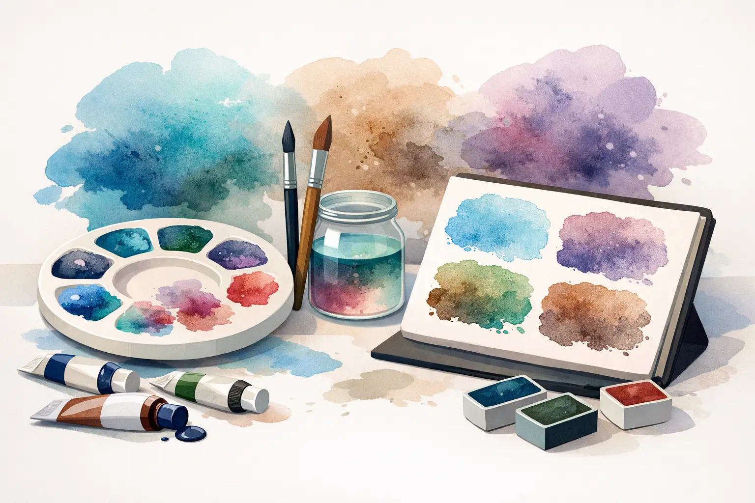
A wash of French Ultramarine settling into the tooth of rough paper can describe a storm cloud more convincingly than a perfectly even blue ever could. The best granulating watercolour paints do not simply add texture: they let pigment, water and paper take an active role in the image. For painters who value material character, that is not an accident to be corrected, but a quality to direct.
Granulation is most apparent in pigments whose particles are relatively coarse, dense or irregular. As a wash dries, those particles gather in hollows in the paper surface, leaving darker deposits beside paler passages. The result can be subtle and atmospheric or boldly mottled, depending on the pigment, the paper, the amount of water and the way the wash is handled.
What makes a watercolour granulate?
Mineral and earth pigments are usually the most rewarding starting point. Ultramarines, cobalts, iron oxides and natural earths often have a visible particulate character that survives grinding and suspension in gum arabic. Many modern organic pigments, by contrast, are finely divided and disperse more evenly. This does not make one category superior to the other. A smooth, staining quinacridone has uses that a granular cobalt cannot replace. The point is to choose according to the effect required.
Paper matters as much as paint. Rough and cold-pressed papers give settling pigment somewhere to collect; hot-pressed paper generally reduces the effect. A generously wet wash encourages movement and separation, while a worked-over, drying passage can turn a promising texture into a hard edge or a dull patch. Granulation is therefore best approached as a collaboration between material and method, rather than a fixed feature of a colour swatch.
12 best granulating watercolour paints
The following colours are particularly useful because they offer distinct handling as well as beautiful surface texture. Pigment codes and formulations can vary between manufacturers, so consult the tube label and colour chart when matching a particular paint to your palette.
French Ultramarine
French Ultramarine, commonly PB29, is one of the essential granulating blues. It separates into a lively, reddish-blue deposit in a broad wash, making it excellent for skies, distant hills, shadows and stone. Its warmth is especially valuable in mixtures: combined with an earth colour, it can produce textured greys that retain more life than a premixed neutral.
Cobalt Blue
Cobalt Blue, usually PB28, granulates with a quieter, more open character than ultramarine. It is often a better choice where a clear, airy blue is needed - spring skies, pale distance, glazed ceramics or cool light. It can be expensive, but its restrained texture and clean mixing behaviour give it a place that stronger blue pigments do not readily fill.
Cerulean Blue
Cerulean Blue is prized for its pale, opaque-leaning washes and soft granulation. Depending on whether it is based on PB35 or PB36, it may lean more blue or greener. It is a natural landscape colour, particularly for hazy skies and coastal light, and makes appealing broken greens with yellow earths. It is not the most forceful mixing blue, but that gentleness is precisely its strength.
Cobalt Turquoise
Cobalt Turquoise offers a cool, mineral blue-green granulation that is difficult to imitate convincingly with smooth modern pigments. It is particularly effective in shallow water, oxidised metal, pale foliage shadows and architectural passages. Use it sparingly in a compact palette, since it has a distinctive personality, but it can transform a wash when its particular light is needed.
Cobalt Green
Cobalt Green has a dry, stony quality that makes it useful beyond obvious botanical subjects. Its subdued, granular green can suggest weathered copper, lichen, distant trees and the cool undertone of neutral mixtures. It is often less intense than artists expect, so regard it as a colour for structure and atmosphere rather than a conventional bright green.
Viridian
Viridian, PG18, is a transparent cool green with a crystalline character in watercolour. Its granulation is not always as pronounced as that of a cobalt, but on textured paper it can produce elegant variation in washes. It is valuable for mixing clear blue-greens and for cooling earth colours without making them look artificially vivid.
Potter's Pink
Potter's Pink, PR233, is a gentle, heavily granulating muted pink. In a full wash it may appear modest, yet it becomes remarkably useful in portraits, masonry, winter skies and floral shadows. Mixed with Ultramarine, it makes nuanced lilacs and violet greys; with an earth yellow, it can suggest the powdery warmth of old plaster. Its low tinting strength rewards a deliberate hand.
Raw Sienna
Raw Sienna, frequently PBr7, is one of the most versatile granular earths. It can read as sunlight, sand, limestone or the first warm layer in a landscape. Its slight settling quality prevents broad washes from becoming bland, while its transparent character makes it a dependable mixing partner for blues and reds.
Burnt Sienna
Burnt Sienna is often chosen for its familiar orange-brown warmth, but its granular potential deserves equal attention. With French Ultramarine it yields an extensive range of textured greys, from cool rain-cloud neutrals to warm stone shadows. Different Burnt Sienna formulations may use different pigments, so painters seeking a particular degree of granulation should compare the pigment declaration rather than relying on the colour name alone.
Raw Umber
Raw Umber brings a cooler, more olive brown to a granulating palette. It is ideal for tree trunks, subdued foliage, old timber and natural shadow. In mixtures it can temper the brilliance of blues and yellows while maintaining a convincingly earthy surface. It is especially effective when allowed to settle undisturbed in the darker parts of a wash.
Burnt Umber
Burnt Umber is deeper and warmer than Raw Umber, with a useful tendency towards soft, broken darks. It is less theatrical than a black and often more adaptable. Pair it with Ultramarine for rich shadow mixtures, or let it dry through a damp landscape wash to establish a sense of soil, bark and weathered material.
Transparent Red Oxide
Transparent Red Oxide, generally PR101, can offer remarkable granulation alongside luminous orange-red transparency. It is a superb pigment for brick, rust, terracotta, autumnal subjects and warm reflected light. In diluted passages it can reveal paper texture beautifully; in stronger applications it retains a mineral weight that gives painted surfaces conviction.
Building a palette around granulation
A useful granulating palette does not need to consist entirely of textured colours. In fact, too many similarly sedimentary pigments can make mixes heavy and reduce the contrast between passages. A practical foundation might include French Ultramarine, Cerulean Blue, Raw Sienna, Transparent Red Oxide and Potter's Pink, balanced by a few smoother colours for clean glazes, sharp accents and controlled colour mixing.
Try mixing one granular pigment with one smoother pigment rather than relying only on ready-made ‘granulating mixes’. A transparent warm yellow with French Ultramarine, for example, can create a green that splits subtly as it dries. A smooth rose added to Cobalt Blue may leave a cool, broken violet. These mixtures are responsive rather than entirely predictable, so make tests on the same paper intended for the finished work.
Michael Harding watercolours are formulated with a strong emphasis on pigment character, which makes pigment-led selection more meaningful than choosing by colour name alone. Single-pigment colours are particularly instructive here: they show clearly whether a texture belongs to the pigment itself or results from a blend.
How to make granulation visible
Begin with a well-wetted area on cold-pressed or rough paper, then charge in a fluid mixture with enough pigment to leave a visible deposit. Tilt the sheet only when there is a reason to move the wash. Excessive brushing keeps particles in suspension and can flatten the effect; repeatedly correcting a drying area is more likely to create blooms than attractive granulation.
For a controlled result, reserve granulation for selected passages - a cloud base, a cliff face, a distant hedge or the shadow side of a building. Against smoother surrounding washes, the texture reads with greater intention. Salt, granulating medium and other interventions can intensify surface effects, but they should be tested carefully: they alter not only appearance but also the handling of the wash.
The most satisfying granular colours are the ones that serve your subject as well as your eye. Keep a small record of washes, mixtures and papers in the studio. Over time, those tests become a more reliable guide than any claim that one paint is universally the best.