
Made by an artist,
for artists.
What began in one painter’s frustration with thin, lifeless colour has become one of the most respected names in professional artist materials - still mixed by hand, still without compromise.
Michael Harding is world-renowned for artist materials of uncompromising quality - grounded in the techniques of the Old Masters, made with ethically sourced ingredients, and formulated for the demands of today’s serious painters.
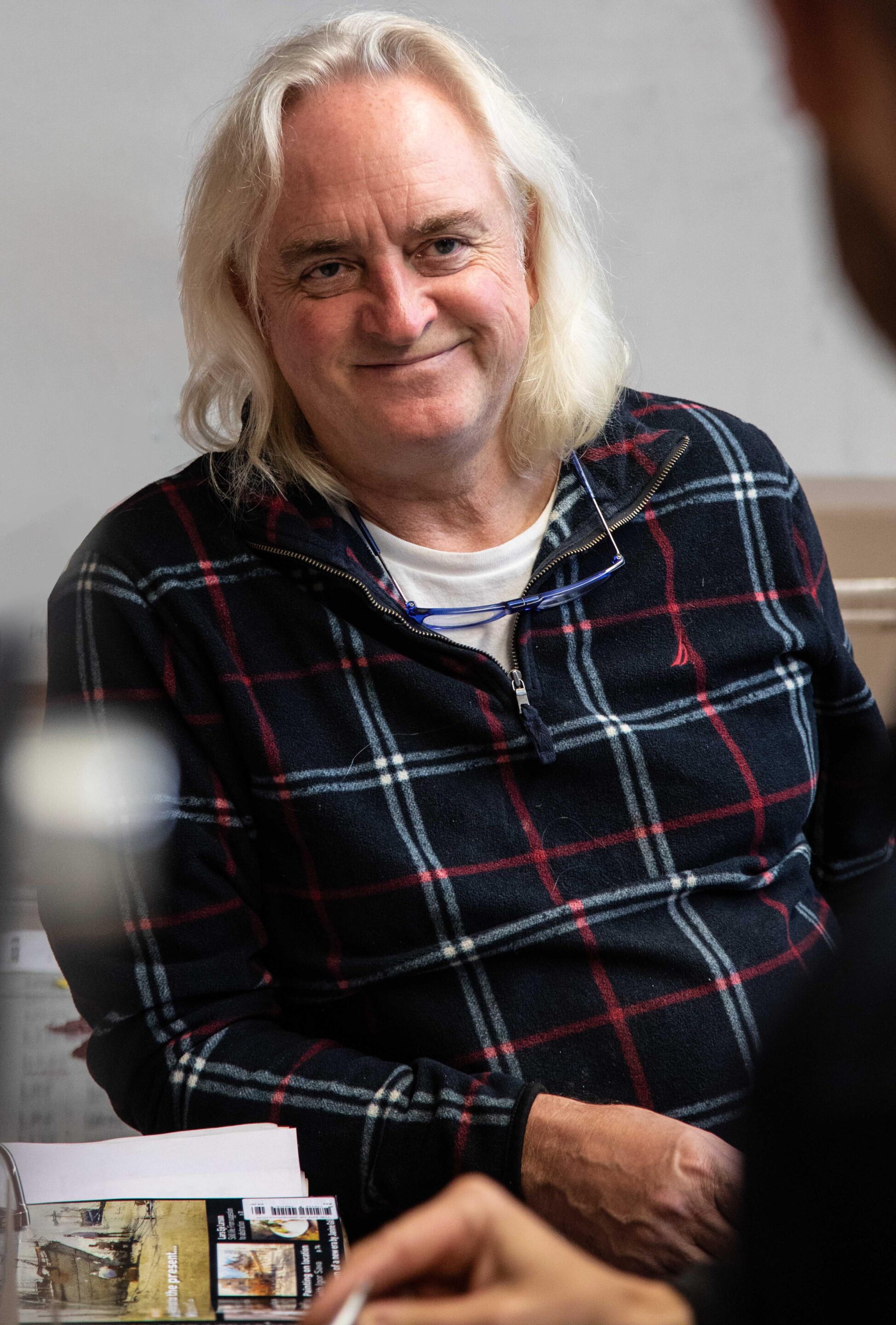
Founder and artist Michael Harding
An artist who simply could not accept second best.
Michael Harding is first and foremost an artist. As a student, he found that modern paints lacked the depth, strength, and luminosity of those used by the great painters of the past.
“So I began making my own - using traditional methods, the finest pigments, and no fillers, extenders, or artificial dryers.”
That same commitment guides everything we do today. Each colour is developed for its own character - some lean and transparent, some dense and luscious - and every tube is judged by how it feels under the brush, not how cheaply it can be made.
Uncover the inspiring journey of Michael Harding.
Renowned for premium artist materials. Explore the story behind the brand, the dedication to quality, and the passion for creating the finest oil paints that have captivated artists worldwide. Learn more about Michael Harding’s commitment to excellence and the artisanal craftsmanship that sets his products apart.
A chapter-by-chapter timeline of quality, craftsmanship and vibrant colour.
From Inspiration To Creation: The beginning of Michael Harding Oil Paints.
At the heart of this story lies a pivotal moment of youthful discovery, when a single painting ignited a flame that would burn bright throughout my artistic journey. It was a moment that forever altered the trajectory of my life, a love affair with the world of art that would shape my path.
When I was ten, I had the opportunity to visit an exhibition in London that showcased student art. Among the impressive works on display, one painting in particular caught my attention — a captivating portrayal of a witch. It was my first encounter with a freshly painted artwork using oil as the medium. The scent of the oil permeated the air, drawing me in as strongly as the figure on the canvas. Even now, I can vividly recall the vibrant red hues and their delightful, earthy fragrance. It was akin to stepping into a bakery and being enveloped by the inviting aroma of freshly baked bread.

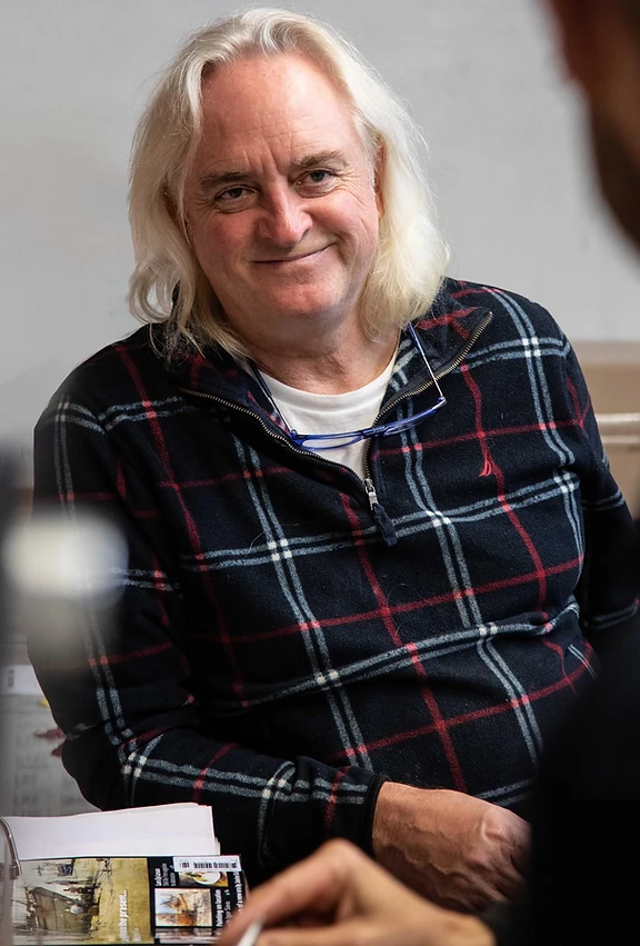

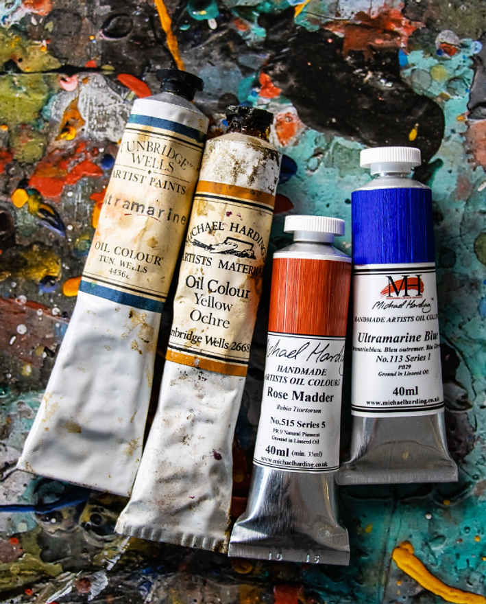
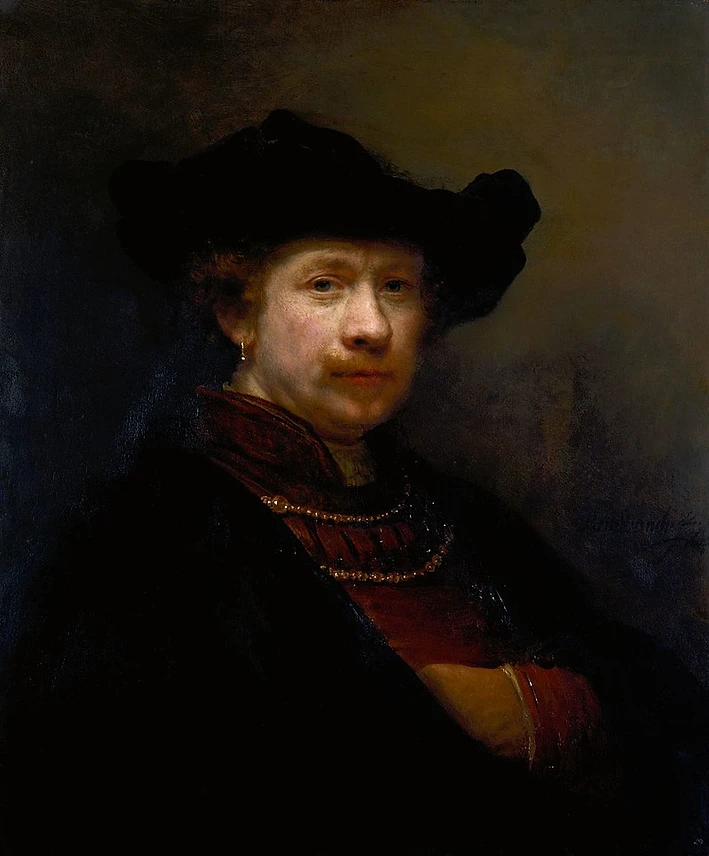
That experience, four decades ago, profoundly influenced my artistic journey. Spending countless hours in the National Gallery, surrounded by Rembrandt’s masterpieces, I became determined to paint like him. But I faced a challenge — finding high-quality oil paints that would do justice to the great Masters. This led me to embark on a quest to create my own paints, ones that would live up to my aspirations. Each colour in my range became a symbol of my quest, evoking memories of those formative early days.
Approaching the development and production of paints, I adopt the mindset of an artist rather than a scientist. We strive to capture the essence of colour, texture, and durability, ensuring that our paints not only meet high technical standards but also ignite the imagination and creativity of fellow artists.
Brushstrokes of Legacy: A Vibrant Tale Inspired by a Witch’s Image.
After seeing the image of the witch, I was captivated by vibrant colours, particularly the mesmerising shades of clarity red. It reminded me of my grandmother’s collection of oil paints, which dated back to around 1911, when she herself was a student.
In those days my grandmother was known as a “blue stocking,” a term used to describe young women who were dedicated to pursuing a career. She attended Goldsmith’s College of Art in London and graduated in 1911 as an art teacher, a profession that resonates deeply with me.
Among the paints in her collection, most of which were still usable, there was a precious tube of genuine rose madder, a beautiful, ruby-red pigment. This colour inspired me to envision a Victorian lady, elegantly adorned in a dress of similar clarity and hue.
I often found the solitude I craved in a nearby field, away from the house. Accompanying me was the box of paints and a small canvas board. I immersed myself in painting, undisturbed. But as time passed and my artistic vision failed to materialise, frustration ensued. Eventually, overwhelmed by disappointment, I tore the painting to shreds and cast it into the river that flowed nearby.

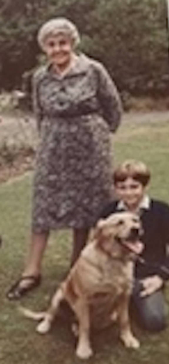

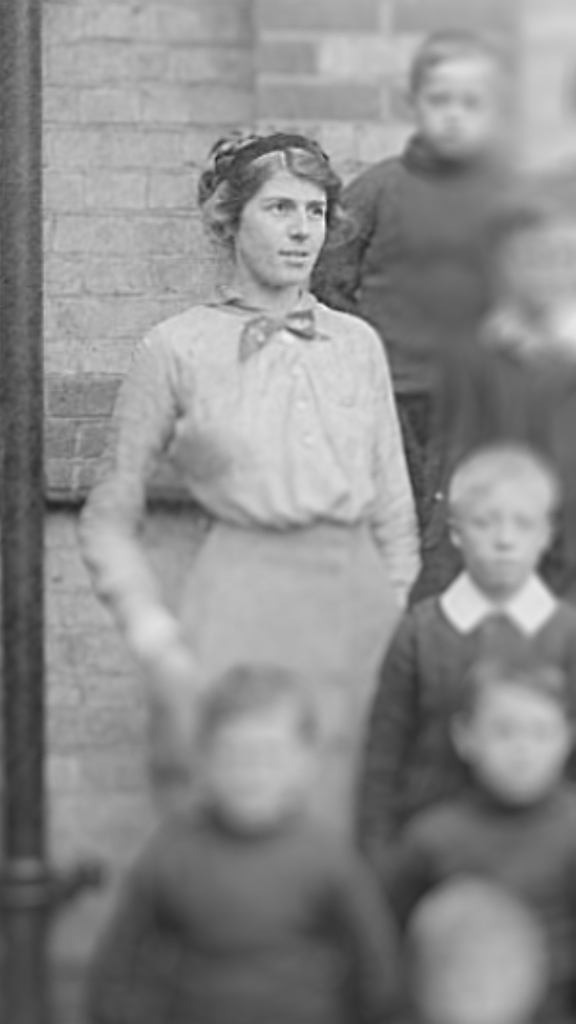
Even now I can vividly recall the image of those torn pieces drifting away. It was a moment of childish exasperation, a glimpse into the complex emotions that arise in the act of creation. Many times since then, I have experienced that same sense of frustration with various paintings.
Fortunately, my grandmother was a pillar of unwavering support. Growing up in the cosey confines of an Edwardian country house, amidst warm summer days, I was truly fortunate. Born in 1891, my grandmother herself embodied the essence of an Edwardian lady. Her home was idyllic, and her presence in it added timeless elegance to the scene. She was wonderfully eccentric, dressing like the actress Margaret Rutherford, wearing long capes and entering into long conversations with our golden retriever as if he were human!
Among my fondest memories of my grandmother are her occasional demonstrations of her painting techniques. Turquoise was a colour she particularly adored. She skilfully incorporated this vibrant hue into her artwork, used it to paint bits of furniture, and even integrated it into her clothing. She had a deep appreciation for the way turquoise captured the hazy blue shades of a scorching summer day beneath the sheltering canopy of trees.

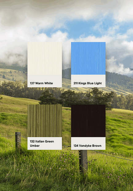
Paint what you see; not what you think is there.
A lesson from Michael's grandmother
Embracing the Artistic Path: Navigating a Journey of Passion and Acceptance.
In the corridors of academia, I learned that the conventional path was not for me. I’d discovered the beacon of joy that illuminated my soul whenever I immersed myself in artistic endeavours. Brushstrokes, pencil strokes, the interplay of colours, and the creation of visual narratives gave me immeasurable delight, and these seeds took root. Art became my passion, my sanctuary, my talent. I found myself defying the constraints of the school system, surreptitiously carving out moments to paint and draw.
My artistic journey was more than self-expression. Nature played an integral role in shaping the course of my exploration. The countryside, with its ever-changing palette, captured my imagination and fuelled my curiosity. The landscape’s seasonal metamorphosis, with its vibrant hues and subtle nuances, mesmerised me. It was during these encounters with nature that the desire to create camouflage-inspired artworks took hold, blending the beauty of the natural world with my artistic vision.

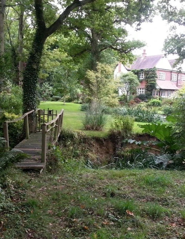
My fascination with greens in the landscape stemmed from a deep curiosity about the interplay between colours and their significance. I became intimately connected with the evolving rural landscape of Kent, immersing myself in its beauty and nuances. This connection persisted until the summer of 1976, when I bid farewell to my school years. My idyllic experience living in the English countryside with my grandmother came to an end when both my grandmother and father passed away.

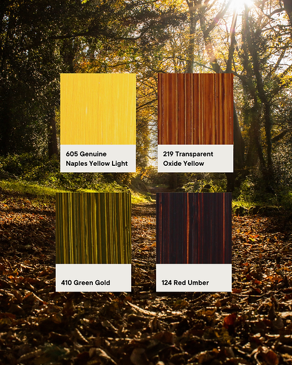
Offered a place at the esteemed Rochester Medway School of Art and Design, I embarked on the next chapter in my artistic journey. Attending art college served as a profound wake-up call, and I transformed from a relatively prominent figure in a small community to a minuscule presence in a sea of artistic talent. I grappled with this sudden sense of insignificance. I was one of a bustling crowd of 108 students, each of us carrying his or her own aspirations and disappointments. The experience was humbling.
Emerging From Constraints: A Journey of Artistic Hope and Rebel Spirit.
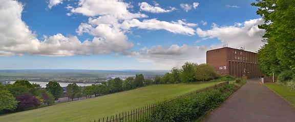
In 1976, after a challenging phase in my life, I found hope for an artistic career when I was accepted into the Medway School of Art and Design, located near the banks of the River Medway, which meanders its way into the North Sea and the Thames estuary. At seventeen, I shed parental constraints and ventured into the world of art. Fort Pitt, in the scenic town of Rochester, Kent, became my haven for creative exploration.
In my foundation course at Medway, I experimented with various artistic forms, from the intricacies of printmaking to the depths of 3D model making. It was in those first months that I discovered my heart was only truly captured by the allures of pencil and paint.
I had a rebellious streak and often clashed with authority, but one tutor, Pete Smith, saw something in me. Pete took the time to understand who I was as a young artist and provided me with assignments that pushed the boundaries of the regular curriculum. Pete was a good man, and his encouragement became an anchor during my time at Medway. But new challenges awaited as I neared the end of my foundation course. My lack of academic qualifications put me at a disadvantage in pursuing a fine art degree. The requirements demanded five O levels (now known as GCSEs), of which I had none but art. It seemed my dreams would slip away.
But I was determined not to let circumstances stop me, so I embarked on a search for colleges that prioritised passion and talent over rigid academic prerequisites. That’s when I discovered the Epsom School of Art and Design.

Epsom offered a diploma program that didn’t rely on O levels. Filled with excitement and a burning desire to prove myself, I sent my application. But the response I received was disheartening; without seeing my work, the school had rejected me. Stalwart, I took matters in hand and visited Epsom without invitation. I was granted a meeting with the head of the department, Lesley Worth. I presented him with my portfolio, recounted my artistic journey, and described my vision for the future.
Mr. Worth told me that prior to receipt of my application, someone he believed to be a Medway department head had sent a letter warning Epsom I was a difficult student. It became apparent the letter had been written by a junior staff member, who had signed as head of department in an attempt to sabotage me. That correction and my tenacity convinced Mr. Worth to reconsider my application and offer me a chance to prove myself in an interview. The day of the interview was both nerve-wracking and exhilarating. I spoke passionately about my art and its transformative power, showcasing my growth and determination. I successfully conveyed my potential and the spark of creativity that burned within me, ultimately securing my acceptance into Epsom. I remember the moment as a validation of and a testament to my resilience and unwavering belief in my artistic journey.



From Medway to Epsom: A Journey of Artistic Discovery and The Enduring Significance of Drawing.
And so, I bid farewell to Medway and embarked on a new chapter in my life at Epsom in 1977. It was an exciting time to be immersed in the art world. Various movements and debates ignited passionate discussions about the definition and boundaries of art. Yet, my goal was clear — to find my unique artistic voice amidst the noise and resist the temptation to conform to existing styles.
During my time at Epsom, I received intensive traditional life drawing training for three months. The Royal Academy also emphasises disciplined drawing exercises with a back-to-basics approach. I must admit, while it could be quite challenging, I believe drawing is the most valuable discipline an artist can undertake.
I often encounter artists asking for advice on how to progress in their careers, and my response is consistent regardless of their level: drawing is the foundation. I firmly believe, based on credible sources, that drawing is one of the highest achievements of the human mind. The genius of Leonardo’s drawings serves as compelling evidence of this notion.
Psychologically, it may be one of the greatest challenges an individual can face. Being a skilled draftsman is undoubtedly a significant asset to any artist. So, I found myself immersed in the life of a student once more, though it wasn’t always a blissful experience. There were trends toward styles like Impressionism and the works of artists like Villard, whom I admired but didn’t wish to emulate. For me, the essence of art lies in discovering one’s unique painting style, not in trying to replicate a style that has come before. While some may argue that figurative work emulates something external, I believe it’s an internal exploration, not an external imitation.


Challenges and distractions awaited me at Epsom, as they often do in the journey of self-discovery. College politics were distracting, and I managed to get myself elected on to the board of governors of the college while also being a student, but presenting an opportunity to test my principles and values.

Eccentric Encounters & Artistic Ventures: Unveiling The Boundless World of Creativity and Business.
While at Epsom, I had the pleasure of meeting Graham Beeching, an extraordinary man and true intellectual. He possessed an eccentric personality and made a captivating friend. His mind was a treasure trove, making every conversation with him utterly fascinating.
His knowledge ignited a spark within me. Amongst Graham’s many abilities was that he understood many artists’ recipes and knew how to make them. His specialty was creating acrylic emulsions for the animation industry, and he supplied paints that brought the world of animated characters to life. My collaboration with him introduced me to a world beyond the conventional boundaries of art. We worked together tirelessly, supplying products to renowned clients such as Pink Floyd for The Wall and engaging in projects like the Busby adverts for British Telecom commercials and the Disney film Watership Down, for which we supplied paint for the animated scenes.
The experience of working with Graham and witnessing his success was eye-opening for me. It showed me that art wasn’t just about creating artwork; it could also be a foundation for a thriving business. It was Graham who started a pivotal conversation with me. I had visited the National Gallery and admired Rembrandt’s paintings, only to return to college with a burning question: Why did Rembrandt’s paint look so different?
Graham explained that in the past artists had to create their own materials because there were no shops or factories producing art supplies for them. They would acquire the raw materials and blend them themselves. That conversation, as I often share with others, planted the seed of curiosity in me. Graham pointed me in the direction of essential resources, such as Ralph Mayer’s ‘The Artist’s Handbook’, which details how to grind your own oil colours. This marked a pivotal moment, and I began to explore the possibility of manufacturing my own art materials. My education fuelled my ambition, and I decided to take a leap of faith.
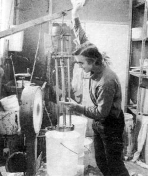
After college, I moved to Tunbridge Wells with a determination to carve my own path in the art world. Armed with my passion for creating unique artwork and a deep appreciation for the intricacies of paint-making, I transformed my humble bedroom into a small-scale paint-making atelier. Researching and experimenting, I delved into the arcane world of paint formulation and began producing my own oil paints. In the early days, it was a challenging yet exhilarating endeavour. I faced setbacks, made countless batches of paint that didn’t meet my expectations, and spent long hours adjusting and perfecting the recipe. But with each failure came a valuable lesson, helping me refine my craft and deepen my understanding of paint materials. Slowly but steadily, I began to produce high-quality oil paints that aligned with my artistic vision.
Throughout my journey, I never forgot the profound impact that Graham had on my artistic growth. His expertise, guidance, and willingness to share his knowledge were invaluable. I’m profoundly grateful for Graham’s contributions and influence to my early career.
The Journey from Epsom to Tunbridge Wells: Perseverance, Challenges, and Paint-Making Dreams.
After leaving art school in Epsom, I stared into a daunting abyss, uncertain where to channel my creative energy or how to kickstart my paint making venture.
Amidst this uncertainty, my oldest friend Steve was setting up a new home in the picturesque town of Tunbridge Wells, where we’d attended school together. Sensing opportunity, I spent a few days with him, and it soon became clear that his place offered the perfect space for both living and tending my burgeoning ambition. Steve let me a room, and I accepted, envisioning a space for my art and paint making endeavours, not to mention a place to sleep. I transformed the room, measuring sixteen by seventeen, into a vibrant atelier. An old-fashioned brass bed, a Victorian carpet, various antiques, and my cherished paintings filled the space. I repurposed a wardrobe Steve had given me, tipping it onto its side to serve as a makeshift table for my paint making apparatus and jars of pigment.
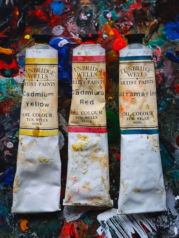
In this modest yet inspiring environment, I began producing small batches of paint, crafting six to eight tubes of each colour. I gradually expanded my palette, creating a dozen different hues. My first patrons were artist friends, including the esteemed portrait painter Derek Chittock. Derek, a fatherly figure and stalwart supporter, not only used my paints but also introduced me to a wider artistic circle. His mentions of my work in minor art magazines helped spread the word about my authentic, handmade paints.


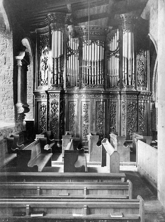
A pivotal moment came with an unexpected call from the Victoria and Albert Museum. They were restoring an 18th-century organ from Fonthill Abbey and urgently needed lead white paint. Tim Miller and Ennio Carnetta, the restoration experts, had spent three years removing scorched paint and now required a fresh supply of lead to complete their project.
Buoyed by these successes, I moved into a light industrial unit in Southborough, Kent, aiming to scale up my operations. However, overextending myself and mismanaging cash flow soon led to financial strain. On October 15, 1987, the day of the great hurricane, I found myself in court over advertising debts. The hurricane’s aftermath mirrored the upheaval in my life, and I spent the next four years contemplating my next move, disillusioned with the idea of returning to paint making.
Fortune smiled again through my friend Neil Farquharson, who introduced me to a mural project at the Pantiles in Tunbridge Wells. Excited by the prospect, I threw myself into creating large murals, only to run out of paint midway. Desperate, I visited a shop that once sold my paint, but they had none left. Forced to use an inferior brand, I quickly realised the unique quality of my own creations. Thus I returned to making paint, initially for the mural project, and soon, by popular demand, for my artist friends as well. This resurgence marked a new chapter in my journey, blending my artistic passions with the meticulous craft of paint making, and reaffirming my place in the vibrant tapestry of Tunbridge Wells’ art scene.

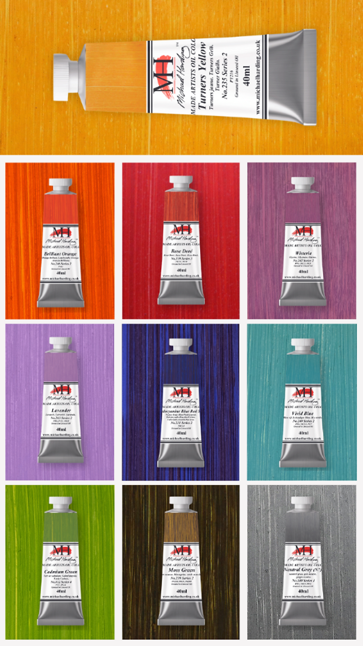
The Tunbridge Wells Selection
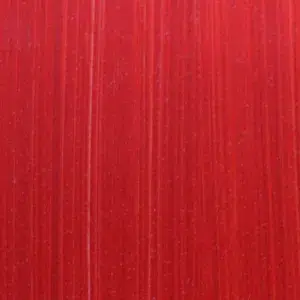
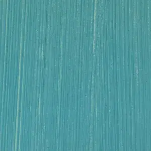
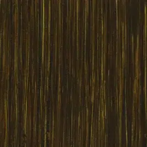
As I reflect on my journey from the humble beginnings in Tunbridge Wells to today, marking the significant milestone of forty years of Michael Harding Paints, I am filled with a sense of pride. To celebrate this occasion, I'm delighted to introduce the first ten of forty new colours. This initial release, the Tunbridge Wells Selection, is a heartfelt tribute to those early, formative days, capturing the essence and romance of our humble origins.







A Canvas of Memories: The Path From Tunbridge Wells to Brick Lane.
After a few weeks reviving my paint making craft, I decided to adopt a more modest, almost private approach to the business.
Having stored my equipment and materials in a rustic barn in Paddock Wood, I gradually ramped up production. In a moment of serendipity, I bumped into Paul Harris, an advertising acquaintance. Upon hearing about my renewed venture, Paul suggested I introduce myself to Mark and Ginny Winthrop, the proprietors of Atlantis, a renowned art store in Brick Lane.
Our meeting was sterling, and camaraderie blossomed. Mark and Ginny, seasoned entrepreneurs, proposed a collaboration: they would provide space for my paint production and a steady clientele of artists. It was a brilliant synergy, and in November 1994, after the birth of my daughter Joelle, I began selling my paints exclusively through Atlantis. For the first time in my life, I enjoyed a steady, reliable income. A vibrant hub akin to Carnaby Street but for East End artists, Brick Lane buzzed with energy. The store attracted a plethora of renowned figures, including Gilbert and George, Terence O’Donovan, David Bailey, and Chris Ofili. The atmosphere was electric, a true melting pot of creativity and inspiration.
One Sunday, while perusing the Sunday Times, I saw Howard Hodgkin was showcasing his work at the Hayward Gallery. His paintings seemed a perfect match for my paints. Through a connection at a Cork Street Gallery, I obtained Howard’s contact number, sent him samples, and waited. To my delight, he loved the paints, placed a substantial order, and provided a glowing letter of endorsement. This pivotal moment opened doors, leading to connections with other art luminaries like David Hockney and significantly bolstering my reputation.

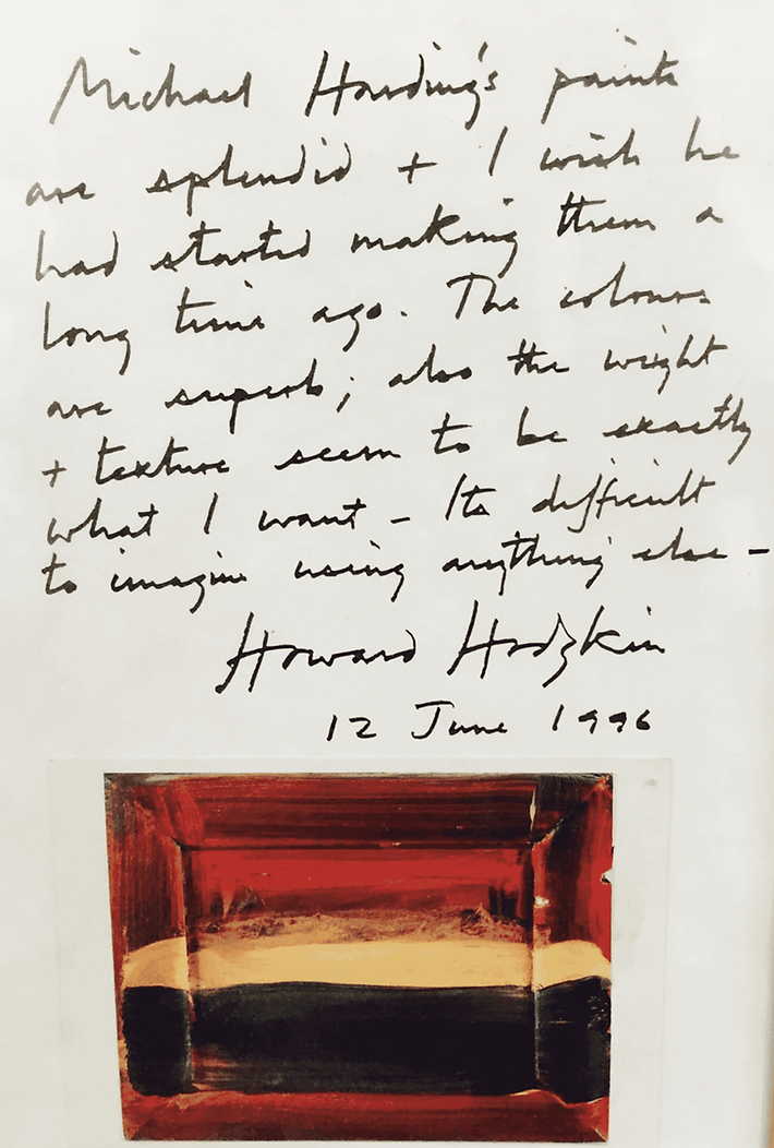
Michael Harding’s paints are splendid, and I wish he had started making them a long time ago. The colours are superb. Also the weight and texture seem to be exactly what I want. It’s difficult to imagine anything else.
Howard Hodgkin, 12 June 1996
Business flourished until 1999, when disaster struck. A fire, ignited by the spontaneous combustion of linseed oil-soaked rags, ravaged my workspace. This peril, inherent to oil paint production, occurred on April 27, the day of the London Marathon. The fire underscored the fact that my burgeoning business had outgrown the space at Atlantis. The Winthrops, understandably, requested I vacate. Though this setback was daunting, it marked yet another turning point in my journey. It was a reminder of the unpredictable nature of life and business, urging me to adapt, persevere, and continue my quest to bring vibrant, high-quality paints to the world. The resilience and passion that carried me from the humble beginnings in Tunbridge Wells would once again guide me through this new chapter.
The Brick Lane Selection
As I share this chapter of my journey, I am thrilled to announce the release of ten new oil colours. These colours debut in celebration of my four decades of dedication to the craft of paint making. This vibrant new collection, aptly named 'The Brick Lane Selection,' pays homage to the dynamic and transformative period I spent at that iconic location. The Brick Lane Selection is not just a tribute to a place but a celebration of my artistic journey and the endless possibilities that colour brings to life.








Beyond Brick Lane: The Making of the Whitechapel Selection.
Some of you may remember the last chapter I shared — the story of how, after reviving my paint-making craft, I found myself in the heart of East London. Thanks to a chance meeting with Paul Harris, then the advertising editor of Artists and Illustrators Magazine, I was introduced to Mark and Genie Winthrop of Atlantis in Brick Lane — a fortuitous connection that would shape the next chapter of my life.
Brick Lane in the 1990s was electric. The Old Truman Brewery bustled with artists, and Atlantis was its creative core — a kind of Carnaby Street for the East End art scene. I worked there among hundreds of fascinating artists who passed through each day. Notable visitors included renowned photographers David Bailey and Terence Donovan; Gilbert & George, the well-known Turner Prize–winning duo; and Turner Prize winner Chris Ofili. Damien Hirst also came through the doors, and I even received a glowing handwritten endorsement from Howard Hodgkin. It was Hodgkin who introduced me to David Hockney, who soon began using my colours as well.
For the first time in my life, I not only had a steady income but also a genuine community built around my paints. But by 1999, just as the business was finding its rhythm, disaster struck. On April 27th — the day of the London Marathon — a fire broke out in my workspace. It was caused by the spontaneous combustion of oil-soaked rags, a well-known hazard in our trade. I had known the risk; I simply hadn’t taken it seriously enough. Though the fire wasn’t large, it forced us to reconsider my continued residence at Atlantis, and the decision was made for me to relocate.
Later that year, I moved east to Whitechapel, to a small space behind 88 Mile End Road — the former residence of Captain Cook and his family. The old gin distillery, which still stands today, became my new workshop. Where Brick Lane had been lively and communal, Whitechapel offered something else entirely. From there, I began supplying numerous art stores, and Michael Harding paints became available worldwide. Whitechapel isn’t known for its spotless history — it’s gritty, but full of vibrant culture and personality.

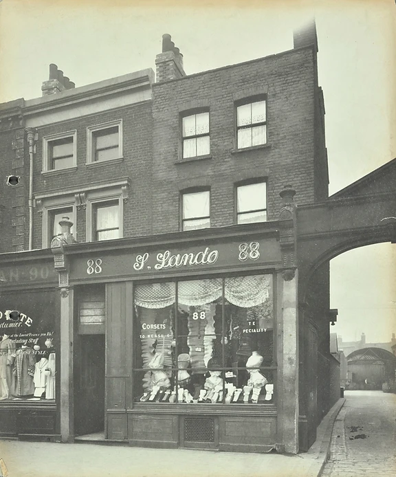
I spent over a decade there, from 1999 to 2009, refining my methods, experimenting with new materials, developing my product range, and expanding my audience. I began exporting to several countries, including the United States and Australia. Eventually, the tides of change came again. My landlord, ever polite, informed me that the rent — then £3 per square foot — was about to increase fivefold. I thanked him, handed in my notice, and began looking further afield. That search led me to South Wales, where we’re based to this day. Still, Whitechapel has stayed with me — its quiet influence woven into my work. The buildings, the light, the worn materials — all left their mark.


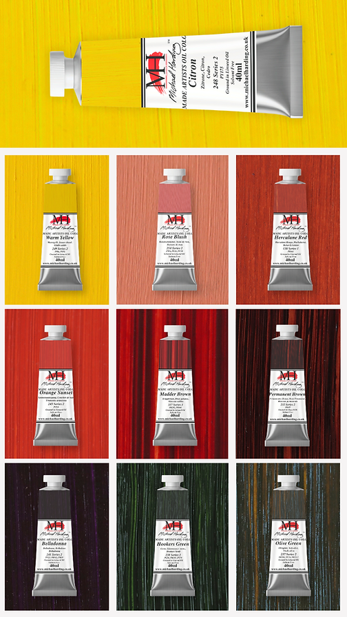
The Whitechapel Selection
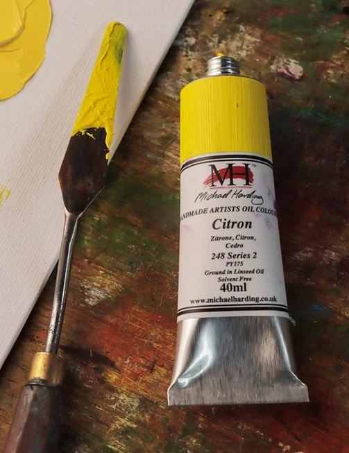
To honour that chapter, I've created the Whitechapel Set - ten colours that reflect the tone and texture of that place and time. It joins Tunbridge Wells and Brick Lane in the growing series, with Brecon Beacons to follow. Each set is available individually or as a collection, crafted with the same care and character that defined those formative years.







The Brecon Beacons Selection: A Celebration of Colour.

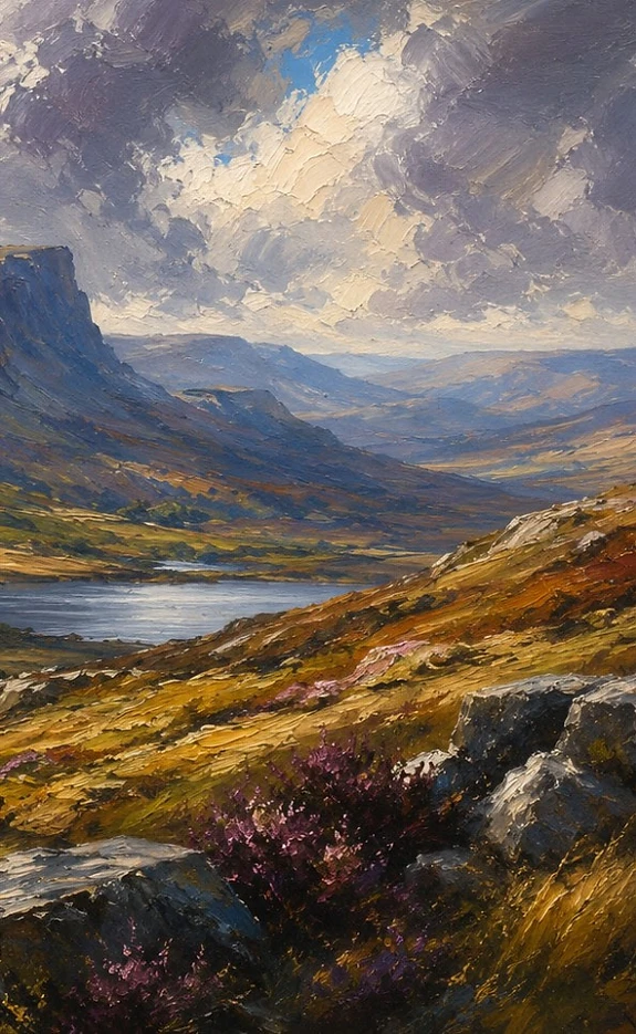
Around 2009, after many years in Whitechapel, East London, I made the decision to relocate to the Brecon Beacons in South Wales.
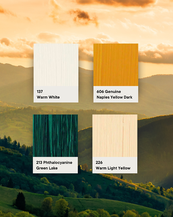
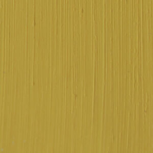
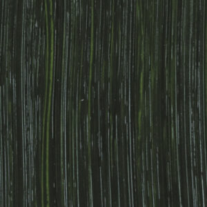
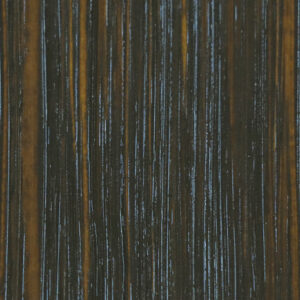
I was immediately drawn to the landscape and atmosphere of Wales. Vast skies, shifting weather, deep valleys, and sudden moments of light all created an extraordinary sense of mood and colour that gradually found its way into this final set. The Brecon Beacons Selection is the fourth and final release celebrating 40 years of Michael Harding Oil Paints. I have loved working with, and experimenting with, each of the new colours in this collection.
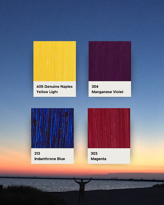
In this particular set, the ones I find myself most drawn to are Amber, Hansa Yellow Medium, Cobalt Blue Deep, and Corinthian Purple. Amber glows with warmth and depth, sitting somewhere between deep orange and burnt gold. Hansa Yellow Medium brings brightness and energy to the palette, while Cobalt Blue Deep carries an immense sense of atmosphere, distance, and shifting weather.

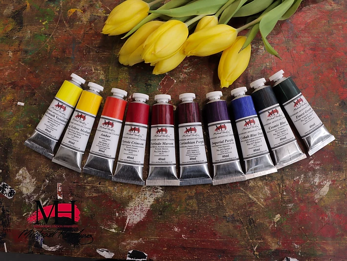

Then there is Corinthian Purple, a colour that immediately sparks ideas of nocturnes, shadows, and evening light. What has always fascinated me most about colour is the way it interacts. Yellow beside purple creates an extraordinary energy. Amber against deep blues suddenly radiates warmth and light. That excitement matters. A painting should invite the eye to travel through unexpected harmonies and moments of discovery.
When colours surprise us, they bring life to a painting, and perhaps that sense of discovery is one of the true joys of being an artist. The Brecon Beacons Selection celebrates exactly that: atmosphere, emotion, and the enduring joy of colour itself.
Discover the Brecon Beacons Selection, the final set in the 40 Colours celebration marking 40 years of Michael Harding Oil Paints.
Four principles, mixed into everything we make.
No Fillers, No Shortcuts
Traditional milling with the finest pigments and no extenders, artificial dryers, or compromise - just pure colour and exceptional load.
Old-Master Foundations
Formulated from the techniques and materials of the great painters of the past, rebuilt for the demands of today’s studio.
Ethically Sourced
Ingredients traced to responsible sources, with a vegan-friendly and non-toxic range for modern, safer practice.
Handmade in the UK
Every tube is made in our Cwmbran workshop - small batches, watched over by people who care about the craft.
Time-honoured materials, alongside modern non-toxic alternatives.
Michael Harding continues to produce time-honoured materials such as artist-grade turpentine, oils, and varnishes - essential tools for painters working in traditional methods.
Alongside these, the non-toxic range offers a modern alternative for those seeking safer options without compromising on quality - ideal for studios, schools, and shared spaces.


@mhpaints
Swatches, paint-outs and studio moments - live from our Instagram. Follow along and tag your own work.

We’re excited to launch our first Rising Artists Workshop Scholarship with @andriikateryniuk.

The Brecon Beacon Beauties: New in the range and available now.

Oh we do love to see your MH materials in the studio! Almost as much as we love to see your beautiful work!

The beauty of 🌌 COSMIC BLUE | No. 252

🌌 COSMIC BLUE | No. 252

Gorgeous, gorgeous swatches by @michellewoodersonart of the new Michael Harding Brecon Beacons Selection, available from today.

#breconbeaconsselection #mhoilpaints in the studio with @issmueller - Available to order now!

New colours deserve a closer look. 🎨

One of the new MH colours available today: Imperial Purple (No. 253)

“Amber glows with warmth and depth, sitting somewhere between deep orange and burnt gold” - Michael Harding

NEW MH OIL COLOURS: Our ambassador Angelina bringing the Brecon Beacons Selection to life. 🎨

Exploring some of the beautiful Granulation colours in my range — #michaelhardingwatercolours — filmed in the MH studio.
Each colour a symbol of the quest.