

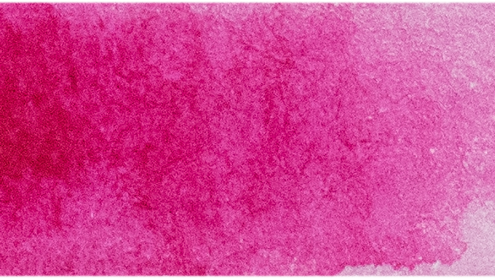
A professional watercolour palette does not need to be huge. The most accomplished painters often work from fewer than a dozen colours - but they are the right dozen, chosen so that every mix is clean, predictable and right for the subject. This is a method for building that palette.
Start with warm and cool primaries
The foundation is a warm and a cool of each primary - six colours that let you mix almost anything cleanly. For example: a warm yellow (New Gamboge PY150) and a cool yellow (a lemon); a warm red (a scarlet) and a cool red (Quinacridone Rose PV19); a warm blue (Ultramarine PB29) and a cool blue (Phthalo PB15 or Cerulean PB35). With these six you can reach the full hue circle without muddying.
Add granulating earths
A couple of granulating earths add texture, warmth and the muted neutrals no primary mix can produce. Burnt Sienna (PBr7) and a raw umber or raw sienna cover most landscape and figure needs and granulate beautifully on rough paper.
A staining or opaque accent
Add one or two colours for specific effects: a staining pigment (Viridian PG18, or a Phthalo) for vivid, permanent underpainting; an opaque (a cadmium, or a white) for lifting crisp highlights or foreground body.
Palettes by subject
- Botanical - transparent, non-granulating single pigments: Quinacridone Rose, New Gamboge, Phthalo Blue.
- Landscape & skies - granulating blues and earths: Ultramarine, Cerulean, Burnt Sienna, Viridian.
- Urban & nocturne - staining darks and neutrals: Indanthrone Blue, a violet, a neutral tint.
Where to begin
You do not have to choose alone - the curated watercolour sets assemble working palettes by subject and artist, and the Palette Architect walks you through choosing a palette step by step. Read our Best Watercolours guide for named pigments, then browse the full watercolour range.