















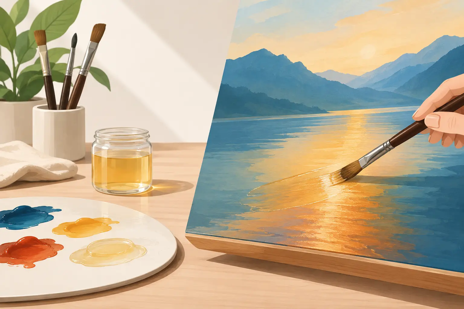
Glazing is where an oil painting can begin to hold light in a different way. If you are learning how to glaze oils, think less of applying a coloured varnish and more of placing a controlled, transparent film over a fully established layer. The light travels through that film, reflects from the paint beneath and returns altered by the pigment suspended above it. Done well, a glaze can deepen a shadow, enrich a passage of colour or bring distant forms into atmospheric relation without obscuring the drawing and modelling already present.
What an oil glaze actually does
A glaze is a thin layer of transparent or semi-transparent oil colour, usually modified with a small amount of medium so that it flows evenly and can be spread thinly. It is applied over paint that is properly dry. Unlike an opaque repaint, a glaze does not primarily cover. Its purpose is to alter the appearance of the layer beneath through optical mixing.
This distinction matters. A transparent blue over a pale yellow passage may create a greenish effect, but it will not behave like a mixed green on the palette. The result depends on the hue, value, opacity and surface texture of the underlying paint, as well as the thickness of the glaze itself. A glaze over a warm, light ground can appear quite different from the same colour over a cool grey underpainting.
Glazing is especially useful when a painting has sound structure but needs greater depth or colour unity. It is not a remedy for uncertain drawing, muddy mixtures or an unresolved tonal design. Establish those decisions first. The glaze should refine the painting, not carry the burden of constructing it.
Choose pigments for glazing oils with care
Transparency is the central pigment characteristic for glazing. Many traditional transparent colours are valued precisely because they retain clarity in a thin film: quinacridone colours, phthalo colours, transparent oxides, Indian Yellow, certain lakes and some earth pigments. Yet pigment names alone do not guarantee identical behaviour. The concentration, particle size and formulation of a colour affect both its tinting strength and its apparent transparency.
Read the colour information rather than assuming that every deep-looking paint will glaze well. A single-pigment transparent colour gives a more predictable result than a complex mixture, particularly when you are trying to adjust a passage with precision. Cadmium colours and many titanium white mixtures are generally too opaque for conventional glazing, although they can be used very sparingly for veiling or scumbling effects.
Value is as important as hue. A glaze with a dark transparent pigment can rapidly lower the value of a passage, even when applied thinly. This is useful in shadows, but it can close them too quickly. Before committing to a large area, test the mixture over a small painted study containing lights, middle tones and darks. You will see immediately whether it enriches the form or merely darkens it.
Prepare a dry, stable painting layer
The layer beneath a glaze must be dry enough to accept a new application without lifting, smearing or wrinkling. Touch dryness is not always sufficient, especially in thicker passages or where slow-drying colours have been used. A thin, lean layer may be ready relatively quickly; a thick layer containing slow-drying pigments may need considerably longer.
The surface should also be reasonably even in absorbency and sheen. A patchy, sunken passage can make a glaze appear irregular because some areas draw in more oil than others. If required, painters may oil out a sunken surface very sparingly, then remove all excess before proceeding. The intention is to restore an even working surface, not to leave a wet layer sitting on the painting.
Build your painting according to the principle of fat over lean. Early layers should generally contain less oil or medium than later ones, while upper layers need sufficient flexibility as the painting ages. A glaze is often a later layer and may contain more medium than the paint beneath, but this does not mean it should be excessively oily. Too much medium can produce a weak, glossy film, slow drying and unnecessary risk of wrinkling.
How to make a glaze
Place a small amount of transparent oil colour on the palette. Add only enough appropriate glazing or painting medium to improve flow and translucency. Begin with more paint than medium. It is easier to increase fluidity gradually than to recover body and pigment strength from an over-diluted mixture.
The correct consistency depends on the passage. For a broad sky or a large shadow, the glaze should spread smoothly in a very thin, even film. For a smaller adjustment, such as warming the half-tone of a cheek or deepening a fold of fabric, a slightly stronger mixture may be preferable. It should still remain transparent enough for the lower layer to read clearly.
Avoid treating solvent as a glazing medium. Solvent can make paint mobile and thin, but used alone it reduces the binder relative to the pigment. It is better reserved for cleaning brushes or for carefully managed lean early layers. A purpose-made medium, or a considered oil-and-resin-free painting medium compatible with your working method, provides the binding and handling qualities a glaze needs.
Michael Harding oil colours are made with a high pigment load, so a little colour can go a long way in a glaze. This is an advantage, but it also rewards restraint. Start with a modest amount of pigment and assess the effect before strengthening it.
Apply the glaze in a thin film
Use a soft, clean brush with enough spring to distribute the paint without disturbing the layer below. A soft filbert is useful for modelling forms; a larger soft brush suits open passages. Load the brush lightly, lay the glaze across the surface and then soften or spread it with long, deliberate strokes.
Work from one edge of the passage to the other where possible. Repeated brushing is the common cause of streaks, lifted underlayers and uneven colour. Once the film begins to become tacky, leave it alone. If the glaze is visibly pooling in recesses or collecting around raised brushwork, remove a little with a clean, dry brush rather than adding more medium.
For an especially even layer, some painters gently pass a broad, dry soft brush over the wet glaze after application. This can unify the film, but it must be done with a light hand. Too much brushing removes pigment from high points and creates a patchy result.
Build depth through separate, dry layers
One clear glaze is usually more convincing than several hurried ones. Allow each layer to dry before applying the next, then judge the painting anew. A red-brown glaze may bring warmth to a shadow, while a later transparent blue or green adjustment can cool selected passages. Because each layer changes what lies beneath, spacing the decisions gives greater control than mixing every adjustment into one dark film.
This staged approach is particularly effective in flesh, drapery, foliage and reflective surfaces. In flesh, a restrained warm glaze can restore circulation to a coolly modelled form, but too much transparent red can make it look cosmetic rather than living. In foliage, transparent earths or greens can unite a mass of leaves, though opaque accents and scumbled lights are often needed afterwards to retain air and structure.
Glazes do not have to cover an entire object. A partial glaze over only the turning plane of a form can change its temperature while preserving a crisp light edge. Masking is rarely necessary. Better brush control and a well-considered sequence normally produce a more integrated result.
Avoid the usual glazing problems
Muddiness often comes from glazing over a lower layer that is already too dark or too chromatic. Transparency does not automatically mean brilliance. If the lower layer lacks light, a glaze cannot create it. Restore or reserve the light with more opaque paint first, then use transparent colour around it or selectively over it.
A dull, cloudy glaze may be caused by an opaque pigment, too much white in the mixture, an uneven surface or excessive handling. A glaze that dries very slowly may contain too much oil or medium, or be based on a naturally slow-drying pigment. Keep notes on the colours and mediums you use. Over time, these observations become more useful than any fixed recipe.
Do not feel obliged to glaze every painting. Direct painting, opaque repainting and scumbling each make different visual statements. Scumbling - dragging a relatively dry, lighter, more opaque paint over a darker dry layer - is often the right counterpart to glazing. Where a glaze deepens and unifies, a scumble can recover light, texture and atmosphere.
The most reliable way to learn glazing is to make a small panel specifically for it: paint a simple arrangement in clear light and dark shapes, let it dry, then test one transparent adjustment at a time. Watch what happens to value before hue, and to form before surface richness. A glaze earns its place when it makes the painting more convincing without announcing itself as a technique.