















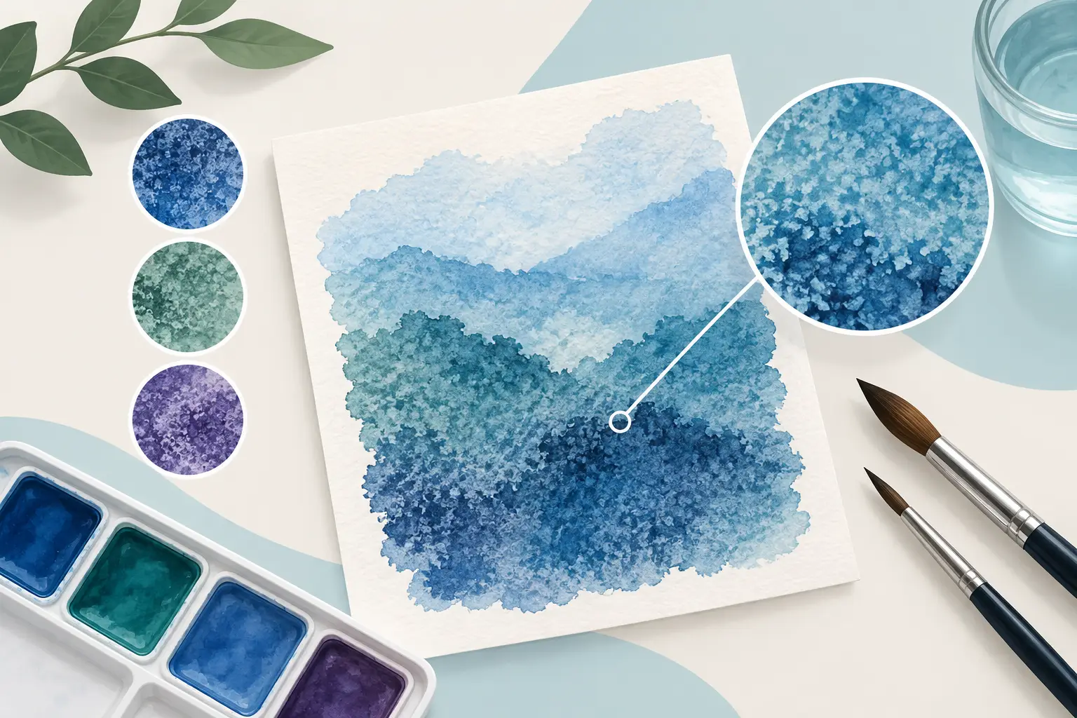
A wash of Ultramarine can settle into the hollows of rough paper while the higher ridges remain pale and luminous. The effect may appear almost geological: colour gathers, separates and reveals the surface beneath it. Why do pigments granulate in this way? It is not a fault in the paint. Granulation is the visible result of pigment particles, water, binder and paper behaving according to their physical character.
For a painter, this matters because granulation changes more than texture. It affects how a wash describes sky, stone, skin, foliage and atmosphere; how two colours mingle; and how much control is possible at the edge of a passage. Once you understand what causes it, granulation becomes a deliberate part of colour selection rather than an occasional surprise.
Why do pigments granulate in watercolour?
Watercolour is a suspension of finely milled pigment in a water-soluble binder, commonly gum arabic. When water is added to the paint, the pigment particles travel across the paper with the wash. As the water slows, sinks into the sheet and evaporates, some particles settle more readily than others. On textured paper, those particles accumulate in the tiny valleys of the surface, creating the characteristic mottled or speckled appearance known as granulation.
The key word is readily. Pigments do not all have the same particle size, shape, weight or surface behaviour. Some remain very evenly dispersed in water, producing smooth, staining washes. Others tend to cluster or settle out of suspension. These are more likely to reveal their particulate nature on the paper.
Granulation is therefore a property of a particular paint formulation and pigment, expressed under particular painting conditions. It is not simply a matter of whether a colour is labelled opaque or transparent, nor whether it is natural or synthetic.
Particle size and shape
Larger pigment particles are often more visible in a wash because they scatter light and settle more distinctly into the paper texture. Unevenly shaped particles can also resist forming a perfectly uniform film. Mineral pigments commonly have this character, which is one reason colours based on cobalt, ultramarine and many earth pigments are valued for their granulating qualities.
Yet particle size alone does not settle the question. A finely ground pigment may still granulate if its particles are inclined to gather together in water. Conversely, a pigment with relatively substantial particles may appear smoother when it is dispersed efficiently, used on a smooth sheet or applied in a controlled, less flooded wash.
Density, settling and flocculation
Denser particles have a greater tendency to settle as water moves across the paper. This tendency becomes more apparent in a generous wash, where there is enough water for particles to migrate before the surface dries.
Another useful term is flocculation. This describes particles drawing together into loose clusters rather than staying evenly distributed. A flocculating pigment can produce soft, irregular deposits of colour, even where the wash initially appeared uniform. The effect is often especially attractive in passages that benefit from variation: weathered masonry, distant hills, cloud shadow or the broken colour of botanical subjects.
The amount of pigment in the mixture also matters. A high-pigment watercolour offers strong chroma and substantial material presence, but granulation will still depend on the identity and behaviour of that pigment. Strength and granulation are related only in the sense that both are governed by the material in the pan or tube, not by marketing descriptions alone.
The role of binder and milling
A watercolour maker balances pigment with gum arabic, humectants and other carefully judged ingredients so that the paint rewets, flows and dries to a stable film. Binder holds pigment on the paper, but it cannot make every pigment behave identically. Too much binder can suppress a pigment's natural character; too little can compromise handling and adhesion.
Milling is equally significant. Grinding disperses pigment through the binder and removes unwanted grittiness, but a colour should not be milled indiscriminately until all evidence of its inherent structure disappears. The aim is a well-made paint whose pigment performs clearly and reliably. With naturally granulating colours, that may mean preserving a beautiful, controlled degree of separation rather than forcing a flat wash.
Paper and water determine how visible granulation becomes
The same colour can look markedly different on hot-pressed, cold-pressed and rough watercolour paper. Hot-pressed paper has a comparatively smooth surface, so pigment has fewer deep hollows in which to collect. Granulation may still occur, but it will often be restrained and subtle.
Cold-pressed paper offers enough tooth to show the effect without making every wash dramatically broken. Rough paper encourages the most conspicuous settling, particularly with a fluid application. Paper sizing also affects the result: a more absorbent surface can arrest the wash quickly, while a well-sized sheet may allow pigment to travel, separate and settle for longer.
Water is the other half of the equation. A damp, generously loaded wash gives particles time to move. A brushstroke laid onto nearly dry paper may show texture through dry-brush marks, but that is not necessarily pigment granulation. True granulation is the settling and gathering of pigment within the water as the wash dries.
Temperature, humidity and the angle of the board can alter the pattern as well. A wash painted on a slight incline creates a moving bead of water. Pigment can be carried to that bead and deposited as it pauses, producing richer, more granulated passages near the lower edge. This can be useful, but it can also create unwanted blooms or heavy lines if the wash is not managed attentively.
Granulation, staining and opacity are different qualities
Painters often encounter these terms together, but they describe different aspects of colour behaviour. A staining colour penetrates more deeply into the fibres of the paper and is difficult to lift once dry. A granulating colour tends to sit in a visibly particulate pattern on the surface. An opaque or semi-opaque colour covers what is beneath it more readily than a transparent one.
A colour may be granulating and transparent, or granulating and relatively opaque. It may also be non-staining but smooth. There are useful tendencies, but no shortcut replaces testing the actual colour on the paper you use.
This is particularly relevant when choosing between single-pigment colours and convenience mixtures. A single-pigment granulator usually produces a more predictable texture. A mixed colour can behave in a more complex way because its component pigments may travel and settle at different rates. In a wet wash, one pigment may collect in the paper's recesses while another remains closer to the surface, creating subtle colour separation.
That separation can be exquisite, but it is less neutral in mixtures. If you are building clean, even secondary colours, a strongly granulating component may introduce variation you did not intend. If you are painting expressive skies or stone, the same quality may be precisely what the subject needs.
How to encourage granulation
To make granulation visible, begin with a pigment known for the characteristic and use it in a fluid wash on cold-pressed or rough paper. Mix enough paint before you start so you can lay the passage confidently. Then apply it with a full brush and avoid repeated brushing as the wash begins to lose its sheen.
Let the water do some of the work. Tilting the board gently can encourage pigment movement, but excessive tilting can leave a hard deposit at the edge of the wash. If you want variation, charge a second granulating colour into the first while both remain wet. Allow the colours to meet rather than stirring them aggressively on the paper.
A test sheet is invaluable. Paint each colour at full strength, as a pale wash and in a simple two-colour mix. Use the same paper, brush and water quantity you would use for finished work. This small exercise reveals far more than a swatch in isolation.
How to reduce unwanted texture
When an even wash is the priority, select smoother pigments where possible and work on hot-pressed paper. Mix paint thoroughly, use sufficient water for the area, and maintain a consistent wet edge. Avoid returning repeatedly to a drying wash, since disturbance can concentrate pigment and make a patchy result more obvious.
You can also use granulating colours more quietly by diluting them or combining them with smoother colours. The result will depend on the ratio, the paper and the amount of water. Do not assume a smooth partner will eliminate the granulation entirely; often it merely softens it.
Granulation rewards observation. Rather than asking a paint to behave like every other paint, give its pigment the conditions in which it can speak clearly. On the right paper and in the right subject, the settled particles become not an interruption to the wash, but part of the painting's own visual language.