An underpainting is not simply a coloured first layer. It establishes the value structure, temperature and visual atmosphere that every later passage must answer to. The best colours for underpainting are therefore not one fixed set of tubes: they are the colours that clarify your particular subject before the fuller palette arrives.
For some painters, that means a transparent earth red beneath flesh, stone or sunlit architecture. For others, a cool grey-green ground gives a landscape its weather before a single local colour is placed. The decision begins with the painting's dominant value and temperature, not with a fashionable recipe.
What an underpainting needs to do
A useful underpainting should make the next decisions easier. It should establish where the deepest darks sit, reserve the important lights, and suggest whether the painting will feel warm, cool, subdued or high-key. If it does all of this, the later layers can be more selective and more alive.
In oil painting, an underpainting may be drawn thinly with a brush, wiped back with a rag, or painted more opaquely. A lean, relatively fast-drying first layer is generally sensible beneath slower, more oil-rich applications. Whatever its appearance, it must be properly dry before you place a substantially different layer over it.
Opacity is as significant as hue. An opaque underpainting can provide a firm, covering base, but may reduce the luminosity of transparent glazes laid later. A transparent or semi-transparent stain allows the ground to participate in the final surface. Neither approach is superior. The choice depends on whether you want light to appear to travel through the paint or to sit decisively on it.
Best colours for underpainting: start with earth pigments
Earth colours remain dependable underpainting choices because they are naturally restrained, useful across a broad value range, and often dry more readily than many modern organic colours. Their subdued chroma helps the painter judge the strength of subsequent colour mixtures. A vivid top layer placed over a quiet earth preparation can appear more convincing precisely because the underpainting has not competed with it.
Raw Umber for a cool, architectural foundation
Raw Umber is one of the most practical choices for a monochrome underpainting. It tends towards a cool, greenish brown and is especially effective for still life, portraiture, interiors and overcast landscapes. Used thinly, it permits swift drawing and wiping-out; used more solidly, it gives a sober middle tone from which lights and darks can be developed.
Its restraint is its virtue. Raw Umber can make a warm final palette appear clearer, but it may feel too cool beneath a painting intended to glow with late-afternoon warmth. In that case, shift towards a warmer earth rather than attempting to correct every passage later.
Burnt Umber for rapid, dark value design
Burnt Umber is darker and warmer than Raw Umber, with a depth that makes it particularly useful when the subject is organised around strong shadow. It can be a fine choice for a quick tonal block-in, especially when you want to establish dark accents without using black.
Use it with a light hand in passages that must remain luminous. Its rich darkness can become heavy if it is applied opaquely across the whole support. Wiping back into the lights is often more effective than painting the lights over a uniformly dark brown layer.
Burnt Sienna and transparent earth red for warmth
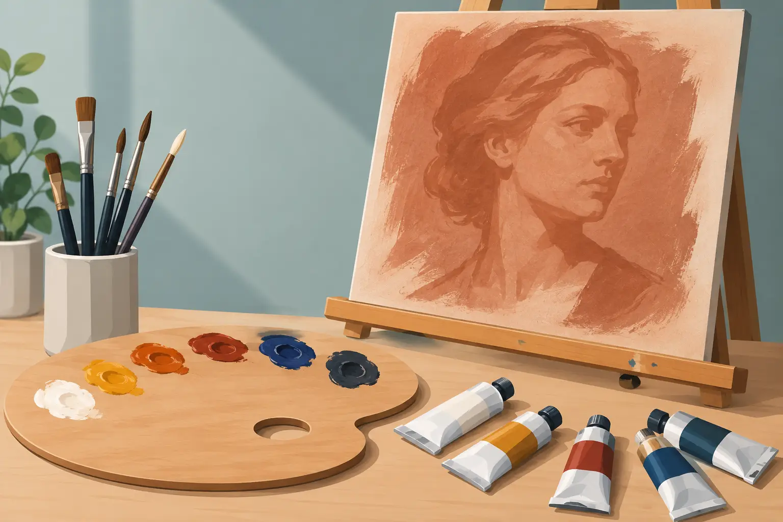
Burnt Sienna offers a warmer, more orange-red starting point. It has a long history in figure painting because it sits sympathetically beneath many flesh mixtures, particularly where transparent warm shadows or reflected warmth are wanted. It is equally persuasive beneath terracotta, brick, wood and autumnal landscape subjects.
A transparent earth red, often made with an iron oxide pigment such as PR101, can take this further. Its transparency makes it well suited to a stain or imprimatura, allowing a pale ground to illuminate the subsequent paint layers. Keep the values open, however. A strong red-brown beneath every part of a pale portrait can force the top layers towards unnecessary opacity.
Yellow Ochre and Venetian Red for an opaque start
Yellow Ochre creates a muted golden ground that can be especially helpful for portraits, still lifes and sunlit subjects. It is less dramatic than a red or umber preparation, but it gives warm lights a coherent base and keeps cool accents readable.
Venetian Red, another earth-derived red, is more opaque and more assertive. It is valuable when you want the painting to begin with a broad, warm middle tone rather than a transparent wash. Because it has considerable covering power, reserve it for an approach in which the underpainting remains an active painted layer, not merely a preliminary drawing.
Choose temperature from the finished painting, not the subject name
A portrait is not automatically best begun with Burnt Sienna, nor is a landscape automatically best begun with Raw Umber. Look instead at the temperature relationship that will carry the painting. A cool underpainting can make later warm passages feel more immediate. A warm ground can prevent a cool scene from becoming inert, provided the warmth is allowed to show only where it serves the whole.
For a predominantly warm subject, a cooler earth such as Raw Umber, or a restrained blue-grey mixture, may create useful counterpoint. For a cool seascape or northern light, a thin warm earth ground can stop the painting becoming uniformly cold. This is a matter of proportion. If the underpainting is too forceful, it will dictate the image rather than support it.
Complementary underpaintings can be effective, but they require control. A greenish preparation beneath red subjects, or a red-orange preparation beneath blue-green passages, can create optical vibration where thin upper layers allow it to show. Yet complementary schemes are easily overplayed. The result may become decorative where the subject calls for quiet observation.
A limited palette often gives better control
For a tonal underpainting, one colour is enough: Raw Umber, Burnt Umber or a neutral grey mixture can carry the whole value statement. This approach, sometimes called grisaille when worked in greys, is especially valuable when form and light are more difficult than local colour.
A two-colour approach can add temperature without introducing confusion. For example, a cool earth for shadow and a warm earth for light-facing planes can establish the main turn of form. Ultramarine Blue moderated with an earth colour can produce useful blue-greys for cooler subjects, while retaining more life than black and white alone.
Avoid treating Ivory Black as the default solution for underpainting. It can be entirely appropriate for certain subjects and traditions, but its slow drying and strong tinting power deserve consideration. Mixed thoughtfully with a warm earth or white, it can yield subtle neutrals. Used indiscriminately, it can flatten shadows and make later colour mixtures needlessly difficult to keep clean.
Consider the ground and the layers above
The same pigment behaves differently over a brilliant white ground, a warm primed canvas or a dark panel. A transparent Burnt Sienna wash over white may appear radiant; over a red or brown ground, it may lose distinction. Before committing to a large work, test your intended underpainting and the next two layers on a prepared offcut of the same support.
Also consider the covering power of the colours to come. If the final painting depends on transparent lakes, glazing colours or lightly scumbled passages, keep the underpainting lean, clear and structurally sound. If you intend to paint opaquely with strong lead or titanium white mixtures, the underpainting can be broader and more decisive because much of it will be covered.
Pigment information matters here. A single-pigment earth colour offers predictable behaviour and a direct route to understanding its temperature, transparency and mixing character. Mixed convenience browns can be useful, but they may make it harder to anticipate drying, opacity and the colour cast that emerges through later layers.
A practical way to test your choice
Prepare three small studies from the same reference. Paint one in Raw Umber, one in Burnt Sienna or transparent earth red, and one in a neutral grey or blue-grey. Keep the drawing and value design as close as possible. Once dry, add a small area of your intended final colour to each.
The comparison will reveal more than a colour chart can. You will see which preparation supports your lights, which gives your shadows sufficient air, and which changes the apparent temperature of your mixtures. This is also a useful way to build a personal record of pigment behaviour across different grounds and mediums.
The finest underpainting is often the one that becomes almost invisible in the finished work, not because it has been buried, but because every later mark still benefits from the decisions it made.