




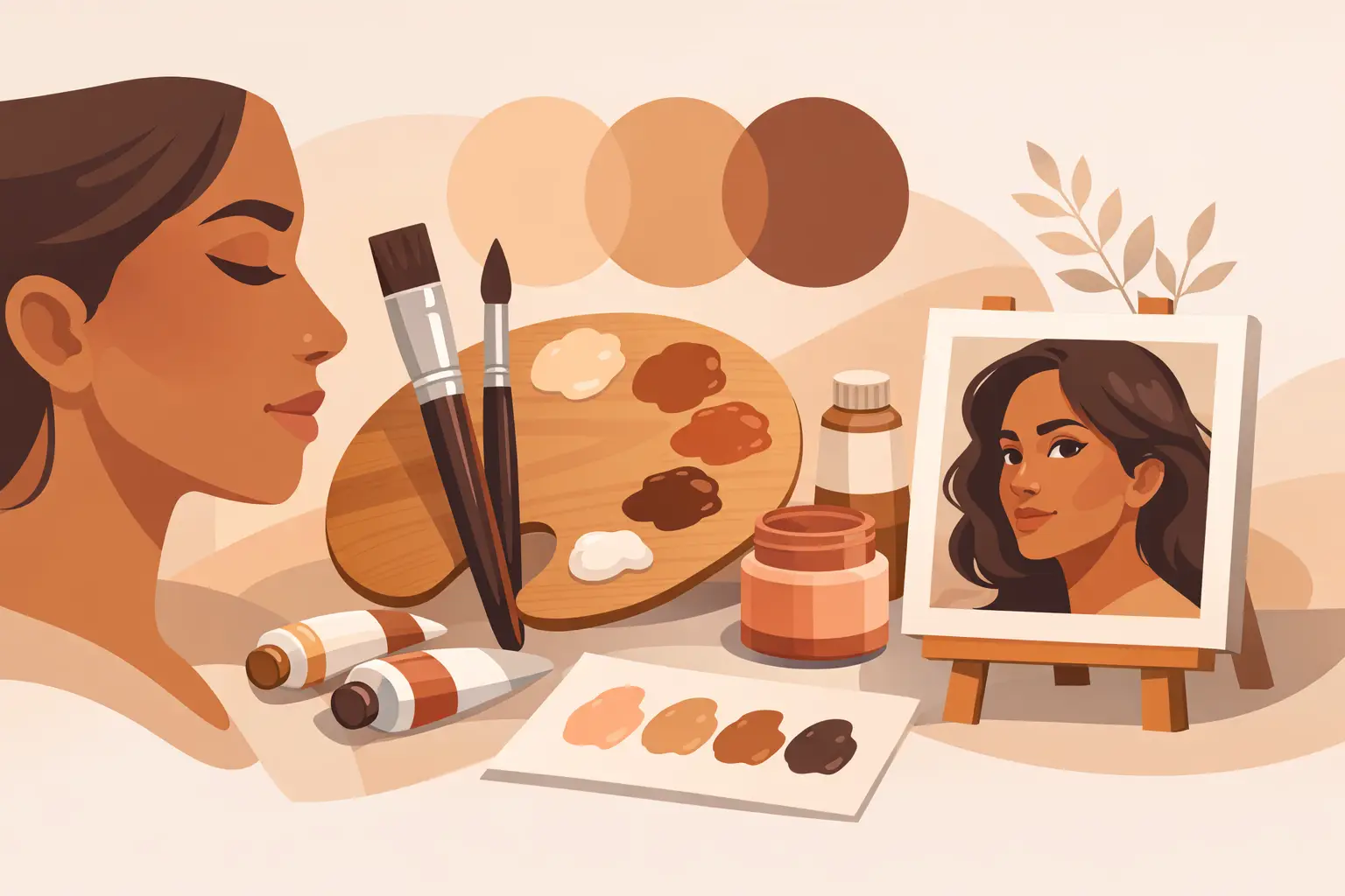
A convincing face is rarely made from a ‘flesh tint’. It is built from relationships: a cool plane against a warm one, a transparent shadow beside a more opaque highlight, a quiet grey that lets a note of rose feel alive. The best pigments for portraits are therefore not simply the colours that resemble skin in the tube. They are the pigments that give you control over temperature, value, opacity and mixture.
A portrait palette should be judged by how well it describes the sitter under a particular light, not by how many ready-made skin colours it contains. Pigments with clear identities make that task easier. Their undertones remain legible in mixtures, their handling is predictable, and their permanence supports work intended to last.
What makes a pigment useful in portraiture?
Portrait painting asks more of a pigment than local colour matching. Skin is translucent, but its appearance shifts rapidly from plane to plane. Foreheads may carry a cool pearly light; cheeks can hold a warmer red note; a jaw may turn through muted violet, green-grey or brown. A useful portrait pigment must help you organise those changes without producing dead, over-mixed colour.
Three characteristics matter particularly. First is undertone: the colour revealed in a thin wash or extended mixture. A red that appears warm and earthy in mass tone may reveal a cool, bluish undertone when thinned. Second is opacity. Opaque pigments are invaluable for adjusting value and building light planes, while transparent pigments can produce depth in shadows and glazed passages. Third is tinting strength. Very powerful colours can be excellent in small quantities, but may easily dominate a restrained mixture.
Lightfastness is equally a practical matter. Portraits often depend on delicate reds and muted violets, precisely the areas where historic fugitive lakes once caused difficulty. Select permanent pigments so that a carefully observed complexion does not shift as the work ages.
Best pigments for portraits: a considered palette
There is no universal portrait palette. A painter working from a north-facing studio window will make different choices from one painting a sunlit sitter outdoors. Yet a compact group of pigments can cover a remarkably wide range when each one has a distinct role.
Earth yellows and earth reds
Yellow Ochre, commonly PY43, remains one of the most dependable portrait pigments. Its restrained chroma, relative opacity and warm earthy character make it useful in lighter skin passages, warm halftones and muted greys. It also moderates stronger reds without making them artificial.
Raw Sienna and Burnt Sienna, often PBr7, bring different possibilities. Raw Sienna tends towards a golden, transparent warmth that can be especially useful in underpainting and warm light. Burnt Sienna provides a deeper orange-red brown, capable of enriching shadow transitions when balanced with blue. Because natural earth pigments can vary in character between sources and formulations, evaluate the actual paint rather than relying on a name alone.
For a more decisive warm red, Venetian Red, Indian Red or another red iron oxide based on PR101 offers permanence and authority. These pigments are often opaque and can become heavy if overused, but a small amount gives structure to cheeks, ears, lips and warm reflected light. Transparent Red Oxide, also commonly PR101 but processed for greater transparency, is a particularly useful counterpart where a luminous, red-brown shadow is needed rather than an opaque covering layer.
Reds for life without fragility
A portrait palette needs at least one red that can shift towards cool rose or violet. Quinacridone Rose, usually PV19, is valued for its clarity, transparency and excellent permanence. Used carefully, it can enliven a pale cheek, cool a red-brown mixture or create subtle violet greys with blue.
The question is not whether a red is bright enough in isolation, but whether it can be muted gracefully. Strong modern organic pigments have high tinting strength and may make a palette feel less forgiving. They work best when introduced in very small quantities and grounded with earth colours or a suitable complementary mixture.
For painters drawn to the depth associated with traditional alizarin, choose a permanent modern alternative rather than relying on historic Alizarin Crimson formulations known for poor lightfastness. The pigment index, rather than the evocative colour name, tells you what the paint is actually made from.
Blues that control temperature
Ultramarine Blue, PB29, is a central portrait blue because it is warm, granulating in watercolour, and capable of producing soft violet and neutralised shadow mixtures. With Burnt Sienna it creates a broad range of chromatic darks and greys. The exact result depends on the balance: more ultramarine tends towards a cooler, bluer grey; more sienna brings warmth and softness.
Cobalt Blue, PB28, is lighter, cleaner and often more restrained in mixtures. It can be particularly valuable for cool daylight passages where ultramarine feels too violet or forceful. Cerulean Blue, usually PB35 or PB36, offers a more greenish, airy coolness. It is not essential to every compact palette, but it can be very persuasive in cool lights, atmospheric backgrounds and blue-green shifts around the temples or jaw.
Avoid treating blue as merely a darkening agent. Adding too much blue to a warm mixture can produce a conspicuous green or purple rather than a believable shadow. Test mixtures in the value range where they will actually sit in the painting.
Greens, violets and the value of near-neutrals
Portrait painters sometimes omit green, then struggle to find the greyed olive notes that appear in real skin. Viridian, PG18, is comparatively restrained and cool, useful for modifying reds and yellows into subtle neutral passages. Phthalo Green, PG7, is much stronger and cooler. It can make excellent mixtures, but requires a disciplined hand; a trace may be sufficient.
A dedicated violet is optional. Many painters prefer to mix their violets from Ultramarine Blue and Quinacridone Rose, adjusting them with an earth pigment as needed. This keeps the palette coherent and avoids introducing another high-chroma colour that may be difficult to quieten.
The most persuasive portrait greys are usually coloured greys. They retain a temperature bias even when their chroma is low. Mix a warm and cool pair until the intensity falls, then adjust value with care. This produces a living neutral more readily than relying on black alone.
Whites and dark pigments
Titanium White, PW6, gives decisive covering power and a strong value lift. It is indispensable for many oil painters, especially in direct painting and higher-key work. Its opacity can, however, make mixtures chalky if used too early or too freely. Reserve the lightest mixtures for planes that genuinely turn towards the light.
A softer or more translucent white may suit painters seeking more gradual transitions, though each white brings its own handling considerations. In watercolour, the white of the paper often performs the role that white paint plays in oils, so planning the lightest passages is fundamental.
Ivory Black, PBk9, is useful for low-chroma darks and can create beautiful cool mixtures with white. Mars Black, PBk11, is denser and more opaque. Neither should be treated as a shortcut to every shadow. A dark made from complementary pigments often carries more colour information and relates better to the rest of the painting.
Build the palette around your method
For an economical starting palette, choose Yellow Ochre, Burnt Sienna, a red iron oxide, Quinacridone Rose, Ultramarine Blue, a cool blue or green option, and Titanium White for oils. This is not a prescription. A painter working in transparent layers may favour Transparent Red Oxide and a cooler rose; an alla prima painter may prefer the solidity of more opaque earths and cobalt.
Watercolour painters should pay close attention to transparency, staining strength and granulation. Granulating Ultramarine and earth pigments can describe broken, complex transitions beautifully, but they may be less suitable when an exceptionally smooth wash is required. Oil painters should also consider the behaviour of each pigment in the chosen medium and the proportion of white used in mixtures, as both affect surface and drying characteristics.
Make a chart before committing to a portrait. Paint each colour in mass tone and a thin extension, then test every warm pigment against every cool one. Record the pigments, not only the colour names. A Colour Compare tool or Mixing Studio can help identify gaps in a palette, but the final judgement belongs at the easel, under your working light.
The finest portrait palette is not the largest one. It is the one whose pigments you know well enough to anticipate the quiet temperature shift that makes a painted face begin to breathe.