


















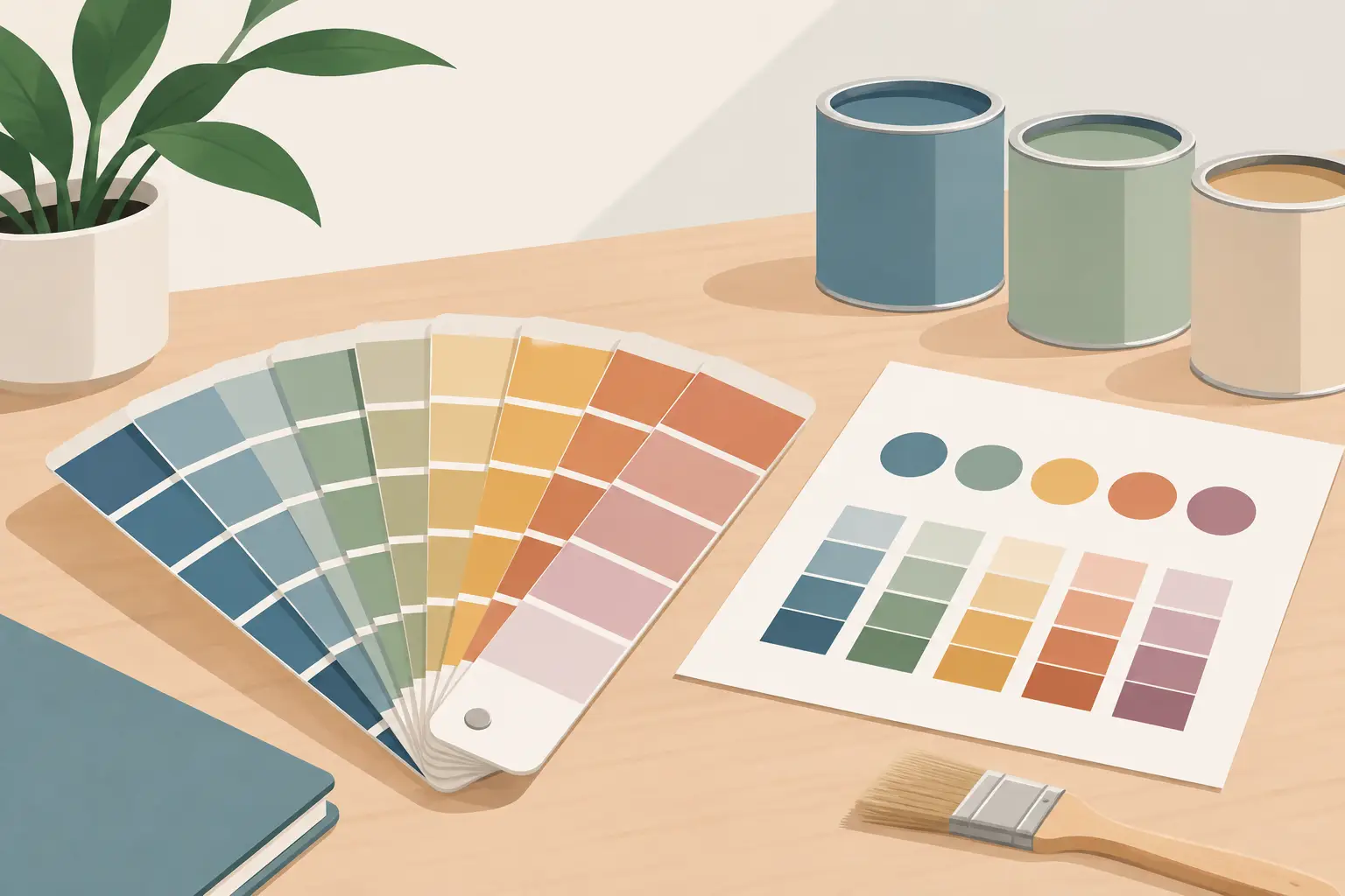
A tube label can tell you the pigment, but it cannot show you the particular blue-grey cast that appears when a colour is spread thinly, nor how strongly it will influence a mixture. Learning how to make paint swatches gives those facts a physical form. A well-made swatch chart becomes a working record of your own paints, your chosen ground and the way you paint.
This is especially valuable when building a considered palette. Two colours with similar names may differ in pigment composition, transparency, drying rate, granulation or tinting strength. A swatch lets you compare what is actually on your palette rather than relying on a printed chart, a screen or memory.
Begin with a chart designed for observation
Use a stable, white support with enough tooth for the medium. For watercolour, a good-quality watercolour paper is the sensible choice. For oils, use properly primed paper, a panel or a piece of the same ground you intend to paint on. If you routinely work on a warm-toned or absorbent ground, make an additional chart on that surface later. Colour is always affected by its surroundings.
Rule your sheet into generous rectangles and leave room for notes. Small swatches save space but often conceal the very qualities you need to assess, particularly granulation in watercolour and brushmark retention in oil. A useful rectangle is large enough to show a full-strength passage, a thinner passage and a transition between them.
Write the information before applying paint. Include the colour name, Colour Index pigment code or codes, and whether it is a single-pigment colour. Add the date if you are testing a new batch, medium or surface. This may seem methodical, but charts become much more useful over years when they can answer a precise studio question.
How to make paint swatches for useful comparisons
Squeeze or decant only a small quantity of paint. The aim is not to make a decorative colour card. It is to lay down enough material to see its full character without wasting paint.
For an oil-colour swatch, place a substantial stroke at one end of the rectangle. Draw it out with a clean brush until it becomes a thin film. This simple graduation reveals body, transparency and undertone. A colour that looks dense and opaque in a pile may become unexpectedly luminous at the edge of the stroke. Conversely, a seemingly bright colour may reveal a duller or greener undertone when spread thinly.
If you use medium in your usual practice, make two versions: one with paint straight from the tube and one with your normal addition. Do not assume a medium merely makes paint more fluid. It may alter gloss, transparency, body, drying behaviour and the appearance of brushwork. Mark the medium clearly on the chart.
For watercolour, wet the rectangle evenly, then introduce a strong charge of colour at the top. Pull the wash down with a clean, damp brush, allowing it to fade naturally. Let the paper, pigment and water do their work. Avoid over-brushing, which can disguise settling, granulation and separation. On drying, note whether the colour has lightened substantially, travelled to the edges, or settled in the texture of the paper.
Allow every swatch to dry fully before judging it. Oil colour can change in gloss as it begins to set, while watercolour often reveals its true value only when dry. View the chart in neutral daylight where possible, not under a strongly coloured lampshade or beside competing painted surfaces.
Test opacity, transparency and undertone
A black-and-white bar beneath or beside each swatch makes opacity easier to see. Paint across both sections in a consistent film. If the bar remains clearly visible, the colour is transparent or semi-transparent; if it is largely concealed, it is more opaque. This is not a ranking. Transparent pigments are invaluable for glazing, optical mixtures and luminous shadows, while opaque colours can establish solid lights and direct coverage.
Treat the result as conditional. A thin layer of an opaque colour may still allow the ground to influence it, and a thick application of a transparent pigment can appear deep and forceful. The chart should show the behaviour you can expect at the film thicknesses you actually use.
Undertone deserves equal attention. Look at the thinnest part of an oil stroke or the palest area of a watercolour wash. Ultramarine may lean redder or violet in dilution, whilst a phthalo blue may disclose an intense green bias. These tendencies matter when mixing neutral greys, natural greens and convincing shadow colours. They often explain why a mixture that looked correct on the palette becomes too cold, too green or too violet on the painting.
Add tinting-strength and mixing tests
A neat swatch tells only half the story. Beside it, create a tint with a consistent white. Titanium White is commonly used because it is strongly covering, but it will make most colours appear cooler and more opaque. The objective is not to identify a perfect pastel version, but to compare the relative force and colour bias of your paints under the same conditions.
Use the same small measure of colour and white for every test. A high-tinting pigment needs very little paint to shift the white markedly. This is especially instructive with powerful modern organic pigments, which can dominate a mixture far more quickly than many earth colours or traditional lakes.
For a compact mixing reference, add one controlled mixture with a chosen opposite or near-opposite from your palette. Do not chase every possible combination on a single page. Instead, test the pairs you genuinely use: perhaps a blue with a warm earth, a yellow with a violet, or a red with a green. Record the proportions approximately, then identify whether the resulting neutral is warm, cool, clean, granulating or prone to becoming chalky.
Single-pigment colours are often easier to predict in these studies, but convenience mixtures have their place. A mixed pigment may offer a particular handling quality or hue that suits a painter’s method. The key is to know what the colour does, not to follow a rule for its own sake.
Include the characteristics that matter to your medium
Oil painters may wish to reserve a narrow section for drying observations. Note which colours remain tacky longer, which sink in on an absorbent ground, and which retain a pronounced gloss. These are practical considerations when planning layers, not minor technicalities. A slow-drying colour placed beneath a faster, more brittle layer may affect the structure of the painting.
Watercolour painters can add observations on granulation, staining and lifting. Test lifting only after the wash has dried completely: dampen a small area, wait briefly and lift with a clean brush or tissue. Some pigments release readily, making them useful for corrections and soft transitions. Others stain the paper decisively, supporting layered washes but offering less opportunity for retrieval.
If ethical or studio-safety considerations guide your choices, record those too. Clear notes on non-toxic or vegan selections can help when choosing colours for teaching spaces, shared studios or a deliberately limited palette. Material decisions are part of practice, not an administrative afterthought.
Keep the chart alive in the studio
Store swatches where they can be consulted while mixing, ideally near the palette rather than in a drawer. Group them by family, pigment or intended role: earths, transparent reds, blues for skies, greens for landscape work. There is no single correct system. A portrait painter may organise by flesh-mixing usefulness, while a watercolour landscape painter may sort by granulation and atmospheric potential.
When replacing a colour, swatch the new tube beside the old one. Even closely related pigments can have different handling qualities, and a change from a single pigment to a blend will alter mixtures. Tools such as the Michael Harding Colour Compare tool can assist with initial selection, but your own chart remains the most relevant evidence because it is made with your brushes, paper or ground, and working method.
A swatch chart earns its place when it prevents guesswork. Leave space for additions, corrections and unexpected discoveries. The most valuable page is not the neatest one, but the one that helps you choose a colour with greater intention before the next brushstroke reaches the painting.