








We use essential cookies to run the site and optional analytics cookies to understand how you use it. Read our privacy policy.

Skip to content

40 New Anniversary Oil Colours - Now Available Explore Collections

Michael Harding
Studio Notes

Studio
Notes

Essays, technique guides, and stories from the Michael Harding studio - on pigments, mediums, materials, and the craft of oil painting. Filter by category, author, or topic.

Authors ·
Topics ·
Howard Hodgkin’s Review of Michael Harding Oil Paint
Recommended Reading

Howard Hodgkin’s Review of Michael Harding Oil Paint

MH in UK Government Parliamentary Review 2017
Blog Post

MH in UK Government Parliamentary Review 2017

MH in UK Government Parliamentary Review 2017

Michelle Wooderson
Artist Feature ·

Michelle Wooderson

Michelle Wooderson is an artist based in rural Kansas, where she finds inspiration in the landscapes around her. With a background in interior design and a…

Suzie Baker
Artist Feature ·

Suzie Baker

Suzie Baker is an accomplished plein air and studio artist based in Texas, known for her vibrant and expressive oil paintings. She captures the beauty of l…

Ricky Mujica
Artist Feature ·

Ricky Mujica

Ricky Mujica is an award-winning realist painter based in New York City, known for his masterful depictions of human emotion and beauty. With a background …

What Makes a Professional Watercolour?
Tutorial

What Makes a Professional Watercolour?

What separates a professional watercolour from a student one? Pigment load, single-pigment formulation, and disclosed lightfastness, transparency, granulation and staining — here is how to read a Michael Harding watercolour label and choose with certainty.

Layering - Coloured Priming
Tutorial

Layering - Coloured Priming

Layering - Coloured Priming

Makenzy Beard
Artist Feature ·

Makenzy Beard

Makenzy Beard is a young Welsh artist gaining recognition for her incredibly detailed and lifelike portraits. Despite her age, her work has garnered intern…

Henrik Uldalen
Artist Feature ·

Henrik Uldalen

Henrik Uldalen is a self-taught Norwegian artist, known for his emotive figurative paintings that explore themes like existentialism, loneliness, and the b…

Haidee-Jo Summers
Artist Feature ·

Haidee-Jo Summers

Haidee-Jo Summers is an accomplished British plein air and studio painter, celebrated for her vibrant depictions of gardens, landscapes, and seascapes. She…

Jeremy Lipking
Artist Feature ·

Jeremy Lipking

Jeremy Lipking is a celebrated American realist painter known for his stunning portraits and landscapes that evoke the romanticism of 19th-century masters …

HRecommended Reading
Recommended Reading

Health & Safety

All Michael Harding oil paints have been tested and conform to the ASTM-D 4236 standards. The following industry-standard “best practices” should be observed when using any and all fine art oil paint products and media. Handling Paints and

Oiling out and Sinking In: An Interview with Michael Harding
Tutorial

Oiling out and Sinking In: An Interview with Michael Harding

By Abigail Lashbrook Topics: Artist Interview Oiling out is just a part of the process for a lot of artists, but if it’s overdone it can damage the quality of your painting, and frequently the need to oil out is completely avoidable. There

About Linseed Oil
Recommended Reading

About Linseed Oil

Cold Pressed vs. Refined Linseed Oil and Its Drying Process IMPORTANT Safety Information Rags with linseed oil or paint stored in a pile should be considered a fire hazard because they provide a large surface area for oxidation. The oxidati

DRecommended Reading
Recommended Reading

Details & Descriptions of Colours

This section gives assessments for certain determinable characteristics of all the colours presently in my range, as well as a few informal remarks on their qualities and idiosyncrasies when used. Following the pattern already laid o

Details & Descriptions of Colours
Recommended Reading

Details & Descriptions of Colours

This section gives assessments for certain determinable characteristics of all the colours presently in my range, as well as a few informal remarks on their qualities and idiosyncrasies when used. Following the pattern already laid out on a

CRecommended Reading
Recommended Reading

Composition of Paint

If you think of paint as a two-part material, with the oil being the glue that binds the pigment particles into place, it is the pigment that is responsible for delivering the colour. The pigment must therefore have the following qualities:

How to Read an MH Label
Tutorial ·

How to Read an MH Label

Pigment code, series, lightfastness and the watercolour characters - what every part of a Michael Harding label means, for oil and watercolour.

Michael Harding Watercolours: Professional Artist Watercolours
Blog Post ·

Michael Harding Watercolours: Professional Artist Watercolours

Discover Michael Harding Watercolours — professional artist-quality watercolour paints created for painters who demand exceptional colour, beautiful pigment character and uncompromising quality. With a guide to choosing professional watercolours, building a palette, granulation, transparency and an FAQ.

Painting the World and Inspiring Young Artists in Ghana
Artist Feature ·

Painting the World and Inspiring Young Artists in Ghana

For the last 4 years, I have been travelling and painting my way around the world. In September, my travelling studio and I were invited to Ghana to undertake a position as artist in residence for Arms Around the Child.

Best Watercolour Paint: Professional vs Student Explained
Tutorial ·

Best Watercolour Paint: Professional vs Student Explained

What makes the best watercolour paint? We explain the real differences between professional and student watercolours - pigment load, single-pigment formulation, lightfastness and rewetting - so you can choose with confidence.

When To Varnish?
Tutorial ·

When To Varnish?

Chuck Mauldin, an accomplished artist and chemist, investigates when is the correct time to apply varnish to an oil painting - a subject that has puzzled artists for generations.

Watercolour Pigments Explained: Reading the Colour Index
Tutorial ·

Watercolour Pigments Explained: Reading the Colour Index

Learn to read the watercolour Colour Index (PB29, PV19, PY150...) and what each pigment code reveals about a paint's chemistry, lightfastness, granulation and mixing behaviour.

Lightfastness in Watercolour: A Guide to Permanent Colour
Tutorial ·

Lightfastness in Watercolour: A Guide to Permanent Colour

A practical guide to watercolour lightfastness - ASTM ratings, the Blue Wool scale, fugitive pigments to avoid, and how to choose permanent colours for work meant to last.

Granulation in Watercolour: Why Pigments Behave Differently
Tutorial ·

Granulation in Watercolour: Why Pigments Behave Differently

Granulation is the texture that makes some watercolours sediment and granulate on paper. Here is why it happens, which pigments granulate, and how to use it for skies, landscape and texture.

Transparency and Opacity in Watercolour
Tutorial ·

Transparency and Opacity in Watercolour

Transparency and opacity in watercolour explained - how to read it, why it matters for glazing and layering, and which pigments suit your subject.

Staining and Non-Staining Watercolours: Lifting and Layering
Tutorial ·

Staining and Non-Staining Watercolours: Lifting and Layering

Staining and non-staining watercolours behave very differently on paper. Learn how staining pigments affect lifting, layering and stubborn colour, and when to use each.

How to Build a Professional Watercolour Palette
Tutorial ·

How to Build a Professional Watercolour Palette

A practical method for building a professional watercolour palette - warm and cool primaries, granulating earths, staining accents, and how to choose the right colours for your subject.

Watercolour Mixing: Clean Colour and Avoiding Mud
Tutorial ·

Watercolour Mixing: Clean Colour and Avoiding Mud

How to mix clean watercolour colour and avoid mud - single-pigment mixing, complementary pairs, the role of transparency, and a simple method for predictable mixing.

Watercolour Techniques: Wet-on-Wet, Glazing, Dry Brush and More
Tutorial ·

Watercolour Techniques: Wet-on-Wet, Glazing, Dry Brush and More

The core watercolour techniques - wet-on-wet, wet-on-dry, glazing, dry brush, lifting and charging - explained with when to use each and the pigments that suit them.

Watercolour for Beginners: Where to Start
Tutorial ·

Watercolour for Beginners: Where to Start

New to watercolour? A clear beginner's guide to the paints, a starter palette, paper and brushes, and your first techniques - plus how to upgrade from student to professional.

Watercolour for Botanical Painting: Choosing Pigments and Palettes
Tutorial ·

Watercolour for Botanical Painting: Choosing Pigments and Palettes

Watercolour for botanical painting - the transparent, single-pigment colours and techniques botanical artists rely on, with a recommended botanical palette.

Watercolour for Landscape and Skies
Tutorial ·

Watercolour for Landscape and Skies

Choosing watercolour for landscape and skies - granulating blues, atmospheric washes, earths and greens, with a recommended landscape palette and techniques.

Do's and Don'ts of Technique
Tutorial ·

Do's and Don'ts of Technique

Essential advice on the versatility of oil paint - choosing supports, preparing priming, sealant size, and the fundamental norms that ensure long-lasting results.

About Linseed Oil
Blog Post ·

About Linseed Oil

We often get asked if our linseed oil is cold pressed or refined - the answer is, it is both!

CBlog Post
Blog Post ·

Colour and Technique

Painting technique is a dauntingly large and rather vague subject to discuss. We could provisionally define 'technique' as the skills involved in accomplishing a specific artistic intent.

What Makes Michael Harding Watercolours Unique?
Blog Post ·

What Makes Michael Harding Watercolours Unique?

Meticulously ground for vividness and clarity, with 134 hues including 92 single pigment shades - purposefully curated for bright, pure colour blends.

Composition of Paint
Blog Post ·

Composition of Paint

If you think of paint as a two-part material, with the oil being the glue that binds the pigment particles into place, it is the pigment that is responsible for delivering the colour.

Do You Add a Preservative to Your Watercolours?
Blog Post ·

Do You Add a Preservative to Your Watercolours?

Preservatives, Oxgall, gelatine, gum Arabic sourcing from the Sahel, pigment quality control, fugitive pigments, and lightfastness testing.

DBlog Post
Blog Post ·

Details & Descriptions of Colours

This section gives assessments for certain determinable characteristics of all the colours presently in my range, as well as a few informal remarks on their handling.

Are Michael Harding Watercolours Lightfast?
Blog Post ·

Are Michael Harding Watercolours Lightfast?

Yes - Michael Harding watercolours are lightfast and have received an excellent rating. Information can be found on the product label or official website.

FBlog Post
Blog Post ·

Flying with your MH Paints

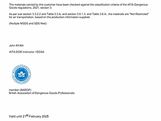
Download your printable PDF to use when flying with MH paints - a notice for airport security personnel.

What Are Your Watercolour Primary Colours?
Blog Post ·

What Are Your Watercolour Primary Colours?

Our three most popular watercolour primary colours: Ultramarine Blue, Yellow Lake, and Scarlet Lake.

HBlog Post
Blog Post ·

Health & Safety

All Michael Harding oil paints have been tested and conform to the ASTM-D 4236 standards. The following industry-standard best practices should be observed.

Howard Hodgkin's Review of Michael Harding Oil Paint
Artist Feature ·

Howard Hodgkin's Review of Michael Harding Oil Paint

The colours are superb, also the weight and texture seem to be exactly what I want - it's difficult to imagine anything else.

Lapis Lazuli: An Article by David Margulies
Recommended Reading ·

Lapis Lazuli: An Article by David Margulies

Lapis lazuli was described by Pliny the Elder as 'a fragment of the starry vault of heaven'. It is, and always has been, the most exotic of semi-precious stones and pigments.

MH in UK Government Parliamentary Review 2017
Artist Feature ·

MH in UK Government Parliamentary Review 2017

Michael Harding Art Formulas is featured in the UK Government Parliamentary Review 2017.

PBlog Post
Blog Post ·

Product Concerns Form for Consumers

At MH, we are committed to providing our customers with high-quality products. If you have any concerns regarding our products, we want to hear from you.

RRecommended Reading
Recommended Reading ·

Recommended Reading (Booklist)

Essential books for artists - a curated reading list from Michael Harding on pigments, materials, and technique.

TTutorial
Tutorial ·

Ten Artist Tips!

Artist And Illustrator magazine featured a piece from Michael about the use and care of his paints - ten essential tips for oil painters.

The History and Use of Mediums
Blog Post ·

The History and Use of Mediums

Through the Renaissance, artists worked with combinations of tree resins, thickened vegetable oils, waxes and balsams. The basic desire to create an oil paint film with a degree of gloss and depth seems to be a constant.

The Art of Colour
Artist Feature ·

The Art of Colour

An exclusive interview with Michael Harding, the master paint maker behind some of the most exceptional oil paints in the market.

Oiling Out and Sinking In: An Interview with Michael Harding
Artist Feature ·

Oiling Out and Sinking In: An Interview with Michael Harding

Oiling out is part of the process for many artists, but if overdone it can damage the quality of your painting. Michael Harding discusses causes of dulling and sinking in.

Working with Paint: An Interview with Michael Harding
Project ·

Working with Paint: An Interview with Michael Harding

Working with Paint: An Interview with Michael Harding By Abigail LashbrookTopics: Art Inspiration My main motive for producing paint came out of looking at Rembrandt. As a young artist just out of art school, I wanted to paint like him and I couldn’t reproduce, with my materials, what I saw in his p

TRecommended Reading
Recommended Reading ·

The Artist's Handbook of Material's & Techniques Ralph Mayer. (The Artist's Bible - Fifth edition).

LRecommended Reading
Recommended Reading ·

Living Craft, A Painter's craft by Tad Spurgeon

Lapis Lazuli an article by the renowned authority David Margulies
Project ·

Lapis Lazuli an article by the renowned authority David Margulies

Lapis lazuli was described by Pliny the Elder as ‘a fragment of the starry vault of heaven’. It is, and always has been, the most exotic of semi-precious stones and pigments. The best quality blue stone is to be found high in the mountains at Sar-i-Sang, Badakhshan province, north eastern Afghanista

Watercolour: Pigments & Paints
Project ·

Watercolour: Pigments & Paints

FAQ - Watercolour: Paints & Pigments Question: Does MH exclusively use natural pigments in their watercolours? Are there any unique pigments that MH is known for, such as Lapis Lazuli? Answer: MH offers a range of watercolours that include both natural and chemically created pigments. While we do ut

When To Varnish? By Chuck Mauldin
Project ·

When To Varnish? By Chuck Mauldin

We have had many requests to create a Munsell Wheel from the Michael Harding Oil Range, so we reached out to our wonderful ambassador Vicki Norman.

Non-Absorbent Acrylic Primer - FAQ
Project ·

Non-Absorbent Acrylic Primer - FAQ

FAQ - Non-Absorbent Acrylic Primer Q: What is Michael Harding Non-Absorbent Acrylic Primer used for? A: Michael Harding Non-Absorbent Acrylic Primer (NAAP) is a versatile product suitable forapplication on various surfaces, including linen, wood, MDF, and more. It is designed tocreate a robust, flex

Watercolour FAQ: Sustainability
Project ·

Watercolour FAQ: Sustainability

FAQ - Watercolour: Sustainability Q- Is the company committed to minimizing chemical additives in its products? Answer: MH is committed to producing high-quality watercolour paints with a focus on using only the essential ingredients necessary for creating watercolour paint. Our goal is to provide p

Where can I buy Michael Harding watercolours?
Project ·

Where can I buy Michael Harding watercolours?

FAQ - Watercolour Where can I buy Michael Harding watercolours? Thank you for your interest in purchasing Michael Harding watercolours. To find a local stockist near you, we recommend visiting our Watercolour Store Locator, available here: The Watercolour Store Locator is a convenient tool that allo

Stack Lead White the Reincarnation of Rembrandt's Lead White? By Michael Harding
Project ·

Stack Lead White the Reincarnation of Rembrandt's Lead White? By Michael Harding

Imagine for a moment that we are in Rembrandt’s studio. What would we learn, what would we see? Obviously genius in the making! To some he may be on a human scale of a god in his domain. On a more grounded level what can we glean from his studio practices? His materials for me would unlock many secr

CProject
Project ·

1. Choose the Support Intelligently.

A support is whatever material onto which the paint of an artwork, including the primer, is applied. Slate, marble, copper, aluminium, glass and paper have all been used with some success as supports for oil paint, but many of these require unusual preparation and conservation. For the last 500 year

Lapis Lazuli an article by the renowned authority David Margulies
Recommended Reading ·

Lapis Lazuli an article by the renowned authority David Margulies

DRecommended Reading
Recommended Reading ·

Download MH Oil Colour & Mediums Brochure

Munsell Colour Wheel and Colour System
Recommended Reading ·

Munsell Colour Wheel and Colour System

SProject
Project ·

7. Slow Drying Paint

One can think of this as a particular application of the treatment of the flexibility/inflexibility rule given above. It is apparent to anyone using a variety of oil paints that, even in identical conditions, drying speeds will vary greatly between them. Burnt Umber can be touch dry by the end of a

UProject
Project ·

6. Use Medium as a Help, not as a Panacea

A medium can be defined as a pre-mixed blend of a drying oil, possibly a resin, and possibly a turpentine vehicle, which is commonly added to the later layers of paint in a work, so as to facilitate handling, and/or enable transparency of layers, and/or increase the gloss and colorific intensity of

UProject
Project ·

5. Use Appropriate Thinners

This is merely a short but necessary clarification to the previous references to diluents. “Thinners”, as a term, covers both what is used to clean brushes, and what is used to dilute paint for artistic purposes. Whilst standard decorators’ quality White Spirit is satisfactory for brush-washing at t

FProject
Project ·

4. Fat over Lean

This old maxim concisely expresses how, generally speaking, a successful and durable painting is developed. I say “generally” because there are instances of great painters bending this maxim to conspicuous effect, but nevertheless to ignore it is to court disaster. It could be clarified by paraphras

TProject
Project ·

3. Take care with Priming

If a priming is faulty then your efforts to achieve desired artistic qualities may be constantly thwarted, and the survival of the work might be irreversibly impaired. Excessively slick or excessively suctive primings are uncomfortable to work on. A slick ground, lacking tooth and possibly absorbenc

PProject
Project ·

Preparing Sealant Size

As is evident, a semi-absorbent layer of size is necessary for both oil and gesso primings. Art shops will sell size of sufficient quality for this purpose; decorators’ “size” sold in DIY stores may not be good enough, and may not be rabbit-skin glue at all. Size is available in granule or in sheet

PProject
Project ·

2. Prepare to Support to Suit the Priming

Usually, artists think about the choice of priming as they make their choice of support. The priming can be defined as the liquid application that, when dry, to some extent isolates paint layers from the support. This is necessary in the cases of wood and canvas, which, in their untreated states, ar

Stack Lead White the Reincarnation of Rembrandt's Lead White? By Michael Harding
Recommended Reading ·

Stack Lead White the Reincarnation of Rembrandt's Lead White? By Michael Harding

WProject
Project ·

Wet-and-Wet Mixing

This is a common term for method (i)above, and is clearly the one familiar to most painters today. It must seem self- evident to us that mixing distinct colours (e.g blue and yellow) produces others, but to the medieval artist this appears to have been unknown. Since glazing alone could not create a

GProject
Project ·

Glazing - The Venetian Tradition

In the hands of 16th century Venetian and some central Italian artists glazing methods were adapted to attain more adventurous effects. These tended to use the mixing principles stipulated in the previous section., and usually presupposed an overall coloured priming, on which highlights of the motif

GProject
Project ·

Glazing - The Northern Tradition

Experts must forgive this somewhat bald classification which is only adopted to be concise. Flemish 15th century artists quickly exploited the way in which oil paint could create rich colour effects by means of successive layers of thin transparent paint of similar or even identical chroma (see abov

TRecommended Reading
Recommended Reading ·

The Versatility of Oil Paint

JRecommended Reading
Recommended Reading ·

Juxtapositional Mixing

ARecommended Reading
Recommended Reading ·

Artists' Pigments (A Handbook of Their History and Characteristics) Robert L. Feller, Editor. National Gallery of Art, Washington.

PRecommended Reading
Recommended Reading ·

Painting Materials (a short encyclopedia) Rutherford J. Gettens and George L. Stout.

FRecommended Reading
Recommended Reading ·

Formulas for Painters, Robert Massey.

TRecommended Reading
Recommended Reading ·

The Artist's Assistant (Oil Painting Instruction Manuals and Handbooks in Britain 1800-1900 With Reference to Selected Eighteenth-century Sources). Leslie Carlyle

MProject
Project ·

2: Models of Interpretation

At this point the physics of light becomes less important than simply positing some useful models of colour organization. The colour wheel introduced above must be familiar to most readers, but if it is given three “spokes” or diameters then we have three axes of the complementaries, linking each pr

Michael Harding Sample Set
Project ·

Michael Harding Sample Set

MH Sample SetThe Michael Harding Set Contains:These sample colours have been hand-selected by Michael Harding to give you a beautiful introduction to the endless mixing possibilities available when using his paints. The Michael Harding range contains superb, modern lightfast and ancient oil colours.

Storing Paint Tubes
Project ·

Storing Paint Tubes

Over time pigment may separate from oil in the tube. To resolve this situation store your tube upright on the cap to ‎allow gravity to pull the heavier pigment to the cap. This will alleviate oil from seeping out when the cap is opened.‎ Remember to wipe away paint that may be around the neck [&hell

PProject
Project ·

Phasing out Zinc White?

"I read a report from a manufacturer about using zinc white causing problems in oil paintings, and they are phasing out the usage of it. Any thoughts about it?" Indeed we have after much consideration decided to err on the side of caution and cease making it. It has also been removed from our [&hell

Travelling with Paints
Project ·

Travelling with Paints

Flying with your MH Paints When flying with your Michael Harding oil paints, we always recommend you place a notice in your luggage for the airport security personnel to read. It will inform them that you are carrying oil paints and that they are safe to transport. Please note this letter is intende

LProject
Project ·

Layering Paint - Underpainting

As said previously, drawing and painting are ultimately inseparable activities, and underpainting is often confusingly termed underdrawing .But this at least elucidates its function. In the 15th century both northern and southern European artists, having prepared their panels, would usually draw on

TProject
Project ·

The Materials of the Artist and their use in Painting, Max Doerner

This classic book on the craft of painting is the accepted authority on questions of materials and techniques. Max Doerner, drawing on over twenty-five years of teaching at the Academy of Fine Arts in Munich, examines everything that the practicing artist might need to know about the preparation of

MProject
Project ·

3: Methods of Application and Mixing

It must be obvious that studio practice in colour use long pre-dates scientific theories which attempt to explain it. Only one artistic movement, the neo-impressionism of Seurat and Signac, attempted to order the former according to the latter. For preceding ages the approach was that of pragmatical

OProject
Project ·

Organic Pigments

As I said, organic pigments are constituted of what was, at some time, plant or animal matter. And again they divide into the natural and those resulting from sophisticated manufacture. The natural ones were made simply by crushing up insect or vegetable tissue (e.g. Cochineal, Gamboge, Indigo, Madd

EProject
Project ·

Environmental Research For Art Conservation

This project was initiated by a consortium of galleries and Birkbeck College, London University, with the aim of evaluating the air quality of the indoor environments of museums, art galleries and historic houses containing paintings. Tests for ascertaining air quality involved the preparation of co

IRecommended Reading
Recommended Reading ·

Inorganic Pigments

EProject
Project ·

English Heritage

On this occasion I was approached by the architectural paint researcher Helen Hughes who was part of the English Heritage team endeavouring to analyse, and so to reproduce, various colours which constituted the original decorative schemes uncovered during the restoration of Danson House, a grade 1 l

LProject
Project ·

1: Light and Pigment Compared.

Painting technique is a dauntingly large, and rather vague, subject to discuss. We could provisionally define “technique” as the skills involved in accomplishing a certain artistic intent. But this leaves the notion of “artistic intent” unexamined (it obviously takes infinitely various forms between

TProject
Project ·

The Tate Gallery

Working with the conservation scientist Joyce Townsend, I was asked to formulate a 99.9% pure flake white paint which incorporated, as pigment, a lead carbonate we had made specifically for this purpose. Every aspect of its manufacture had to be considered, so as to replicate in every way the charac

RProject
Project ·

Recipes for Slow-Drying Painting Mediums

Poppy Oil will keep pale colours from yellowing, but does not have the physical strength of linseed oil and should only be used in moderation for finishing off layers of paint. It will keep pale colours bright and clear.

RProject
Project ·

Recipes for Fast-Drying Painting Mediums

A 3 egg yolks 1 part stand oil 1 part damar B 1 egg yolk 1 part stand oil N.B. Egg yolk is one of the most ancient and permanent materials Method Wash your hands before you start the process. Separate the yoke from the white by gently passing the yoke from one hand to […]

TProject
Project ·

The Best General All Purpose Glaze

A Damar Varnish - 1 part (15%) Stand Oil - 1 part (15%) (sun-thickened oil will do even better) Pure Gum Turpentine - 5 parts (70%) B Damar Varnish - 1 part (33%) Stand Oil - 1 part (33%) (sun-thickened oil will do even better) Pure Gum Turpentine - 5 parts (33%) Cobalt Drier - […]

SProject
Project ·

Sun Thickened Linseed Oil

Knowing how to make and use this oil medium is probably the greatest secret a painter can learn. It is truly remarkable stuff, and yet it can be made easily by artists with minimal cost and effort. Before I tell you how to make it, I have to extol its virtues, because if you understand […]

TProject
Project ·

Toxicity of Oil Colours (Always Read the Label!)

Ways you can approach the subject. You can assume all paints are toxic, and never paint. You can attempt to take a well balanced view, rather as any competent motorist does when driving a vehicle which could prove potentially lethal. You can stop caring; after all we all have to die sometime. Take r

WProject
Project ·

What do the numbers in the Details and Descriptions of Individual Colours mean?

Details and Descriptions of Colours The individual colour descriptions provide assessments for certain determinable characteristics of all the colours presently in the Michael Harding Artist Oil Colours range as well as a few informal remarks by Michael on their qualities and idiosyncrasies when use

Single Pigment Versus Mixes for Better Painting

Single Pigment Versus Mixes for Better Painting

A tube marked with one pigment code can feel like the sensible choice: transparent information, cleaner mixtures and fewer surprises. Yet the question of single pigment versus mixes is not a contest between pure virtue and compromise. It is a decision about how you want colour to behave on your palette, in the painting and over repeated sessions.

A well-chosen single-pigment colour gives the painter a clear point of reference. A thoughtfully formulated mixture can provide a particular hue, value or handling quality that would be slow, difficult or uneconomical to arrive at from a limited palette. The useful question is not which category is always superior, but which one serves the passage in front of you.

What a single-pigment colour tells you

A single-pigment paint is made principally from one identified pigment. On the label, this is usually shown by one Colour Index name or pigment code, such as PB29 for Ultramarine Blue or PR108 for Cadmium Red. That declaration gives you a more reliable indication of the colour's mixing character than its marketing name alone.

When you mix a single-pigment blue with a single-pigment yellow, you are observing a direct conversation between two pigments. If the resulting green appears subdued, you can begin to understand why: perhaps one pigment leans red, perhaps the particles are naturally opaque, or perhaps the pigments have markedly different tinting strengths. This is valuable knowledge. It helps you adjust the next mixture with intention rather than adding more paint in hope.

Single-pigment colours are especially useful for painters building a compact, adaptable palette. They make it easier to learn temperature relationships, predict the direction of a mixture and reproduce a colour when returning to a painting weeks later. They also allow you to assess a pigment's own qualities - its transparency, granulation in watercolour, staining tendency, covering power in oils and character in a glaze.

There is, however, no guarantee that a single pigment will make every mixture brighter. Pigment chemistry has limits. A naturally earthy yellow and a deep mineral blue may create a quiet green even though each tube contains only one pigment. That can be precisely what a landscape or portrait requires.

Why mixed colours belong on a serious palette

A mixed colour, sometimes called a convenience mixture, contains two or more pigments. It may be designed to achieve a chromatic hue that would require several tubes, a useful neutral at a particular value, or a historical colour character that cannot be represented by one modern pigment alone.

The best mixed colours are not shortcuts for painters who do not understand colour. They are formulations with a purpose. A carefully balanced green can offer a particular foliage note immediately; a dark neutral may hold its character more elegantly than black mixed into every local colour; a flesh tint can provide a rapid starting point for a drawing-led study. In watercolour, a granulating mixture can create textural variation impossible to predict by simply combining smooth washes yourself. In oils, a prepared mixture may offer the consistency and colour body wanted for broad, decisive passages.

Convenience is also a practical consideration. If a colour appears throughout a body of work, repeatedly mixing it can consume time and introduce variation. A dependable mixed paint may free attention for drawing, edges and value structure. There is no loss of seriousness in choosing a tool that suits your working rhythm.

The limitation is cumulative. Each additional pigment becomes another influence in subsequent mixtures. A blue-green made from three pigments might look excellent on its own, but when it is mixed with a red, yellow or earth colour it may grey more quickly than anticipated. This does not make it inferior. It simply means that it deserves to be used with awareness.

Single pigment versus mixes in practical mixing

The distinction becomes clearest when colour is combined with colour. A single-pigment palette generally gives more legible mixing routes. You can identify the source of a dull mixture, alter one component and develop a personal map of cause and effect. This is particularly useful when learning to mix convincing neutrals, where small shifts in temperature carry more weight than saturation.

Mixed paints are most effective when treated as established destinations rather than unknown starting points. Use them for the hue they provide, then test their behaviour before relying on them in a complex colour string. Make a small chart: lay the colour out neat, tint it with white in oils or dilute it in watercolour, then mix it with the key colours already on your palette. The results will reveal far more than a colour name.

For instance, a ready-made violet may be ideal for a flower shadow or evening sky. But if you need several grades of violet moving into red, blue and neutral grey, mixing those steps from a red and blue you know well may offer more control. Conversely, a prepared green may establish the middle note in foliage, while transparent yellow and blue adjustments bring it towards light, shadow or distance.

A painter does not need to choose one system exclusively. A rigorous palette often combines a dependable core of single-pigment colours with selected mixtures that earn their place through repeated use.

Consider opacity, not only hue

Pigment count is only one part of the decision. An opaque single pigment may cover a previous layer and lighten a mixture rapidly. A transparent multi-pigment colour may be perfectly suited to glazing. In watercolour, a mixture of two granulating pigments can separate beautifully across textured paper, while a single staining pigment may produce a more even wash.

These properties are material facts, not minor technical details. Before deciding that a mixture has become muddy, consider whether opacity, paper surface, medium, dilution or the order of layers has changed the result.

Read the label as a studio tool

Colour names can be evocative, but labels are most useful when they tell you what is actually in the paint. Check the pigment codes, lightfastness information and transparency or opacity indication. If a colour name appears in several ranges, do not assume the formulations are alike. One brand's Naples Yellow may be a carefully selected mixture; another may use a different set of pigments and behave differently in every respect.

Keep notes when a paint becomes central to your practice. Record its pigments, the partners it mixes well with and the situations in which it disappoints. This quiet discipline turns a collection of tubes or pans into a working palette.

Building a palette without false rules

For a first serious palette, begin with enough single-pigment colours to establish a clear understanding of warm and cool relationships: a yellow, red, blue, earth and white for oils, with suitable transparent choices for watercolour. Then add mixtures only where they solve a real problem in your work.

A portrait painter may value a ready-made neutral or a muted earth mixture that speeds the organisation of flesh tones. A botanical painter might choose distinctive mixed greens to support a large range of leaf colour. A plein-air painter may prefer fewer tubes and a restricted palette, accepting the character that limitation gives to the work. A colourist working in high-chroma passages may require specialist mixed violets or oranges alongside primary pigments.

Avoid judging a palette by the number of colours it contains. Judge it by whether each colour has a role. Duplications can be useful when they offer different opacity, granulation or temperature, but they should be deliberate rather than accidental.

Test before committing to a large painting

A small mixing sheet can prevent expensive assumptions. Use the same ground or paper as the intended work where possible. Test the colour neat, at its palest useful dilution or tint, mixed with white where relevant, and paired with the colours most likely to meet it in the painting.

Allow watercolour tests to dry completely before assessing their value and surface effects. With oils, give thicker passages time to settle, particularly if you are evaluating transparency and drying behaviour in a layered process. A mixture that seems perfect wet may alter in character as the paint film develops.

The aim is not to eliminate surprise from painting. It is to reserve surprise for the expressive possibilities of the work, rather than the avoidable uncertainty of an untested tube.

Choose single pigments when you need clarity, flexible mixing and a deeper understanding of your palette. Choose mixtures when their particular colour behaviour supports your subject and method. The most capable palette is not the purest one on paper, but the one whose materials you know well enough to use with confidence.

Product Information & Disclaimer

The information provided on this website is based on research and testing conducted by Michael Harding Art Formulas Ltd and is intended as general guidance on the characteristics and potential uses of our products in established painting practices.

While we take care to provide accurate and reliable information, individual materials, techniques, working conditions and applications can vary. Michael Harding Art Formulas Ltd cannot guarantee that any product will be suitable for every individual purpose or application. Users should carefully read all product labels, instructions and safety information and carry out appropriate testing before use, particularly when developing individual techniques or combining materials.

To the fullest extent permitted by applicable law, Michael Harding Art Formulas Ltd makes no express or implied warranties as to merchantability or fitness for a particular purpose and accepts no liability for any loss or damage, including indirect or consequential loss, arising from the use or application of its products.

Colour Representation

Colours displayed on this website and in printed materials are for guidance only. Their appearance may vary depending on screen settings, device, lighting conditions, printing processes and other factors, and may therefore differ from the appearance of the physical product.

For the most accurate representation of colour, texture and finish, we strongly recommend viewing a physical product sample or swatch in person before making a final selection or purchase. Where colour accuracy is important, please do not rely solely on digital or printed representations.

© 2026 Michael Harding Handmade Artist Oil Colours. All Rights Reserved.