















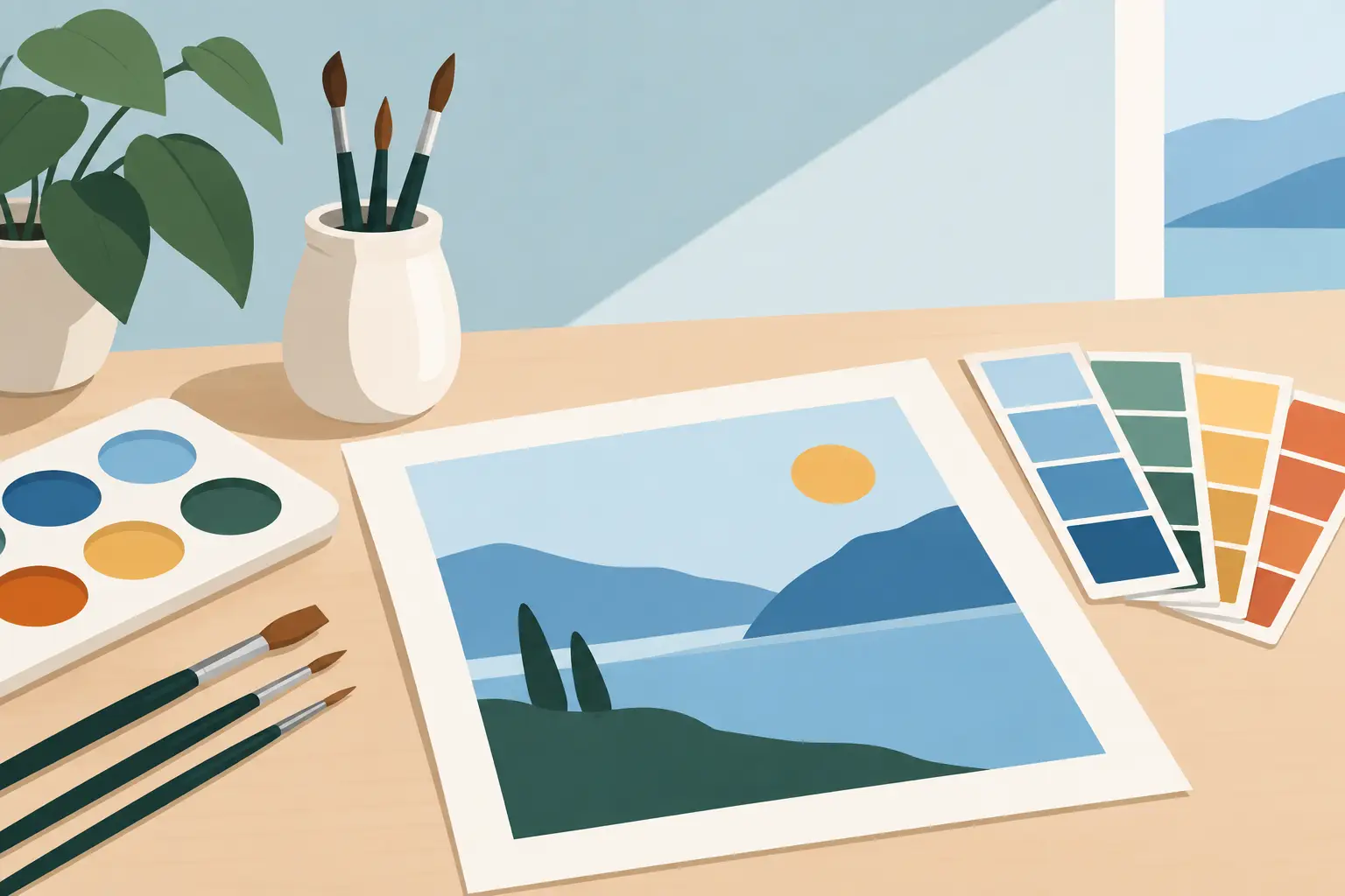
A limited palette is not a compromise made for a smaller paint box. To plan a limited palette well is to decide, before the first brushmark, how your colours will relate, mix and behave across the painting. The result can be greater unity, fewer accidental mixtures and a more direct understanding of the pigments in front of you.
A palette of six carefully chosen colours may offer more usable range than twenty colours selected without a system. The aim is not to impose austerity on every subject. It is to give each colour a clear job and to retain enough space between pigments for mixtures to remain clean, deliberate and expressive.
Begin with the painting, not a fixed list
The strongest limited palettes are built around a particular painting problem. A sunlit harbour, a restrained portrait and a high-key floral study do not require the same colour decisions. Before choosing tubes or pans, identify the dominant temperature, the value range and the colour families that make the subject convincing.
Ask whether the work depends on warm earths, cool atmospheric distance, intense greens or a quiet chain of greys. Consider the light as well as the local colour of objects. A red apple under north light may need a cool, subdued red; the same apple in late afternoon may call for a warmer and more transparent route through orange and yellow.
This preliminary observation prevents a common mistake: choosing colours because they are attractive individually, rather than because they will work together in mixtures. A limited palette should reflect what the painting needs, not every possibility that might arise.
How to plan a limited palette by pigment role
Rather than beginning with colour names alone, select pigments according to their role in the mixing system. Each pigment brings its own undertone, tinting strength, transparency, granulation or opacity, and drying behaviour in oil paint. These qualities affect the painting as much as hue.
A practical starting structure includes a light, a warm and cool yellow, a warm and cool red, a warm and cool blue, and an earth colour where the subject calls for it. This does not mean every palette must contain seven colours. It means you should know which mixing gap each choice is intended to cover.
For example, a cool lemon yellow can make cleaner spring greens with a cool blue, while a warmer yellow earth may create more natural olive greens and subdued flesh tones. A transparent warm red can travel towards orange and deep violet, whereas a cooler red may be more useful for crimson shadows and clean purples. The difference is not academic when mixing on the palette.
Single-pigment colours are especially valuable when building a controlled system. They make it easier to predict what a mixture will do and to repeat it in later work. Convenience mixtures can have their place, particularly when a very specific handling quality is wanted, but their component pigments may complicate neutralisation and reduce clarity in secondary mixtures.
Choose one useful dark, not every dark
Many painters overbuild the dark end of a palette. A blue-black, a brown-black and a tube black can quickly lead to mixtures that are heavy but not necessarily deep. Often, a dark can be mixed with more life from a transparent blue and a warm earth, or from complementary colours chosen for the subject.
This approach produces darks that belong to the painting. A blue and burnt umber mixture can yield a wide sequence of chromatic near-blacks, from cool storm greys to warm shadow browns. It also makes it easier to shift temperature within the darkest passages rather than treating all shadow as one inert tone.
Black is not forbidden. It is simply a pigment that deserves a defined purpose. If you use it, test its undertone and tinting strength with white, then see how it affects the yellows, reds and blues already on your palette.
Test mixtures before committing to the painting
A palette plan becomes reliable when it is tested. Make a small mixing chart with each possible pair, rather than relying on a colour wheel that may not represent the exact pigments you own. Mix two pigments in several ratios, then add white where relevant to assess the tint. For watercolour, make graded washes as well as more concentrated mixtures.
Look for the range between colours, not only the most saturated middle mixture. A yellow and blue pairing may make an attractive green at one ratio, yet leap quickly from yellow to a dull grey-green with little usable territory between. Another pairing may create a longer, more controllable progression. For foliage, that breadth may matter more than the highest chroma available.
Record the pigment names and colour index information beside the swatches. This is particularly useful when replacing a colour, comparing alternatives or returning to a palette months later. Michael Harding’s Colour Compare and Mixing Studio tools can support this research, but a painted chart remains the clearest account of how the colours perform under your own hand.
Test whites and mediums separately
In oil painting, white is not merely a lightener. Its opacity, consistency and influence on temperature alter every mixture. A strong opaque white may be right for decisive, high-key passages but can close down transparent colour if introduced too early. A more restrained approach may preserve luminosity in lower-value areas.
Likewise, mediums should not be added by habit. If the palette depends on the staining transparency of certain pigments, a medium that changes body, gloss or flow may be useful. If you are working directly and want firm paint handling, it may be unnecessary. Test the paint film and brush response alongside the colour chart, especially when a new medium enters an established practice.
Build value and neutralisation into the plan
A limited palette succeeds when it can describe light and dark, not simply when it makes pleasing hues. Make a simple value strip from your intended dark to your light. If the subject has a broad tonal range, ensure your chosen pigments can produce convincing dark mixtures without becoming chalky or excessively blackened.
Neutral colours deserve equal attention. Most paintings contain more quiet colour than intense colour, and neutralisation is where a limited palette begins to show its strength. Complementary pairs can make greys that retain a sense of light and temperature. A violet-grey made from a cool red and blue will behave differently from a yellow-blue-brown grey, even when their values appear similar.
Avoid neutralising every mixture with the same earth colour. It may create unity, but it can also cause every passage to drift towards one brown bias. Instead, plan at least two routes to quiet colour: perhaps a warm neutral for foreground passages and a cooler neutral for distance or reflected light.
Keep the palette responsive
A limited palette should be stable, not rigid. If a study repeatedly reveals one genuine missing note - a particular acidic green, a transparent orange or an unusually cool violet - add a pigment with intention. Then ask whether it replaces an existing colour or expands the system for a specific body of work.
The trade-off is simple. More colours may give speed and directness for certain subjects, but they also increase the number of possible mixtures and weaken the discipline of selection. Fewer colours encourage relationships and repetition, although they can demand more patient mixing. Neither method is morally superior. The appropriate choice depends on the image, the scale, the working method and the visual language you are pursuing.
Keep a record of successful palette plans with swatches, subject notes and observations on handling. Over time, you will recognise which pigments earn a permanent place and which are only occasionally needed. That knowledge is more valuable than any prescribed selection: it turns colour choice into an informed part of the painting itself.