















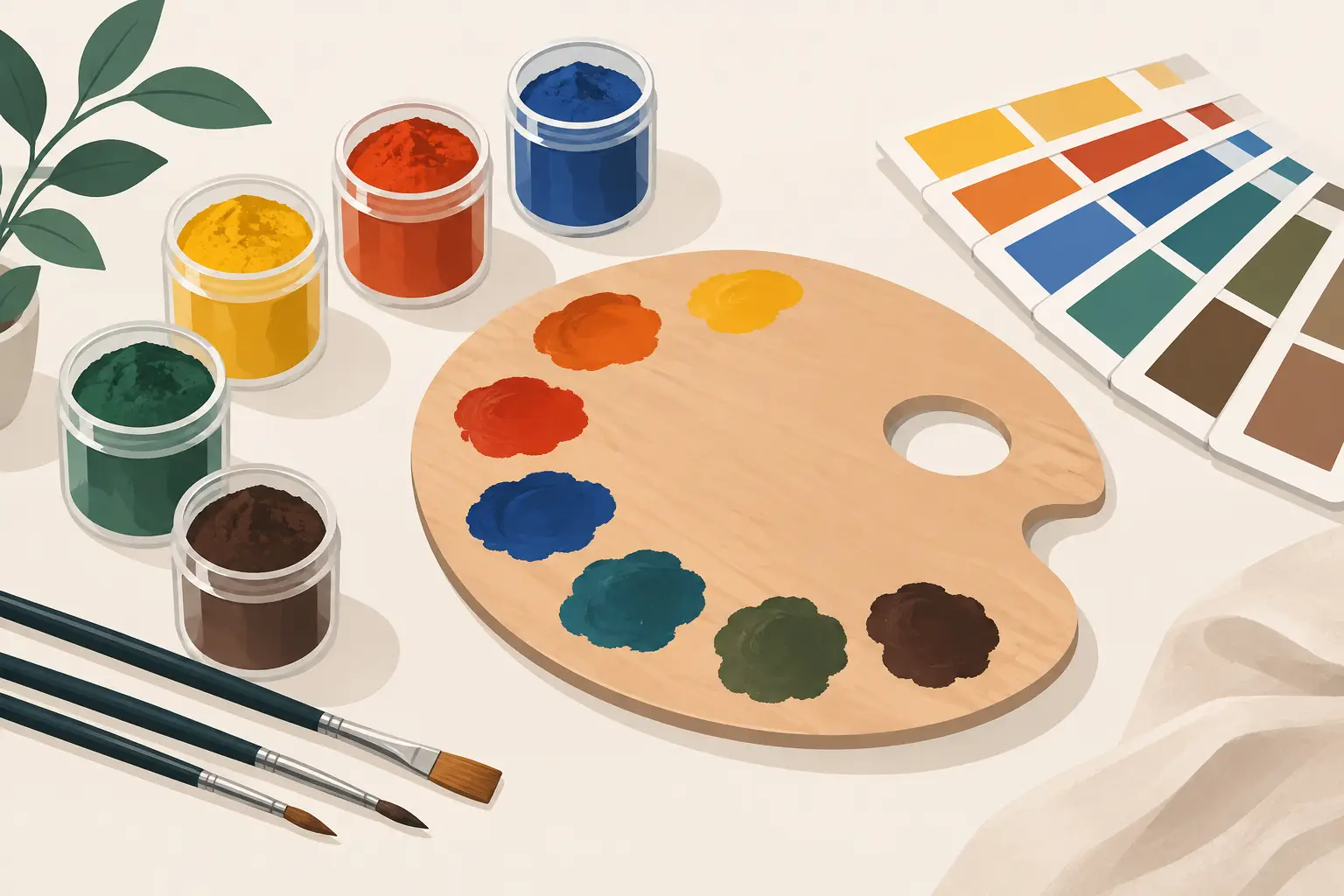
A paint name can be a useful invitation, but it is not a complete description of the material in the tube or pan. Learning how to select pigments begins with looking beyond names such as Crimson, Blue or Yellow Lake and asking what the colour is made from, how it behaves, and what you need it to do in a painting.
For a serious palette, selection is not about owning every appealing hue. It is about building dependable relationships between pigments: colours that mix cleanly, retain their character in layers, and give you the range of temperature, value and chroma your work requires.
Start with the pigment, not the colour name
The Colour Index name or number identifies the actual pigment, commonly shown as a designation such as PB29 for Ultramarine Blue or PR122 for Quinacridone Magenta. This information matters because two paints with similar names can be materially very different. One version of a colour may be a single pigment; another may be a convenience mixture designed to resemble it.
Neither is automatically better. A carefully formulated mixture may be exactly right when you want a particular handling quality or a reliable ready-made neutral. Yet single-pigment colours are often the clearest starting point for a working palette. Their mixing behaviour is easier to learn, repeat and predict. When a mixture becomes dull or unexpectedly warm, you can identify the cause rather than trying to account for several pigments at once.
Look at the pigment declaration alongside the colour name. This is especially useful when replacing a familiar colour, comparing brands, or choosing a substitute for a historical pigment. A name may remain constant while the underlying pigment changes, particularly where older materials are fugitive, toxic, scarce or unsuitable for modern manufacture.
Decide what the pigment must do
A pigment cannot be judged in isolation. The best choice depends on whether you paint thin glazes, dense impasto, precise portrait passages, broad landscape studies or transparent watercolour washes. A colour that is indispensable in one practice may be superfluous in another.
Begin with the roles you need in your palette. Most painters benefit from a considered balance of warm and cool yellows, reds and blues, supported by useful earth colours and a white appropriate to their medium. However, this is a framework, not a rule. A painter working in muted tonal relationships may need several earth pigments and only one high-chroma red. A painter making luminous floral work may place far greater value on intense transparent pigments.
Ask practical questions in the studio. Do you need a yellow that will cover a dark underpainting, or one that will make clear glazed greens? Do you need a blue for expansive skies, for restrained greys, or for powerful dark mixtures? Do you want a red that holds its intensity in a small accent, or one that produces a wide range of flesh and shadow mixtures? The answer directs selection more effectively than a generic list of recommended colours.
Assess permanence before convenience
Permanence is the capacity of a colour to resist meaningful change through exposure to light and normal ageing. For work intended to last, it deserves to be one of your first considerations. A beautiful fugitive pigment can make an immediate visual impression, but its future instability may alter the structure of the painting itself.
Check the manufacturer’s lightfastness information and understand the circumstances in which you will use the colour. Watercolour, with its exposed and often delicate washes, places particular demands on permanence. Oil paint may offer some protection through its paint film and layering, but it should not be treated as an excuse to overlook a pigment’s lightfastness.
Permanence also has an artistic dimension. If a pale rose is integral to the balance of a painting, its fading does not merely reduce colour intensity. It can change the spacing, temperature and emotional register of the entire work. Choosing durable pigments is therefore a decision about preserving intention, not simply meeting a technical standard.
Transparency, opacity and tinting strength
Transparency and opacity determine how a colour interacts with what lies beneath it. Transparent pigments are often prized for glazing, optical depth and clean mixtures. In watercolour, they allow the white of the paper to participate in the image. Opaque pigments can cover decisively, create solid passages and alter mixtures quickly.
There is no universal preference. Transparent Indian Yellow may be ideal for a glowing glaze, while an opaque Yellow Ochre can establish a calm, earthy light with little effort. In oils, Transparent Oxide Red can enrich shadows without concealing an underpainting; Naples Yellow may be valued for its soft, covering presence in a figure painting.
Tinting strength is equally consequential. Some pigments, including many phthalocyanine colours, quinacridones and modern organic reds, exert enormous influence in a mixture. A minute amount can dominate a larger quantity of another colour. Earth pigments generally have gentler tinting strength and are often valued for their restraint.
High strength is not inherently superior. It can be economical and expressive, but it asks for control. If you regularly make subtle greys, reserve a strong blue or green for deliberate use and test it against your preferred earths, whites and complementary colours. A pigment that seems difficult alone may become essential once you understand the small proportion it requires.
How to select pigments for clean mixing
Mixing is where pigment selection becomes a system rather than a collection. Every additional pigment introduced into a mixture increases the likelihood of a lower-chroma or muddier result, particularly when colours already contain multiple components. This is why a palette of well-chosen single-pigment paints can be remarkably expansive.
Test prospective colours in pairs before committing to them. Mix each blue with each yellow you are considering and observe whether the greens lean acidic, natural, deep or muted. Combine your preferred reds with blues for violets, then with yellows for oranges. Finally, make neutrals with complementary pairs and assess whether they offer useful warmth and depth rather than a generic brown.
Do not judge a mix only at full strength. Add white in oils or dilute with water in watercolour, then examine the range of tints and washes it produces. Some pigments retain a vivid, clean character when lightened, while others reveal unexpected undertones. Ultramarine Blue, for example, may give a granulating, reddish-leaning blue and nuanced greys; a phthalocyanine blue may produce exceptionally clear, forceful greens but require careful moderation.
Keep a mixing record on the same support you normally use. Note pigment names, proportions and whether the paint was applied thickly, thinly or over a coloured ground. A painted record is more valuable than memory when you are refining a palette over months or years.
Account for the medium and application
Pigments do not behave identically across media. Their intrinsic qualities remain, but the binder, surface and application alter what you see. In watercolour, granulation can be a major part of the colour’s character. Granulating earths, Ultramarine and certain mineral pigments can settle into paper texture, creating broken, atmospheric passages. On hot-pressed paper, this may be restrained; on a rough surface, it can become a defining feature.
In oil paint, consider body, brushmark and the degree to which a pigment supports glazing or impasto. Some colours have a naturally dense, buttery presence; others are more transparent or need careful adjustment with medium for a particular effect. White deserves particular attention because it affects nearly every mixture. Titanium White offers strong opacity and tinting power, while Zinc White is more transparent but should be used with care in oil painting because of concerns about the brittleness of oil paint films containing it.
The ground also changes a pigment’s appearance. A transparent red over a warm imprimatura may appear deeper and more integrated than the same red on a bright white ground. Before expanding your palette, test whether a change in ground, paper or application could resolve what appears to be a colour problem.
Choose substitutes with precision
When a favourite pigment is unavailable, unsuitable or outside your budget, seek an equivalent by behaviour rather than by name alone. Compare hue, temperature, transparency, tinting strength, granulation, permanence and mixing function. A replacement that matches only the masstone may disappoint as soon as it is diluted or mixed.
Historical pigments present a familiar example. A modern alternative may reproduce the broad appearance of a traditional lake, but its staining quality, transparency and undertone can differ considerably. This is not necessarily a compromise. It may offer greater permanence and a more dependable working life, provided you adjust your expectations and mixtures accordingly.
Ethical and studio considerations also belong in the decision. If you require vegan or non-toxic options, consult the material information rather than relying on colour names or assumptions about a pigment’s origin. Clear declarations allow you to align the palette with your practice without sacrificing professional performance.
Build slowly and test honestly
A first serious palette should be small enough to understand. Select colours with distinct jobs, use them repeatedly, and add a new pigment only when it answers a genuine limitation. Michael Harding’s pigment-led colour information and comparison tools can help clarify whether a prospective addition extends your mixing range or simply duplicates a colour already on the palette.
The most useful pigments are not always the ones that look most spectacular in isolation. They are the colours that continue to repay attention: dependable in mixtures, convincing in the light, and responsive to the particular decisions your paintings demand. Give each one enough studio time to reveal its nature, and your palette will become less a set of purchases than a working language.