





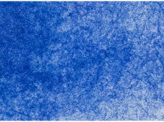

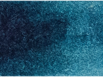

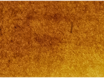

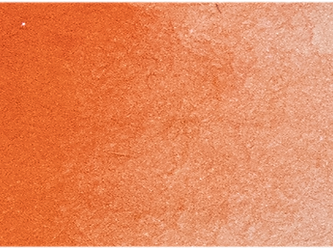


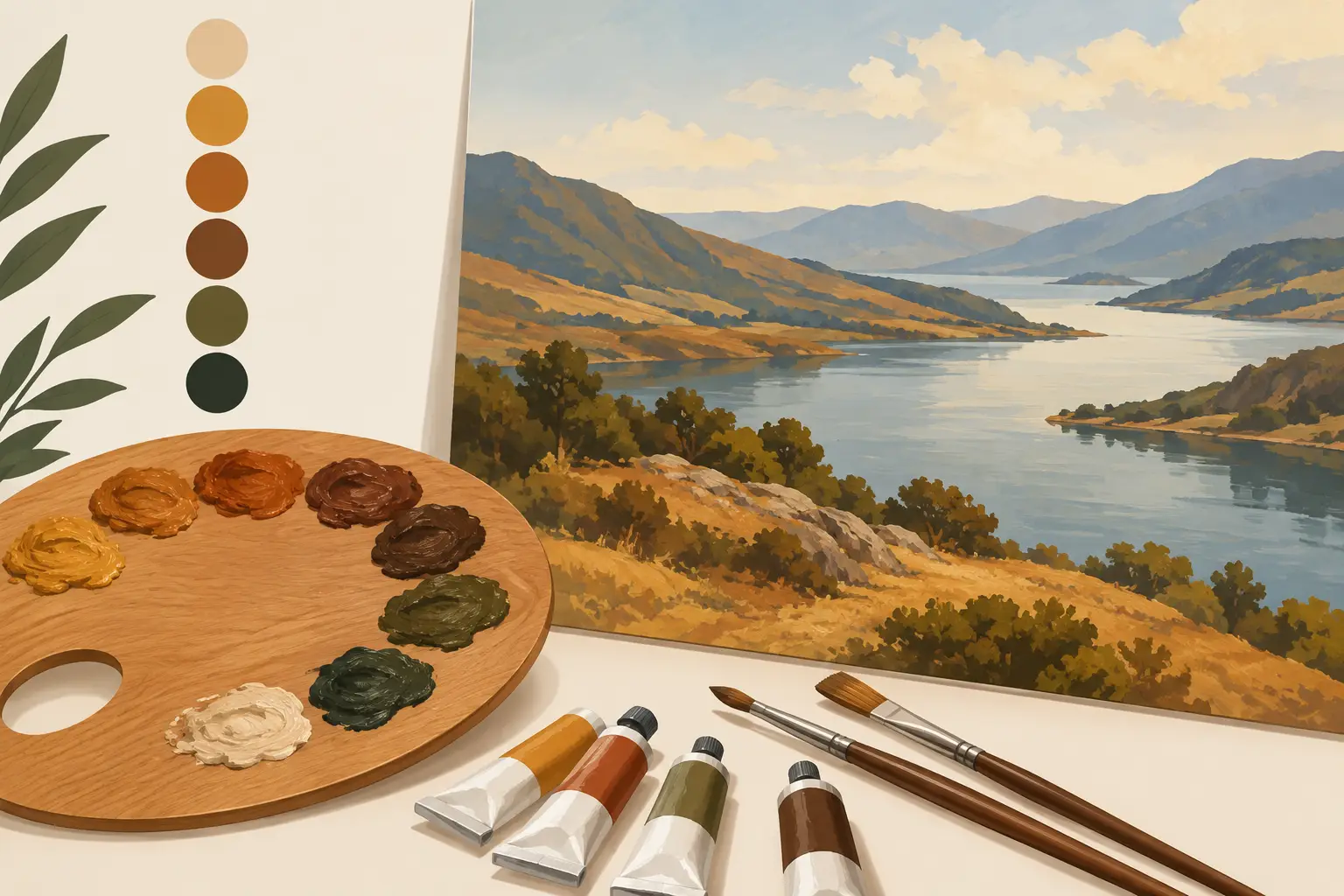
A convincing landscape rarely begins with a bright green. It begins with the quieter colours beneath it: the ochre in dry grass, the umber in a hedgerow shadow, the red-brown of worked soil and the violet-grey contained within distant rock. The best earth colours for landscapes give a painting its structural temperature and keep higher-chroma passages believable.
Earth colours are not merely useful for making neutrals. They establish the relationship between light and substance. A yellow field becomes more convincing when it has an ochre foundation; a blue distance feels more spacious beside a restrained warm foreground. Used with judgement, these pigments allow landscape colour to remain observed rather than formulaic.
What Makes an Earth Colour So Useful?
Traditional earth pigments include naturally occurring iron oxides and mineral colours such as yellow ochre, raw sienna and umber. They are valued for their moderate chroma, excellent lightfastness and natural affinity with one another. Their character is often opaque or semi-opaque, making them particularly effective for blocking-in, covering adjustments and establishing a painting's tonal architecture.
The category has expanded to include synthetic iron oxides, commonly identified as PR101. These may be sold under names such as Venetian Red, Indian Red or English Red. They can be cleaner, stronger and more consistent than many natural-earth formulations, while retaining the weight and warmth painters expect from an earth red.
Pigment names matter. Two paints with similar-looking colour names may differ in opacity, undertone, tinting strength and mixing behaviour. Read the pigment information rather than relying on a historical name alone, especially when building a dependable working palette.
The Best Earth Colours for Landscapes
A compact earth palette can serve a great deal of landscape painting, but each colour has a particular role. The most useful selection depends on whether you work in a cool northern light, paint sunlit Mediterranean scenes, or need a restrained all-weather palette for painting outdoors.
Yellow Ochre: the dependable landscape yellow
Yellow Ochre is one of the most serviceable landscape colours available. Usually based on hydrated iron oxide, it has a muted golden warmth that suggests dry grass, sandstone, path edges, autumn foliage and sunlit skin of the land without becoming strident.
It is especially valuable because it moderates cooler mixtures. Added to Ultramarine Blue, it produces an extensive range of natural greens and greyed olive notes. With white, it can give convincing warm light, although its opacity means that overuse may make a mixture chalky. In watercolour, its granulating or softly settling character can be an advantage in skies, stone and uneven ground, depending on the formulation.
Raw Sienna: transparent warmth and light
Raw Sienna occupies a different position from Yellow Ochre. It is generally more transparent and more luminous, making it particularly useful when a landscape contains dry grasses, pale earth, autumnal underpainting or warm light passing through foliage.
Its transparency makes it a strong glazing colour in oil paint. A thin Raw Sienna layer over a dry neutral passage can restore warmth without burying the drawing beneath. It is less useful than Yellow Ochre where solid coverage is required, but its clarity is often preferable in passages that need to breathe.
Burnt Sienna: warmth that can turn to shadow
Burnt Sienna is Raw Sienna calcined to deepen its red-orange character. It is an exceptional bridge between warm lights and cool darks. Mixed with Ultramarine Blue, it produces a range of useful dark neutrals, from soft blue-greys to rich near-blacks, depending on the balance of the two colours.
This familiar pairing is valuable, but it should not become automatic. Burnt Sienna and Ultramarine can produce a handsome dark that is too colourful for certain subjects. For rain-heavy skies, wet tarmac or deep woodland, introduce a cooler earth or a more neutral blue rather than forcing every shadow through the same mixture.
Raw Umber: an early decision-maker
Raw Umber is often greenish, cool and low in chroma. It is one of the best colours for quickly placing the tonal framework of a landscape. It can suggest olive foliage, damp soil, weathered timber and subdued foreground shadow without asserting itself too strongly.
For oil painters, Raw Umber's traditionally lean, fast-drying nature has made it a common choice for an initial drawing or imprimatura. The exact drying behaviour of a paint still depends on the formulation and the amount applied, so treat this as a useful tendency rather than a fixed rule. Its coolness also makes it an excellent corrective when a warm earth palette begins to feel overly autumnal.
Burnt Umber: depth without theatrical black
Burnt Umber is darker, warmer and usually more red-brown than Raw Umber. It is effective in tree trunks, deep banks, peat, shadowed brick, winter hedges and the warm lower notes of a landscape. Combined with a blue, it can create strong darks with more colour movement than a tube black.
There is a trade-off. Burnt Umber can make mixtures heavy if it is used indiscriminately. In a high-key landscape, keep it for selective accents and let the broader shadow structure be carried by lighter, more air-filled greys.
Earth reds: the pulse beneath greens and greys
Venetian Red, Indian Red and related iron-oxide reds are often overlooked in landscape palettes. Yet they are invaluable wherever the land has a mineral presence: red brick, tiled roofs, iron-rich soil, cliff faces, distant heath or the warm notes within tree bark.
Their greatest strength may be indirect. A small amount of an earth red can neutralise an assertive green, warm a grey cloud base or give an otherwise cool landscape an underlying sense of geological coherence. These colours tend to have considerable tinting strength and opacity, so add them cautiously, particularly when mixing pale passages with white.
Build the Palette Around Place and Light
There is no single correct set of earth colours for every landscape. A painter working from the chalk downs may favour Yellow Ochre, Raw Sienna and a restrained earth red. A painter concerned with woodland, moorland or overcast coastal scenes may rely more heavily on Raw Umber, Burnt Umber and cooler red oxides.
Begin by asking what the earth is doing in the subject. Is it dry and reflective, wet and dark, red with iron, pale with chalk, or hidden beneath a dense canopy? Then consider the prevailing light. Low evening sun may call for transparent siennas and warm ochres, while a north-facing slope under cloud will often demand cooler umbers and subdued mixtures.
A useful limited palette might include Yellow Ochre, Raw Sienna, Burnt Sienna, Raw Umber and one earth red. This is not a prescription to exclude brighter colours. Rather, it gives greens, blues and high-key yellows something to belong to. If every pigment on the palette is intense, the painting has no reserve.
Mixing Earth Colours Without Losing Air
The common error is to treat earth colours as mud-makers. They become dull only when mixtures are made without a clear temperature or value intention. Mix for the specific task: a warm light, a cool shadow, a softened green or a dark accent. Avoid stirring together several earths simply because the subject looks brown.
For foliage, try beginning with a blue and an ochre rather than a ready-made green. Adjust towards warmth with Raw Sienna or towards depth with Raw Umber. A touch of earth red can push a green towards the subdued notes seen in late summer leaves, but too much will flatten its sense of light.
For atmospheric distance, earth colours are often more useful in small quantities than as dominant ingredients. A cool blue grey may need only the faintest trace of Burnt Sienna or Yellow Ochre to lose its artificial cleanliness. Keep distant passages lighter in value and generally quieter in contrast than the foreground. Atmospheric perspective is as much about value control as hue.
White deserves particular care. Opaque earths mixed heavily with white can become pastel and inert. Where the passage permits, preserve some transparency by using a thin application, a paler ground, or a more transparent earth such as Raw Sienna. In watercolour, reserve the paper where the light is most acute rather than attempting to recover it with opaque corrections.
Let Pigment Behaviour Guide the Mark
Material handling should support the subject. An opaque ochre can be dragged across a textured surface to suggest rough grass or broken stone. A transparent sienna can be allowed to sit in a glaze over a dry underlayer, enriching a bank of earth while preserving earlier marks. Granulating earth colours in watercolour may create useful irregularity in cliffs and soil, but a smooth wash may be preferable for a distant field.
If you are comparing alternatives, look beyond the hue shown on a colour chart. Consider the pigment, transparency, undertone, tinting strength and whether the colour will serve your existing blue and white. A well-chosen earth colour earns its place by making several other colours more useful.
The strongest landscape palettes do not imitate nature by accumulating every brown seen outdoors. They select a few pigments with distinct jobs, then allow observation to direct the mixture. Put an ochre beside a blue, a sienna beneath a grey, or an umber into a green, and let the particular weather of the place decide what happens next.