







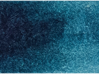





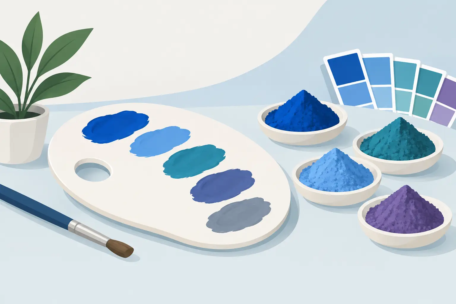
A tube labelled cobalt blue can occupy a surprisingly large place in a painter’s decision-making. It may be valued for its quiet, mineral blue, its controlled tinting strength and the particular way it moderates warmer colours. Yet cobalt alternatives are not a single substitute waiting to be found. They are a set of pigment choices, each preserving one aspect of cobalt colour while changing another.
For a useful replacement, begin with the job the colour performs in your own palette. Is it a light, slightly greenish blue for open skies? A clean modifier for orange and red? A granulating wash? Or simply a dependable blue with less expense and less concern around handling cobalt-containing pigments? The answer determines whether an alternative will feel convincing at the easel.
What makes genuine cobalt colours distinctive?
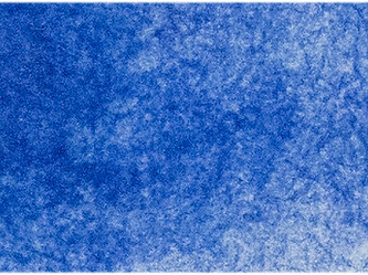
The name covers several inorganic pigments rather than one universal colour. Cobalt Blue is generally PB28, cobalt aluminate. It is a moderately light, cool-to-neutral blue with relatively low tinting strength, excellent lightfastness and a composed, opaque or semi-opaque character in oil. In watercolour it often gives a gentle, settled wash rather than the forceful staining of a phthalo.
Cerulean Blue may be PB35 or PB36, commonly cobalt stannate or a related cobalt-based pigment. It is usually lighter and greener than PB28, with a more atmospheric, chalky quality. Cobalt Turquoise, often PB36, sits further towards green, while Cobalt Violet, PV14, supplies a muted violet that is difficult to imitate perfectly.
This matters because a colour marketed as a “cobalt hue” is not necessarily a replacement for the corresponding genuine cobalt pigment. It may be a mixture designed to approach the mass tone, often using stronger modern pigments. That can be a sensible, permanent and economical choice, but its undertone, transparency, mixing behaviour and staining may be quite different.
Choosing cobalt alternatives by painting purpose
For the role of Cobalt Blue PB28
Ultramarine Blue, PB29, is the most familiar practical alternative, but it is not identical. It is deeper, redder and usually more transparent than cobalt blue. In oil, ultramarine makes rich, characterful greys with earth colours and can be exceptionally useful in shadow passages. It can, however, push a clear blue sky or a pale blue mixture towards violet if used without adjustment.
For a closer visual direction, mix ultramarine with a small amount of Phthalo Blue Green Shade, PB15:3, or use a ready-made blue mixture based on these pigments. The phthalo supplies the greenward clarity ultramarine lacks, while ultramarine restrains its intensity. Start with far less phthalo than seems necessary. Its tinting strength can quickly turn a quiet cobalt-like mixture into an assertive, staining blue.
Cerulean Blue is another useful alternative when the desired attribute is value rather than exact hue. Its lighter, greener character can describe high skies and distant water beautifully. It will not replace cobalt blue in every mixture, particularly where the slight violet restraint of PB28 is central, but it may occupy the same physical space in a compact palette.
For the role of Cerulean Blue PB35 or PB36
A cerulean-like blue is often sought for pale skies, cool architectural light and the blue-green notes of shallow water. Here, Phthalo Blue Red Shade, PB15:1, mixed cautiously with white in oil or substantially diluted in watercolour, can provide brightness but is generally too intense, transparent and staining to behave like cerulean.
A more controllable approach is to temper phthalo blue with a little white and, if needed, a trace of a warm blue or yellow earth. In watercolour, combine phthalo blue with a low-staining, opaque or granulating pigment rather than expecting the wash to settle like genuine cerulean. The result may match a target colour, but not the pigment’s texture.
For painters who value cerulean chiefly because it cools warm mixtures without darkening them too rapidly, a carefully selected light blue mixture may be entirely satisfactory. Check the pigment declaration rather than relying on the name. A single-pigment colour gives the clearest prediction of behaviour; a mixture can be excellent, but it introduces more variables when building neutrals.
For turquoise and violet cobalt colours
Cobalt Turquoise is especially difficult to replace by hue alone. Phthalo Green Blue Shade, PG7, can reach similar bright blue-green territory, yet it is dramatically stronger, clearer and more staining. Mixing it with white in oil creates useful turquoise passages, but not cobalt turquoise’s subdued mineral body. In watercolour, a wash of PG7 can dominate adjacent pigments, so reserve it for mixtures where that strength is an advantage.
For Cobalt Violet, consider whether you need the colour itself or its function as a restrained, light violet. Dioxazine Violet, PV23, is often much darker, stronger and more blue-violet. Ultramarine plus a transparent red or rose can make a broad range of violets, with greater control over temperature. These mixtures are often more adaptable in a limited palette, although they will not reproduce PV14’s particular muted opacity.
The trade-offs behind a lower-cost or cobalt-free choice
Replacing cobalt is rarely a matter of loss versus gain. It is an exchange of properties. Modern organic pigments can offer exceptionally high chroma, excellent lightfastness and a more economical price per tube. Their strength may also mean that a small amount goes a long way.
That same strength can reduce delicacy. A cobalt blue may allow repeated adjustment in a pale mixture because it does not overpower white, yellow ochre or a warm earth. A phthalo-led alternative requires more disciplined proportioning. In watercolour, staining colours can make lifting and correction more limited, while granulating cobalt pigments can create atmospheric variation that a transparent dye-like wash will not provide.
Opacity is another practical distinction. If cobalt has been serving as a semi-opaque blue for covering passages, glazing with a transparent substitute will alter the optical construction of the painting. Conversely, a transparent alternative may be preferable for layered work, where cobalt’s body could obscure earlier colour.
Health and studio practice deserve the same precision. Cobalt-containing pigments require sensible handling, particularly when working with dry pigment, sanding painted surfaces or spraying. Avoid generating dust, keep food and drink away from the work area, and follow the product’s safety information. However, do not assume that every cobalt-free paint is automatically non-toxic or that a cobalt pigment is uniquely problematic in every format. Assess the specific formulation and your method of use.
Test the alternative before rebuilding the palette
A small comparison chart will reveal more than a colour swatch on a screen. Paint the cobalt colour and candidate alternative in full strength, then make a white tint scale in oil or a dilution scale in watercolour. Observe the hue shift as the colour becomes lighter. This is where apparently similar blues often separate.
Next, mix each blue with a warm yellow, a warm red, burnt sienna and a neutral white. These tests show whether the alternative produces the greens, violets and greys your work requires. For watercolour, add a wash test on the paper you use most often and note granulation, edge formation, lifting and staining after the wash has dried.
Keep the test beside a study rather than judging it in isolation. A substitute that is less accurate in theory may be more useful in your particular landscape, portrait or abstract work. Equally, an exact-looking hue may prove unsuitable if it changes the pace of your mixing or the surface of the painting.
Build a palette around function, not names
A well-chosen cobalt alternative need not imitate every quality of the original pigment. One painter may keep genuine Cobalt Blue for its measured handling and use ultramarine for darker, redder mixtures. Another may choose cerulean for pale sky notes and rely on a restrained phthalo mixture when greater chroma is needed. A limited palette can also omit cobalt entirely, provided its blue choices collectively cover lightness, temperature, mixing range and desired surface character.
Label your trial mixtures with pigment codes and proportions, then return to them after a few painting sessions. The right alternative is the one that leaves you able to see the colour relationship you intended, rather than merely the colour name you expected.