











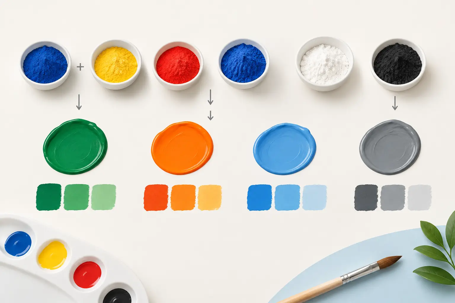
A mixed grey can be beautifully alive, or it can collapse into a dull, unconvincing brown. The difference is rarely a matter of talent alone. It usually begins with knowing which pigments are meeting on the palette. These pigment mixing examples are intended to make that encounter more predictable, whether you work in oil or watercolour.
Paint names describe a useful visual family, but the pigment code tells you more about mixing behaviour. A colour called blue may lean green or red, cover strongly or stain deeply, remain clear in a wash or become opaque at once. Begin with the pigment, then observe the resulting mixture in the context of value, transparency and application.
What pigment mixing examples can teach you
A colour wheel is a helpful introduction, but it cannot tell you whether a particular yellow and blue will create a luminous spring green or a restrained olive. Pigments have individual undertones, tinting strengths and physical characters. Some are single pigments; others are carefully balanced formulations. Both can be valuable, but they do not offer the same degree of predictability.
For a meaningful test, mix modest quantities at roughly equal proportions, then make two further steps: one biased towards each parent colour. Paint or wash these beside the original colours and allow them to dry before judging. Watercolour often dries lighter, while oil colour can deepen or alter in apparent saturation as the film settles.
Do not assess mixtures only as neat marks. Pull each one into a graduated tint with Titanium White in oils, or dilute it progressively in watercolour. A dark pigment can appear neutral in mass tone yet reveal a decisive colour bias when lightened or thinned.
Yellow and blue: not every green is the same
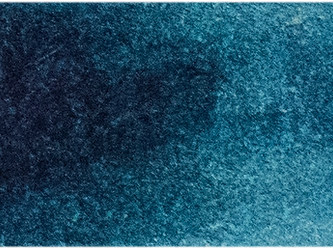
A cool yellow such as Lemon Yellow mixed with a green-leaning blue such as Phthalo Blue Green Shade produces a very high-chroma green. This is useful for intense foliage accents, reflected light or contemporary colour passages, but it can quickly feel synthetic in a naturalistic landscape. The strength of Phthalo Blue means that a minute quantity is often sufficient.
Replace the blue with Ultramarine Blue and the result moves towards a more earthy, often granulating green in watercolour. Ultramarine carries a red bias, so it cannot make the same piercing greens as a green-biased blue. That limitation is precisely its value when you need foliage with distance, weight or atmosphere.
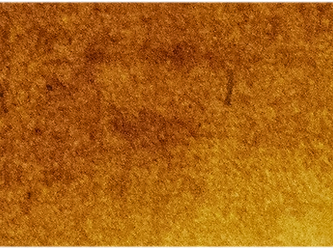
A third example is Yellow Ochre with Ultramarine Blue. Here, both pigments bring restraint: the yellow is naturally muted and the blue is red-leaning. The mixture commonly yields olive, moss and grey-green territory. It is not a failed bright green. It is a practical route to colours often seen in shadowed leaves, weathered stone and subdued landscape passages.
The lesson is simple: use a yellow and blue that both lean towards the green you want for maximum intensity. If you need a quieter green, introduce a pigment whose bias turns away from it, rather than automatically adding black.
A note on Phthalo strength
Phthalo pigments reward measured handling. In oil, place a small touch at the edge of the yellow rather than beginning with equal piles. In watercolour, use a dilute charge and build slowly. Their exceptional tinting strength makes them economical and expressive, but they can overwhelm more moderate pigments before you have had time to observe the mixture.
Red and yellow: oranges, earths and flesh colour
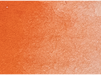
A warm red such as Pyrrole Red with a warm yellow such as Indian Yellow can make a clear, confident orange. The pairing shares a bias towards orange, so little neutralisation occurs. This family is useful for autumn foliage, illuminated brick, fruit and passages requiring heat without a brown undertone.
Use a cooler red, such as a quinacridone rose, with the same yellow and the orange will generally become less direct and more red-sensitive. This is not necessarily weaker. It may be better suited to floral colour, glowing sunset transitions or mixtures that must travel towards violet without becoming chalky.
For a more restrained orange, mix Yellow Ochre with a transparent earth red such as Burnt Sienna. The result is often an excellent foundation for terracotta, timber, sandstone and warm skin notes. It carries far more life than an orange subdued with black, because both parents already belong to a lower-chroma earth range.
Flesh colour deserves particular caution. There is no universal flesh mixture, because light, local colour, reflected colour and the sitter's complexion change the relationship constantly. A Yellow Ochre and Burnt Sienna foundation can be adjusted with a cool red, blue or white, but keep the mixtures separate on the palette. Premixing one large “skin tone” usually removes the variations that make a painted figure convincing.
Blue and red: violet requires the right bias
Ultramarine Blue and a cool red or rose are a dependable route towards violet. Both pigments lean towards the shared destination: Ultramarine towards red, and a rose towards blue. The mixture can range from clear purple to deep, shadowed violet according to proportion.
By contrast, a warm scarlet-style red mixed with a green-leaning blue is likely to make a muted violet or near-neutral. Each pigment brings part of the complementary influence that suppresses chroma. This can be exactly right for distant mountains, dark fabric, cast shadows or a restrained floral background. It is only disappointing if a brilliant violet was the intention.
In watercolour, inspect these mixtures for granulation as well as hue. A granulating Ultramarine combined with a staining transparent rose may produce a textured wash with pigment separation at its edges. In oil, the same chromatic relationship will be shaped more by the body of the paint, opacity and the medium used.
Complementary mixtures: make neutrals with purpose
The most useful neutrals often arise from complementaries rather than black and white. A red and green, blue and orange, or yellow and violet pairing contains a wide spread of colour information. When balanced, it can produce a grey that relates naturally to the surrounding palette.
Try Ultramarine Blue with Burnt Sienna. Depending on ratio, it can move through blue-grey, charcoal, soft brown and near-black. It is particularly useful because the mixture remains adjustable: add more Ultramarine for a cool shadow, or more Burnt Sienna for warmer darks. In a landscape, this gives you a family of connected dark notes rather than one imported black.
Another valuable example is a violet mixed into Yellow Ochre. The resulting neutral can suggest aged plaster, muted gold, dry grass or warm light falling across a cool form. Add the complement gradually. Complementary mixing is less about finding an exact fifty-fifty formula than steering a colour towards the temperature and value required by the painting.
Black remains a legitimate pigment, especially where its particular undertone and covering power serve the image. The question is not whether black is permitted. It is whether a mixed neutral would preserve more colour relationship and flexibility.
White changes more than value
In oil painting, adding Titanium White does not merely lighten a mixture. Its opacity and strong tinting action can cool, soften or chalk the apparent colour, especially in transparent organic pigments. A small white addition to a phthalo green may create a delicate mint; too much may remove its depth entirely.
Test a second white where relevant. A more transparent zinc-based white behaves differently, though it must be used with informed attention to the technical requirements of oil painting. In watercolour, paper white normally provides the lightest value, so dilution is the equivalent test. The character of the paper, its warmth and absorbency, becomes part of the mixture.
Build a mixing record you will actually use
A full matrix of every colour in the studio can become an admirable but unused project. Start with the pigments that define your regular palette: two yellows, two reds, two blues, an earth and a dark. Make enough swatches to show bias, range and tint, then annotate pigment names rather than relying only on colour names.
Record the proportions loosely, such as “trace blue into yellow” or “two parts sienna to one part ultramarine”. Exact formulae are less useful than a repeatable method, because paint consistency, paper, medium and desired value all affect the result. Michael Harding's Mixing Studio and Colour Compare tools can help clarify likely pigment relationships before a studio test, but your own painted chart remains the final authority.
Keep the chart near your working palette and revise it as your selection changes. After a few paintings, you will begin to recognise not just what a colour looks like in the tube, but what it can become in company. That is where pigment knowledge stops being reference material and becomes a quiet, dependable part of painting.