














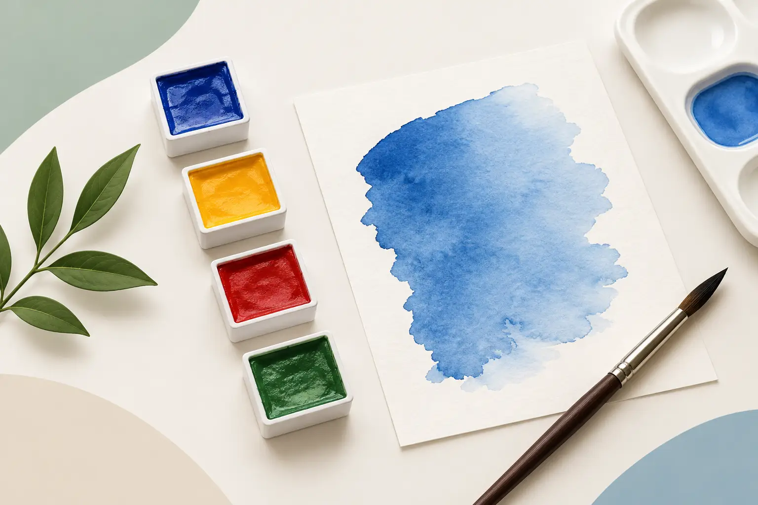
A grey that should have been luminous turns dull after one too many adjustments. A violet shifts unexpectedly towards brown. A carefully chosen green cannot be repeated next week. These are familiar frustrations, and single pigment watercolours offer a practical way to understand why they happen. They reveal what each pigment brings to the wash, the mixture and the finished painting - without another colour already hidden in the pan.
What single pigment watercolours tell you
A single-pigment colour is made with one identified colourant, usually shown on the label by its Colour Index name and pigment code. Ultramarine Blue, for example, is commonly PB29; Quinacridone Rose is commonly PV19. The pigment code is more useful than a poetic colour name because names vary between manufacturers, while the code identifies the material responsible for the colour.
This does not mean every single-pigment paint behaves simply. Pigment character is wonderfully particular. One may granulate heavily, another may stain the paper at once; one may be transparent enough for repeated glazing, while another creates an opaque or softly veiled passage. Particle size, pigment concentration and the binder system all influence handling. But when one pigment is at work, its contribution is easier to observe.
For a painter, that clarity has consequences. You can learn whether a pigment leans warm or cool, whether it settles into paper texture, whether it lifts cleanly, and how it responds when mixed with another colour. Rather than guessing which component of a convenience mixture is causing a result, you have a clear starting point.
Cleaner mixing, with fewer surprises
Every mixture has a colour budget. Add a yellow and a blue, and you can assess the green they make. Add a third colour to correct that green, and the mixture may still be useful, but it becomes less predictable. When several pigments are already present in each pan, a simple two-colour mix can quickly become a four-, five- or six-pigment combination.
That does not automatically produce mud. A multi-pigment paint can be beautifully formulated and entirely appropriate for a particular effect. The issue is control. Multiple pigments often carry differing undertones, degrees of transparency and settling behaviour. As washes overlap or are repeatedly adjusted, colour relationships can become difficult to anticipate.
Single pigment watercolours make it easier to build mixtures with intention. A transparent yellow and a blue with known granulation will produce a different green from an earthier yellow paired with a staining phthalo blue. Neither is inherently better. The advantage lies in choosing the outcome rather than discovering it halfway through a painting.
This is particularly valuable when mixing neutrals. A restrained neutral made from two known pigments can be warmed, cooled or lightened with confidence. It is also easier to recreate. For commissioned work, editions, teaching demonstrations or a body of paintings developed over time, repeatability matters.
The value of pigment codes
Colour names are evocative, but they are not a reliable technical description. “Permanent”, “deep”, “brilliant” and “hue” may indicate a shade, a formulation choice or a marketing convention. The pigment line on a label gives the painter firmer information.
Look first at the pigment code, then consider transparency, staining, granulation and lightfastness. Two paints with similar-looking swatches may be structurally very different. A single-pigment rose and a mixed red-violet might both appear suitable for flowers, yet one may make clean lavender mixtures while the other produces softer, greyer passages. That distinction becomes visible only when the colours are put to work.
Building a palette from pigment behaviour
A useful palette is not necessarily a large one. It is a set of colours whose strengths and limitations you understand. Many painters begin with a warm and cool option across yellow, red and blue, then add earth pigments or specialist colours according to subject matter and working method.
For example, a painter who values clear, transparent washes might choose a bright transparent yellow, a warm yellow, a clean red, a rose, Ultramarine Blue and a high-chroma blue or turquoise. A landscape painter may give more space to ochres, siennas, umbers and granulating blues. A botanical painter may prioritise staining pigments that sustain crisp detail. The correct selection depends on the visual language of the work, not on a universal list.
When choosing colours, test them on the paper you actually use. Make a full-strength swatch, a graduated wash and a simple mixing grid. Allow granulating colours to settle. Lift a small area once dry. Then mix each colour with its likely partners rather than every colour you own. A modest chart, made with care, will tell you more than a crowded box of untested pans.
Michael Harding watercolours are formulated with pigment-led clarity in mind, allowing painters to make such comparisons from the material itself rather than from colour names alone.
A practical first palette
If you are building your first serious palette, begin by resisting the urge to buy every attractive swatch. Choose colours that establish a workable mixing system, then paint with them long enough to notice what is absent. You may find that you need a stronger granulating blue for distant weather, a warmer earth for masonry, or a vivid green for specific botanical subjects. These are informed additions, not speculative purchases.
A limited single-pigment palette also teaches economy. It encourages you to vary water, dilution, layering and temperature before reaching for a new pan. The result is often greater colour unity across a painting, because the same pigments recur in its shadows, middle tones and accents.
When mixed-pigment colours are the better choice
Single-pigment colours are not a rule of artistic virtue. Some mixed-pigment watercolours provide a very specific convenience: a reliable shadow tone, a natural foliage green, a subdued neutral or a high-key skin-tone mixture. They can save time in plein-air work, travel kits and demonstrations where a compact palette is more useful than unlimited adjustment.
They can also offer a colour effect that would take several separate paints to achieve. If a pre-mixed colour performs beautifully in your work and remains stable in glazing and mixing, there is no reason to exclude it on principle.
The sensible distinction is between deliberate use and accidental complexity. Know what the mixture contains, test it with the rest of your palette, and decide whether its convenience serves the painting. A specialist neutral may be exactly right for quick studies, while a single-pigment alternative may be preferable for a large work requiring extensive colour variation.
How to assess a colour before it earns a place
A small amount of studio testing prevents a great deal of disappointment. Paint a generous swatch at full strength, then draw it down into a pale wash. Observe whether the pigment stays even, granulates, blooms readily or leaves a hard edge. Once dry, glaze a second wash across part of the swatch to see how transparency and layering behave.
Next, make a few purposeful mixtures. Pair the colour with a neighbouring hue, its approximate complement and an earth pigment. This shows far more than a single colour chart square. A yellow may look clean on its own but make unexpectedly muted greens; a blue may appear dark in the pan yet create unusually spacious, atmospheric greys.
Keep the sheet and date it. Over time, your own tests become a more valuable reference than generic descriptions because they record your paper, your water, your brushwork and your preferred concentrations.
A more informed relationship with colour
Choosing single-pigment watercolours is not about reducing painting to formulas. It is about giving intuition better material to work with. When you understand the pigment in front of you, accidents can still happen, but they become productive accidents - ones you can recognise, repeat or deliberately avoid.
Let each new colour earn its place through paint, water and paper. The palette becomes more personal that way: not a collection of enticing names, but a set of dependable pigments ready to answer the particular demands of your next painting.