




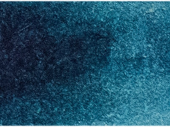
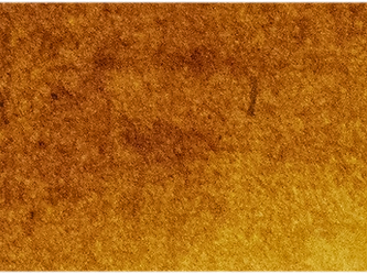

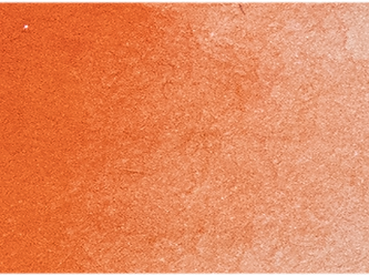



A face can be modelled with the most carefully drawn values and still appear strangely inert. Often, the missing information is temperature. A guide to colour temperature mixing is not simply a matter of separating paints into a warm side and a cool side of the palette. It is the practice of judging relationships: which passage is warmer, cooler, advancing, receding, lit or withdrawn in relation to the colour beside it.
For painters, temperature is one of the quiet structures that gives form its atmosphere. It can turn a grey wall towards daylight, place a warm reflected light beneath a jaw, or make a distant hill sit convincingly behind a sunlit foreground. The useful question is rarely, is this blue cool? It is, cooler than what?
What colour temperature really describes
Warm colours are generally associated with yellow, orange and red; cool colours with blue, green and violet. This is a helpful starting point, but it becomes unreliable if treated as a rule of classification. A green can look warm beside a bluer green. An ultramarine can appear warm because of its red-violet bias, while a greener phthalo blue may read as cooler. Yet either blue may seem warm when placed against an even colder neighbouring passage.
Temperature is therefore relative, not an absolute property stamped on a tube. It is also affected by value, chroma, surrounding colours and the light represented in the painting. A pale, high-value blue-grey may feel cold and airy, while a deep neutral made from the same pigments can feel close, heavy and warm. Judge the mixture where it will live, rather than on the palette alone.
This matters particularly in observational painting. Local colour - the notional colour of an object under neutral light - is only one part of what you see. Illumination changes it. North light, late-afternoon sun, a warm lamp and reflected light from a coloured wall all alter the temperature relationships across the subject.
Read the pigment bias before you mix
A workable palette does not need every conceivable warm and cool colour. It does, however, need pigments whose biases you understand. A yellow leaning towards green will generally make clearer cool greens than a yellow leaning towards orange. A red with a blue or violet tendency will make cleaner violets than a red with an orange tendency. These are tendencies, not fixed outcomes, and the character of each pigment still matters.
Look beyond the painted swatch. Pigment composition, transparency, tinting strength and opacity influence how a mixture behaves. A transparent, high-chroma colour may shift a mixture decisively with a very small addition. An opaque earth colour may soften both chroma and temperature while also changing the covering quality of the paint. Two colours that look similar from the tube can therefore produce very different temperature ranges in mixtures.
Single-pigment colours make these relationships easier to learn because their behaviour is less obscured by a pre-made balance of ingredients. Keep a record of the pigment codes and mixtures that give you the most useful warm and cool neutrals. Over time, that record becomes more valuable than a universal recipe.
Establish the light before mixing the shadows
The source of light sets the temperature logic of a painting. Under warm sunlight, illuminated planes often tend warmer and shadow families may appear comparatively cool. Under a cool, overcast sky, the relationship may reverse: the light can be cool, while reflected light and sheltered planes carry warmth. Neither arrangement is a formula. A red apple in blue daylight does not cease to be red; its red is simply organised by the prevailing light.
Before making a detailed mixture, identify three broad areas: the light family, the shadow family and the most influential reflected colours. Squinting helps reduce distracting detail and makes the larger temperature pattern easier to see. If the light is warm, avoid automatically warming every lit object. Some local colours will remain comparatively cool within that warm family, and those smaller differences are what keep a passage believable.
A useful discipline is to mix the light and shadow versions of one local colour side by side at a similar value. If the shadow mixture is merely darker, rather than distinctly cooler or warmer in the observed direction, it will often look dull when applied.
A practical method for colour temperature mixing
Work from broad relationships towards specific notes. The following sequence is especially useful when painting from life or working from a colour study.
- Mix a reference neutral at the approximate value of the area you are painting. This gives you a control against which a warmer or cooler adjustment can be judged.
- Make a second mixture that shifts warmer without becoming noticeably lighter or more saturated. A small addition of a warmer-biased colour is usually more effective than a large addition of an obviously warm paint.
- Make a third mixture that shifts cooler at the same approximate value. Compare all three mixtures beside the subject or reference, not in isolation.
- Paint the larger temperature statement first, then reserve the more pronounced warm or cool notes for turning forms, reflected lights and focal areas.
This approach prevents a common problem: using temperature changes as a substitute for value structure. A shadow will not turn convincingly because it is made bluer if its value is wrong. Equally, a perfectly judged value can still feel dead if every plane has been mixed from one neutralised recipe.
Keep greys chromatic, not merely dull
The finest temperature shifts often occur in greys. A grey mixed from complementary or near-complementary colours can lean subtly towards green, violet, blue, red or yellow while retaining restraint. These mixtures are often more alive than black-and-white adjustments because they preserve a trace of the colours around them.
Mixing complementary pigments directly can neutralise quickly, especially with high-pigment-load professional colour. Add the stronger colour in small increments. If the mixture becomes too brown or too black too soon, do not assume the pairing has failed. It may simply need a different proportion, a higher value, or a clearer temperature direction.
White deserves particular care in oil painting. Titanium white raises value efficiently and can make a mixture cooler, chalkier and more opaque in appearance. That may be exactly right for a cool sky plane, but it can flatten a warm, translucent flesh note. Where possible, establish the hue and temperature before adding white, then add only enough to reach the required value. In watercolour, the equivalent decision is often made by dilution and the reserved paper, which retain a different kind of luminosity.
Use warm and cool contrast selectively
If every edge is set up as a warm-against-cool contrast, the effect becomes decorative and restless. Temperature is most persuasive when it serves form, space or attention. A restrained warm note against a field of cool grey can bring a highlight forward more effectively than a bright accent surrounded by competing contrasts.
In landscape, distant forms frequently appear cooler and less chromatic because of atmospheric conditions, but weather, time of day and local colour can complicate this. A warm sunlit distance may be warmer than a cool foreground in shadow. In portraiture, the warmest note is not automatically the cheek or forehead; reflected colour beneath the chin, around the nostril or near the ear may provide the more telling shift.
Hard and soft edges also influence temperature perception. A soft cool transition can feel like air moving around form, while a crisp warm accent may feel nearer and more tactile. Consider edge, value and temperature together rather than asking one mixture to do all the work.
Test your palette as a system
A palette becomes dependable when you know not only what each colour looks like, but what it does with its neighbours. Paint small mixture charts using your chosen yellow, red and blue biases. Make warm and cool greens, violets and oranges, then mix each pairing into neutrals at several values. Label the pigments and leave room for notes on opacity, drying behaviour in oils, or granulation in watercolour.
Digital references and colour tools can help identify possible pigment relationships, but they cannot replace a painted test under your own studio light. Michael Harding's Mixing Studio is most useful when treated as a prompt for informed experimentation, rather than as a substitute for seeing the physical mixture.
Return to one simple subject - an egg, a white cup, a pear, a plaster cast - under different lighting conditions. The exercise reveals how much temperature depends on context. The object remains familiar, while its colour relationships change completely.
The next time a mixture seems neither right nor wrong, resist the urge to reach immediately for a stronger colour. Place it beside its intended neighbour and ask whether it is too warm, too cool, too light, too dark, too clean or too grey. That measured comparison is where colour temperature becomes a practical part of painting rather than a theory on the palette.